
November 21, 2020
In part I we described the proliferation of bullshit, especially on social media, and discussed the importance of a questioning attitude and learning to recognize logical fallacies in arguments as central to developing and tuning your personal BS detector. In this part, we discuss in some detail two other central aspects of critical thinking: learning techniques to assess the validity of quantitative data and judging the sources of information.
4. Assessing Quantitative Data
Bullshit is often enhanced by numerical misinformation. It is often challenging to verify the numerical accuracy of claims, but there are many crosschecks you can apply to decide if data are plausible, sensible, honestly presented, internally consistent, consistent with results of other studies and other reports, and actually supportive of the conclusions that are allegedly based on the data. I describe below a large number of such crosschecks, and refer the reader for even more detail to the book Weaponized Lies: How to Think Critically in the Post-Truth Era by Daniel J. Levitin.
- Qualitative plausibility: Are the numbers plausible – do they pass the simplest “laugh test?” Can they be reconciled with other numerical values you know about? Do they comport with your experience? When percentages are reported for various possible outcomes, do the percentages sum to 100%?
A very recent example of an implausible numerical claim was made by Donald Trump during a televised Town Hall he participated in on Oct. 15, 2020. He claimed that a recent study by the U.S. Centers for Disease Control (CDC) had shown that 85% of people who wear masks contract COVID-19. Now various polls have shown that more than 70% of American adults – at least 150 million people — say they wear masks all or most of the time when interacting at close distance with people outside their home. If 85% of them contracted the virus, we would have well over 100 million recorded infections, rather than the 8 million or so that had tested positive for COVID-19 at the time Trump made this claim. So the claim makes no sense. Later in this post (see item (12) below), I’ll explain the numerical trap that Trump fell (or leapt?) into.
Graduate training in physics actually hones the development of abilities to make quick qualitative plausibility checks, by teaching students to address so-called “Fermi questions.” These are named for the Nobel Prize-winning physicist Enrico Fermi, who was renowned for his ability to make good approximate calculations of almost anything with little or no actual data to rely on, by breaking down each problem into constituent parts for which educated guesses could be made. For example, Fermi famously came within a factor of two of estimating the actual strength of the first atomic bomb test blast carried out at the Trinity site, by observing how far pieces of paper he dropped during the blast traveled away from him. Typical Fermi questions ask for rough estimates such as: “What is the mass of all the automobiles scrapped in North America this month?” or “What is the number of intelligent civilizations within our galaxy?” You might try your own hand at the following Fermi question of particular relevance at this moment: “Once COVID-19 vaccines are approved for use, how long would it take for qualified health care professionals to vaccinate every willing American?”
2) Distribution of data: If the results of many observations or tests on a large sample of subjects are presented only in terms of the average results, ask what the distribution of results looks like, or at least a measure of the range of resulting values. Does the distribution have multiple peaks? Is it skewed by outliers? Are there significant differences among the mean, median (i.e., midway point) and mode (most probable) values? In case of anomalies, average values can give a highly distorted view of what the data actually convey.
For example, as of the beginning of 2020, the mean net worth of American households was $692,100, while the median net worth was $97,300. This implies that only a small fraction of households have net worth at or above the mean, while the distribution is very strongly skewed by less than 1% of households maintained by extremely wealthy individuals.
3) Understand the significance of values that are quoted or plotted: What is the sample studied and the conditions under which it was studied? Be wary of attempts to compare data taken from incompatible samples or under different conditions, or referred to different baselines. For example, Donald Trump and his allies are fond of pointing out that he has received the largest number (about 73 million) of presidential election votes of any incumbent in U.S. history. That statement is true, but is it meaningful? The 2020 election featured the largest number of voters in U.S. history because the voting population is growing steadily and the turnout percentage was the largest in more than a century (not solely, or even primarily, because of passion among Trump supporters). Furthermore, there was not a significant vote share given to third-party candidates in 2020. More relevant than the absolute number of votes Trump received is the fact that he has lost the election by a popular vote margin (currently about 3.8%) that is pretty typical of historical losers, and is even larger than the percentage by which he lost the popular vote in 2016, while managing nonetheless to secure an electoral college victory.
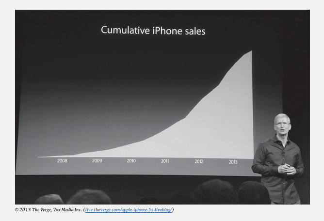
If percentages or ratios are quoted, make sure you know what the denominator (or comparison group) corresponds to.What is the size of uncertainties in the quoted values? Distinguish between plots of differential quantities, such as COVID deaths per day, vs. cumulative quantities, such as total COVID deaths to date. An increase or decrease in a differential value shows up only as a change in slope on a plot of the corresponding cumulative quantity, and can be harder to detect. So cumulative graphs can sometimes be used to hide bad news without lying. See the example in Fig. 4.1, where Apple CEO Tim Cook’s graph of cumulative iPhone sales presented to shareholders hid disappointing early 2013 sales as a small change in the slope of a persistently upward trend.
4) Beware plotsmanship: The mode in which data are presented in graphical form can often be used to “guide the reader’s eye to the author’s conclusion.” Do not take seriously any graphs that do not have clearly labeled axes with numerical values, because the omission of such information is almost always intended to mislead. An example to be discussed below is in Fig. 4.2. Learn to distinguish among axes where the numerical values are spaced linearly vs. logarithmically (e.g., each factor of 10 increase corresponds to the same distance along the axis) vs. discontinuously (the axis has a significant break somewhere) vs. in some unscaled way. Take note of suppressed zeroes, where axes do not begin at zero, as they can make small trends seem large. Be wary of graphs that show only smoothed trends, not the underlying data, because the smoothed trends hide the sometimes large fluctuations in the real data, and those fluctuations can be an important part of the story. Distinguish whether statistics are being quoted or plotted in absolute terms or relative to a changing population, or other changing denominator.
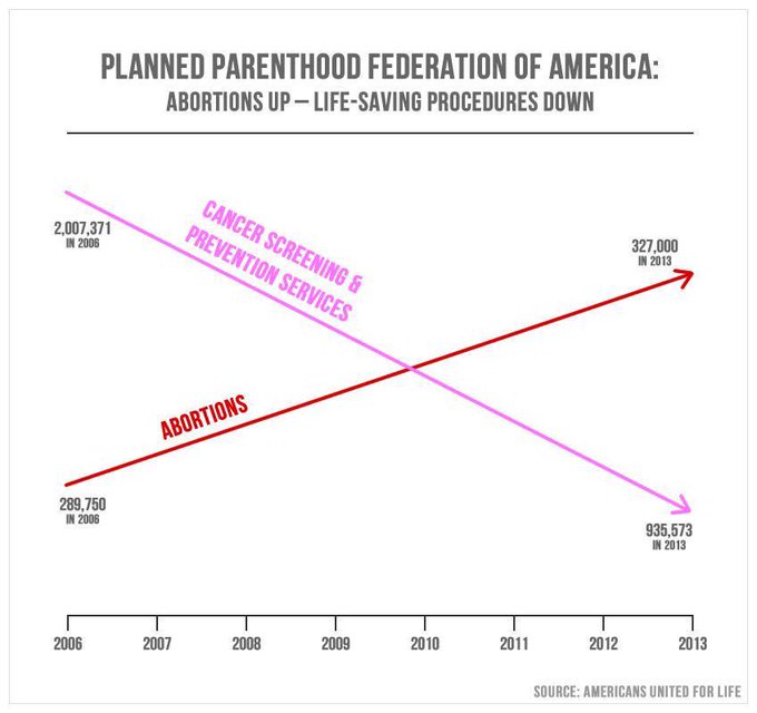
An egregious example of bullshit plotsmanship, exploited by former Congressman Jason Chaffetz to make a political point in a 2015 Congressional hearing on Planned Parenthood, is shown in Fig. 4.2. There is no vertical axis and, rather than data or even smoothed trends, the plot shows only straight lines connecting the values in 2006 to those in 2013. Those elements of the plot should immediately raise alarms. Furthermore, if one is able to read the numbers in fine print, it becomes clear that the abortions line cannot refer to the same (missing) vertical axis as the preventive screening line. If the numerical values are accurate, then the number of abortions performed at Planned Parenthood clinics increased from about 290,000 to 327,000, or by a bit under 13%, while preventive services decreased from 2 million to 936,000, or by 53%. If the two trends were plotted with respect to a common vertical scale, the abortions line would be barely distinguishable as trending upward, and would not induce the intended visual takeaway. The plot also lacks any context. How did the number of patients treated at Planned Parenthood clinics change over this period? How was the number of preventive screenings affected by ongoing changes in medical guidelines, which recommended far less frequent mammogram scans, especially for younger women?
5) Absolute vs. relative changes: Distinguish whether reported changes are absolute or relative. A recent example of confusion on this distinction arose when Donald Trump and Food and Drug Administration Commissioner Stephen Hahn extolled the therapeutic value of convalescent blood plasma for COVID-19 treatment, by misleadingly claiming that it reduced COVID death rates by 35%. The actual study underlying that claim showed a decrease from 13.7% to 8.9% deaths among patients treated with plasma with relatively low vs. relatively high SARS-CoV-2 antibody concentrations. That apparent difference represents a relative reduction of 35% of the 13.7%, not an absolute reduction from, say, 50% to 15%. Furthermore, the quoted uncertainties in the reported death probabilities meant that the relative change could be anywhere from a 5% increase in mortality rate to a 60% decrease in mortality rate. So ask about uncertainties – here, they tell you that the results are so far very imprecise, and only more so when you take into account that there was no correction applied for differences in confounding variables (see below) between these two uncontrolled samples.
6) Confounding variables: When a difference between numerical results for two different data sets is attributed to one specific characteristic that differs between the two samples, ask yourself whether there might be other characteristic differences – so-called confounding variables – that contributed to the difference in results. In carefully controlled clinical trials for medical treatments, the control group is chosen to have as similar a distribution of age, environmental exposure, health issues, etc. as the group given the trial treatment. However, in a case like the convalescent plasma study referenced under item (5), the researchers have had to deal with pre-existing patient samples and could not control the selection of individuals who received different treatments from a demographically similar pool. It is therefore unclear if the apparent difference in mortality rates between the two samples might have been influenced not only by the different antibody concentrations in the plasma they received, but also by different distributions in age, underlying health issues and health history, geographical location, or other confounding variables within the two groups.
7) Sampling bias: Polling surveys attempt to extrapolate from a modest sample of respondents to infer attitudes and preferences in a much larger population. The finite size of the sample leads to statistical uncertainties that are generally quoted with the survey results. However, sampling bias may lead to hidden systematic errors in the extrapolation to the general population. Ask whether the sample was chosen randomly from a truly representative group of the larger population being studied. In what ways may the sample be not truly representative, and how might that bias the survey results? Of course, there are also other potential sources of systematic bias in polling results; they rely on respondents providing honest answers, generally with little ability to discern whether the answers are trustworthy.
In the early days of U.S. Presidential election polling, during the first half of the 20th century, several surveys made grossly incorrect predictions of the election outcomes because they polled by telephone (at a time when telephone ownership was not yet widespread) or among readers of certain magazines. The samples for those polls thus skewed richer and more conservative than the overall American population, of which they were intended to be representative.
A much more recent example of sampling bias affected worldwide reports in March and April 2020 that elderly people were much more susceptible to infection by the SARS-CoV-2 virus than young people. That perception was driven especially by experiences in Italy and Sweden, where early COVID-19 testing had a very strong sampling bias. In particular, testing was done mostly on symptomatic patients, rather than on randomly selected representative samples of the larger population. As shown in Fig. 4.3, countries that did far more testing relative to the recorded number of COVID deaths, and therefore more representative sampling, systematically found that young people were at least as likely as the elderly to be infected, but the effects of the disease on the young were less severe. The difference between infection probability and infection severity is highly significant when a country is trying to devise methods to control community spread of the disease.


8) Analyze polling questions: If trying to make sense of polling percentages, make sure you read and analyze the specific wording of the questions respondents were asked. Can apparent differences between results of different surveys be understood, at least in part, from how respondents may have interpreted differently worded questions? Does the phrasing of the question introduce an explicit or implicit bias in the responses? Are the questions likely to elicit intentionally misreported responses, because of respondent concerns about privacy, embarrassment, desire to impress, bias of the pollsters, etc.?
I gave examples in Part I of this post of intentionally loaded questions used to appeal to emotions in partisan political surveys. But often the impact of the wording choice is more subtle. We have given examples in earlier posts on climate change and evolution. In the former case, responses can differ significantly depending on whether surveys ask if scientists agree or disagree with the following statements: “human influence has been the dominant cause of the observed global warming since the mid-20th century” vs. “human release of carbon dioxide, methane, or other greenhouse gases is causing or will, in the foreseeable future, cause catastrophic heating of the Earth’s atmosphere and disruption of the Earth’s climate.” In the first case, the respondent is asked to judge existing quantitative data, while in the second the respondent is asked to judge future projections featuring the loaded word “catastrophic.”
In the case of evolution, Pew surveys found different results when subjects were given two vs. three options to represent their views. With two options, 31% of respondents chose “Humans have existed in their present form since the beginning of time” over “Humans have evolved over time” as more closely representing their own view. However, only 18% chose the first option when evolution was broken down into two more descriptive options: “Humans have evolved over time due to processes such as natural selection; God or a higher power had no role in this process” vs. “Humans have evolved over time due to processes that were guided or allowed by God or a higher power.”
9) What do the uncertainties represent? Try to understand the confidence levels associated with quoted data uncertainties. Is the probability of results falling within the specified range of the uncertainty band 68%, 95%, or 99%? These are three typical values, corresponding, respectively, to one, two, or three standard deviation intervals centered on the most probable result of measurements that follow a so-called normal (bell-shaped curve) probability distribution. Then consider the probability that two points differing by more than the quoted uncertainty size may represent a significant vs. random fluctuation difference. If many data points are shown with error bars, do the results fluctuate around a smooth curve as one should expect from the confidence interval? For example, if standard deviations are drawn for error bars, would a smooth curve pass through the error bars for only roughly two-thirds of the data points, as expected? If the data are “too smooth,” that probably indicates either an overestimate of the uncertainties or possibly doctored data.
Use the quoted uncertainties to judge the significance of reported trends. If researchers, or reporters, claim to see a clear trend in data (e.g., as a function of time, or position, or country), is that trend truly significant given the size of the quoted uncertainties? For example, news reporters often claim to see trends in political candidates’ polling numbers over time, when the changes reported are smaller than or comparable to the size of the quoted uncertainties – such changes are not significant. If the changes are clearly larger than the reported uncertainties, ask whether there may be potential systematic errors (e.g., sampling bias) in the techniques that could have changed and caused the apparent data trends?
10) Understand the baseline: Decide for yourself what the most relevant denominator should be for a report of a relative rate. In an early August interview with Axios reporter Jonathan Swan, Donald Trump claimed “you can’t do that” when confronted with the information that the U.S. COVID-19 death rate per capita was among the highest in the world, not among the lowest, as Trump claimed. Rather than the ratio of deaths to population, Trump preferred the ratio deaths/positive tests because it made the U.S. look better (but still hardly the best) compared to the rest of the world. But with Trump’s ratio, the comparison among different countries is strongly dependent on how many tests are performed per capita, how effective the tests are, how many false positives they may produce, etc. Information about the severity of the pandemic in different countries is then obfuscated by other, hidden factors. If results are compared to a baseline, make sure you understand how the baseline was defined.
When comparing two different results or analyses, make sure they are both compared to consistent baselines. For example, different analyses of global warming often plot temperature “anomalies” with respect to different choices of years to compare to. In an infamous graph John Christy has used to cast doubt on the extent of global warming, he has made a singular choice to compare temperatures to one specific year, rather than to an average over a range of years, introducing unnecessary sensitivity to possible anomalies that occurred within that specific chosen year. When evaluating clinical trials, ask whether there was a randomly selected control group given a placebo, to use as a demographically comparable baseline for comparison to the sample given the trial treatment. Ask also if the trial was “double-blinded,” meaning that neither the subject nor the administering doctor knew whether that subject was receiving the trial treatment or the placebo.
11) Understanding the nature of probabilities: What is a quoted probability based on? Does it assume random selection among a discrete set of equally probable outcomes, as for flipping a coin or rolling a die? Or is it based on measurements of the frequency of various outcomes in past events (e.g., mortality rate of COVID-19 patients within some age group)? Or is it an “educated guess” as to future outcome frequencies (e.g., the probability that global mean temperature will rise by more than 3°C during the 21st century)? If the probability is determined from a measured frequency of certain outcomes, is the sample size sufficiently large to take the estimate seriously, especially if the estimated probability is itself very small? For example, if you flip a coin five times in a row, the probability of it randomly landing on heads all five times is one-half to the fifth power, or about 3%. If you did this 100 times – 500 flips in all – you would observe five heads in a row, on average, for 3 of the 100 sequences. But it would be folly to try to measure this probability by observing only 10 five-flip sequences, because the sample size is simply too small to determine such a small probability.
Is the probability of an outcome influenced by past events? Flipping heads or tails is independent of past outcomes from flips of the same coin, unless the coin is “doctored.” People are sometimes caught up in the “gambler’s fallacy” that we covered in Part I of this post, by “guessing” incorrectly that if coin flips have shown up heads five times in a row, the probability for tails must be greater than the usual 50% on the next flip. On the other hand, the probability of picking a second club at random from a well-mixed deck of cards is 12/51, compared to 13/52 for picking the first club – so in this case, the probability for the second event is influenced by the first event.
In judging the probability of multiple occurrences, you must ask whether the individual outcomes are independent of one another or correlated in some way. If they are independent, the net probability is given by the product of the individual outcome probabilities. In the case of picking two sequential clubs from a deck of cards, the probability of the second occurrence is influenced by the first outcome, but the second outcome is still random with respect to that modified probability. So the probability of selecting two sequential clubs is (13/52)x(12/51) = 5.9%. In the same fashion, the probability that your first 13 selections from a normal card deck will get you all clubs is only 0.16 billionths of a percent!
12) Understanding conditional probabilities: Probabilities are often quoted for samples that are restricted to satisfy certain conditions, and those conditional probabilities are often misconstrued. Suppose you’re told that 80% of men diagnosed with prostate cancer are over the age of 60. That does not imply that 80% of men over 60 will develop prostate cancer. The latter is an independent probability from the former. In the first case, the condition applied to subjects in the sample is that they be men with prostate cancer. In the second, it’s that they be men over 60. Two different conditions, two different probabilities.
Donald Trump fell into, or exploited, the trap of misconstruing conditional probabilities when he made the implausible claim highlighted under item (1) above that 85% of people who wear masks contract COVID-19. He based this on a recent CDC study where, among 154 sampled people who had tested positive for COVID-19, 85% self-reported that they had worn a mask either always or often during the 14 days preceding their positive test. In the CDC report, the condition on the sample was that people had tested positive. In Trump’s misinformation, the condition implied was that people had worn masks. Two different conditions, two quite different probabilities. Furthermore, it was clear that many fewer than 85% of the CDC sample wore masks all the time, because 41% of that sample said they had gone to dine at a restaurant during that time period, where they would obviously have removed their masks to eat.
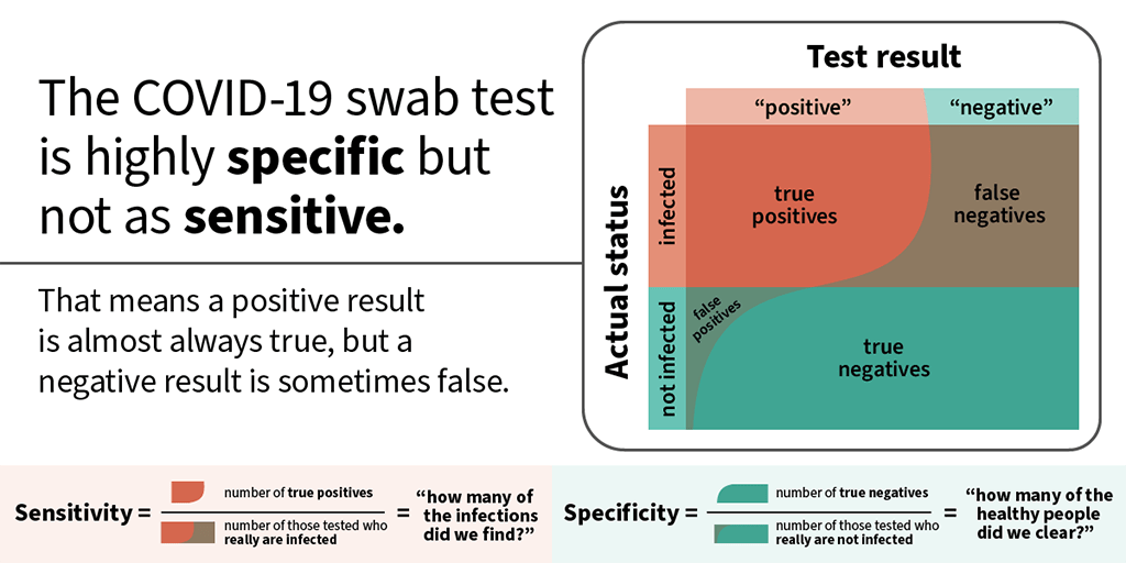
13) False positive and false negative test result rates: A specific case of independent conditional probabilities worth calling out separately, because they are frequently misunderstood, concerns false positive and false negative rates for tests for medical conditions or DNA analysis indications for physical characteristics such as eye color. As indicated in Fig. 4.4 for COVID-19 nasal swab tests, the condition applied to the sample used to determine false negatives is that subjects are actually infected with the virus, while false positives apply to the separate class of subjects not infected with the virus. Two different conditions, two often quite different probabilities. For the nasal swab test in particular, especially during the first few days of infection when the viral load is low, the false negative testing rate is much higher than the false positive rate.
Understanding false positive and false negative rates is critical in designing procedures to mitigate the spread of the disease. For example, the White House has tried to protect itself against COVID-19 spread by carrying out daily rapid-result tests for the virus on all members of its staff. But studies indicate that the particular (Abbott Labs) test used has a false negative rate anywhere from 30-50% during the early days of infection. There is thus a sizable probability that a potential spreader of the disease will test negative and still infect many others on the staff. That information should tell you that testing alone does not provide sufficient protection, and that additional mitigations, such as mask-wearing, should have been imposed. Without them, the White House turned into a super-spreader site.
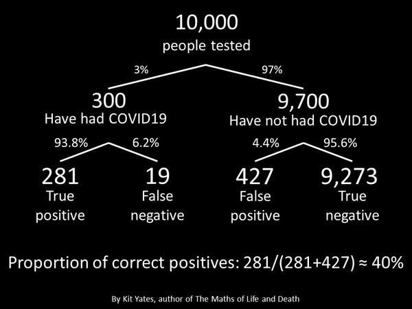
Various other probabilities are sometimes used to characterize a testing matrix such as that in Fig. 4.4. As specified in the figure, the sensitivity of a test is defined as the fraction of truly infected individuals who test positive, equivalent to one minus the false negative rate. The specificity of the test is the fraction of uninfected individuals who test negative, or one minus the false positive rate. And as indicated in Fig. 4.5, one can also inquire about a distinct conditional probability, namely, the “correct positive” probability that, among the sample who test positive, individuals actually have the disease. Figure 4.5 illustrates that if the infection rate is relatively small, even a small false positive rate can lead to a low overall “correct positive” rate.
14) Judge bin sizes in reported data: Be aware of bin size. For example, a comparison of COVID-19 case mortality rates for 0-40 year olds vs. 40-80 year olds is not particularly useful because the mortality rate varies sharply with age among the older cohort. So narrower age bins are called for in order to get a useful feeling for the variation. On the other hand, the narrower one makes bins, the smaller the sample within each bin and the larger the uncertainties in measurements. If the uncertainties become too large, the noise overwhelms any trend you might seek. Be sensitive especially to sample size in cases of multi-dimensional binning. For example, few election surveys will break down respondents into subgroups according to age, party registration and ethnicity simultaneously, because in order to get meaningful statistics within each such three-dimensional bin, one would have to poll an extremely large sample of respondents overall. That can be done in election exit polling, but is seldom done in pre-election polls.
15) Are Results Replicated?: Data can be skewed by unrecognized systematic errors or unanticipated dependences on the conditions under which measurements were made. So, it’s important to check if the results of a study have been replicated independently by independent groups of researchers. If results from different independent studies deviate significantly (well outside quoted uncertainties), does one study do a more thorough and lucid job of explaining possible systematic uncertainties in the approach? Can recognized systematic uncertainties explain the differences? If one study stands out as an outlier from others that mutually agree, is there any reason (e.g., reputation of researchers, clearly improved techniques, much larger sample size) to take the outlier result seriously? Are results reported by different teams related to the same, standardized quantitative definitions of metrics used? Be sensitive to possible quantitative distinctions between metrics whose names sound qualitatively similar, e.g., disease incidence (number of new cases reported per specified time period) vs. prevalence (number of existing cases). If measurements were made by different teams at different times, might some definitions have changed during the time interval (e.g., in the items included or excluded from the Consumer Price Index in the U.S.)?
16) Are Results Internally Consistent?: Have all the data reported been measured with consistent techniques? If data obtained in substantially different ways – e.g., temperature proxy data and worldwide meteorological records in the famous “hockey stick” plot of Mann, Bradley and Hughes – are included in the same graph, are the different methods compatible, and how have they been cross-calibrated? Have corrections been applied to the raw measurements and, if so, have all the measurements been corrected in the same manner? Have some measurements been ignored without adequate explanation? Are different results from the same study mutually compatible? For example, if ratios of two different quantities q1 and q2 are quoted with respect to the same denominator q3, does the inferred (but unspecified) third ratio q1/q2=[q1/q3]/[q2/q3] make sense – is it consistent with information you may have from independent studies, or with common sense, or with limits on its possible range of values? If percentages are quoted for different contributions to a sum, do the percentages sum to 100%, or to less if some contributions are clearly missing?
A classic example of shoddy and inconsistent treatment of data was included in our post on attempts by Young Earth Creationists to provide “theories” explaining how observations of light from distant stars could be reconciled with a 6000 year age of the universe. One of those attempts, claiming that the speed of light had decreased dramatically during the past thousands of years, was launched with a deeply flawed analysis by Norman and Setterfield of historical measurements of light speed. Those authors chose to omit some measurements and to apply large corrections to selected others, while leaving yet other measurements made using the same techniques uncorrected, all to manipulate the data to support their unsubstantiated conclusion.
17) Judging Output from Computer Calculations: Try to understand the assumptions underlying the calculation and the sources of data used as input to the calculation. Are they reasonable and well justified? Are they the same as used in independent calculations? How might the choices of assumptions and input data affect the output results? For example, are forensic DNA phenotyping computer outputs reliable, just because they emerge from computer algorithms? Are the sensitivities of output to input data and assumptions probed and reported, along with the results?
18) Model comparisons: Beware of apples-to-oranges comparisons. When comparing a model to measurements, make sure that they are based on the same phenomenon and consistent assumptions. For example, the John Christy plot often used to claim that global climate models cannot explain atmospheric temperature data uses different assumptions in analyzing satellite data than are used in the models to which the data are then compared. Such differences in treatments of data and calculations often hide an agenda.
When extrapolating to project future occurrences, like global mean temperature rise, you need models that are consistent with known science and with past historical measurements. Learn to ask good questions about the nature of the models and their assumptions. You then have to judge whether very important factors may have been omitted, or treated poorly, or whether possible omissions are likely to be of minor consequence. This is often difficult without serious research and expert opinions. But ask the questions!
19) Questioning the interpretation of quantitative results: Do authors ask well-posed questions which are rigorously addressed by the measurements they report? Is the interpretation supported by sufficient quantitative data, or is it rather based on anecdotal examples? Be alert to cherry-picking: has some of the data been discarded or ignored to come to the reported interpretation? Is the interpretation authors offer clearly justified by the measurement results and their uncertainties, or does it seem too optimistic or pessimistic, or possibly affected by the researchers’ biases?An example of a shoddy, biased interpretation of data is Donald Trump’s frequent claim that the U.S. sees surges in COVID-19 cases only because there are surges in testing. He justifies his claim by saying “If we performed half as many tests, we’d have half as many cases.” That statement is true if taken at face value and considered at a given moment in time. But it completely ignores the time-dependence. The U.S. may perform twice as many COVID tests as it did months ago, but that does not imply that positive test results have only doubled since that earlier time. In fact, the U.S. is now going through its third surge in positivity rate – the fraction of tests that yield a positive result is rising rapidly. So, it is viral spread, not increased testing, that is causing the rising case load.
Can you imagine viable alternative interpretations to that offered, which are also consistent with the measurement results? Does the researchers’ interpretation differ from those of other researchers, even though the data themselves are consistent within uncertainties with other studies? Does their interpretation require overthrowing other well-established scientific results or theories? If so, does the new interpretation present evidence of a fundamental failure of the previous understanding – one that appears to contradict one or more basic principles of a theory – or just of a minor, incidental anomaly that might, for example, be ameliorated by tweaking parameters of an underlying theory or model, or adding minor modifications to it?
20) Give randomness a chance: If an argument claims to reveal a pattern in observations, learn to evaluate the probability that random coincidences may have led to an apparent pattern. For example, it might appear meaningful if a coin-flipper manages to score five heads in a row. But the probability of flipping heads on any try is ½. If the successive flips are independent events, then (as we already pointed out under item (11) above) the probability of flipping five consecutive heads is (½ ´ ½ ´ ½ ´ ½ ´ ½) = 1/32 or about 3%. That makes this result appear not so unlikely to occur by pure chance. Flipping 20 heads in a row, however, has a probability of only 0.0001%, so if the flipper achieves this, it is reasonable to ask if the coin is doctored. Learning to evaluate random probabilities is an essential aid in debunking many conspiracy theories.
It is not always easy to distinguish random patterns from ones that follow some distinctly non-random algorithm. Figure 4.6 shows a good example of the challenge, taken from a blog post by David Spiegelhalter. Inspired by the art of Gerhard Richter, Spiegelhalter arranged 9 x 9 grids of colored squares, in which one of nine colors was selected at random to fill each of the 81 squares. Of the four grids shown in Fig. 4.6, three were created with this random choice, while the fourth deviates strongly from randomness. See if you can distinguish which grid is filled by a non-random algorithm, before you go on and read the text following the figure.
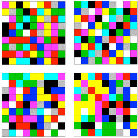
The answer to the puzzle of Fig. 4.6 is that the upper right grid is non-random. In fact, it is basically a sudoku puzzle with colors: no color is repeated in any row or any column, or within any of the nine 3 x 3 sub-grids into which the overall grid can be subdivided. The probability of arriving at such a non-repetitive layout – with no like-color clusters and no color repeats within rows, columns or sub-grids – from random choices is minuscule. You could say the same about a sequence of 80 coin flips in which you never observed two or more heads, or two or more tails, in a row. Some clustering is a natural characteristic of randomness.
21) Are Timelines Consistent with Causality?: Do arguments violate causality, in appearing to claim that something occurred before it was possible? For example, Trump has complained that Barack Obama and Joe Biden did not produce a vaccine for COVID-19 during their administration, but the virus was not discovered until 2019, so it would have been impossible for them to have driven research on such a vaccine. Stella Immanuel has claimed that hydroxychloroquine was proven to be a cure for COVID-19 from laboratory tests in 2005, 14 years before the virus was discovered. Causality is often the enemy of revisionist history.
5. Judging the Sources of Information
While the preceding sections provide guidance in recognizing logical fallacies and quantitative shenanigans, distinguishing science from pseudoscience, or fact from bullshit, often requires background knowledge beyond what you are willing to invest the time to develop. If in such cases you tend to rely on the arguments of others, it is important that you judge the reliability of your sources. In this section, I offer some types of questions you should ask yourself and/or your sources.
- Judge the source and the nature of a claim by an “expert”: Is the claim based on evidence revealed or referenced, or merely on the expert’s opinion? Is the expert actually experienced in the discipline about which the claim is made, or is that discipline outside the expert’s area of expertise? Scott Atlas, the Stanford radiologist who has gotten Donald Trump’s ear, and encouraged his neglect of the COVID-19 pandemic in the deadly pursuit of illusory herd immunity, has no expertise in infectious diseases like COVID-19. Even Nobel Prize winners are not immune from opining, often incorrectly, about issues beyond their expertise. For example, William Shockley, who shared the 1956 Nobel Prize in Physics for the development of the transistor, later embraced long-since debunked ideas about race and eugenics, arguing that black people were genetically inferior intellectually to whites. Linus Pauling, who won the 1954 Nobel Prize in Chemistry for his research on the nature of chemical bonds and the 1962 Nobel Peace Prize, became in his later life a passionate advocate for the use of high doses of vitamin C to prevent the common cold and combat cancer and heart disease, with no serious backing for any of these claims from clinical trials.
Is the “expert’s” claim backed up by included references to original scientific literature or to first-hand observation, or is it just of Donald Trump’s preferred form “many people say that…,” without attribution? Is the claim based on a plausible scientific mechanism? Is it consistent with claims made by a consensus of other experts, or does it contradict consensus claims? If the latter, what is the claimer’s track record? Is he/she an iconoclast who has come up with original ideas in the past that have proven correct? Or has he/she made many contrarian claims, the vast majority of which have been proven incorrect? The latter is the case, for example, for the late S. Fred Singer, whose many bogus takes on issues of science-based regulatory policy we have reviewed here. If the claim contradicts conventional “wisdom,” does the claimer explain in some detail why it should nevertheless be taken seriously?
2) Judge the reputation and credibility of journals and reporters presenting evidence: What is the journal’s track record and sources of funding? Among scientific journals and publishers, are they ones with rigorous peer review policies that have traditionally reported major discoveries proven by experiment and observation? Do the most trustworthy scientists publish in them? Alternatively, does the journal or publisher appear on Beall’s List of potential predatory pay-to-publish journals and publishers?
Among newspapers and other media, have their reports often attracted major awards for impact and accuracy? Do they have a track record of sensationalism or of significant political leaning that may influence reported claims? Are claims sourced to their originators? If sources are anonymous, are the claims corroborated by multiple sources? Have previous reports from the same journals and reporters, using anonymous sources, been proven correct by subsequent events? Are events described by multiple eyewitnesses? Have the reporters asked appropriate questions of eyewitnesses to probe the robustness of their descriptions? Have alternative views been sought and reported?
3) Be wary of claims spread on social media: Social media platforms based on business models that rely on funding from advertisers can enhance clicks for those advertisers by feeding you stories that are primarily consistent with your own established reading record, interests. likes and biases (see the recent documentary The Social Dilemma). Seek out the funding sources and track record for web and social media sites. Maintain skepticism regarding claims made on those sites if those claims are clearly in the financial or political interest of the funders.
Don’t be fooled by site names that give the impression of being independent, neutral and evidence-based – do some research to find out the actual funders and managers of the site, in order to judge whether they have a conflict of interest in the claims they present. If a set of claims on social media contains references and links to sources, check out a few of the references to make sure they actually say what the referring site claims they do.
4) Question your own confirmation bias: Fight against confirmation bias – judge critically whether your own willingness to accept a new claim is based more on the evidence presented or more on your political affiliation or your resistance to alter your pre-existing views. Ask whether the information you would like to believe is being promulgated only by people in the same group or political tribe as you, and whether that might be an indication of either bias or disinformation. Seek and evaluate evidence that may contradict your pre-existing view, as well as evidence that supports it (see Fig. 5.1). Then try to weigh both types of evidence by applying definable criteria of evidentiary reliability – criteria such as those recommended throughout this post – rather than by using your individual world view as a filter on the evidence.
5) Be sensitive to “tells” from unreliable sources: A source or site that begins a claim by saying something to the effect of “what I’m about to tell you is true” or “to be perfectly honest” or “trust me” often is intending to hide the truth. They should have to earn your trust by strong argument and well-sourced evidence, not by simply claiming they know the truth. Similarly, claims that begin with exaggerated touts of the proposer’s own intelligence, knowledge, reputation and background are often masking the claimer’s attempt to “pull a fast one” on readers. Claims that feature gratuitous discrediting of the knowledge or honesty of opposing sources (not to be confused with relevant unveiling of clear conflicts of interest among those sources) should be treated skeptically.
6) Check the date on reports in media: Sometimes, new research or events cast doubt on earlier evidence or claims. Make sure you are basing your judgment on up-to-date information. See if a journal article has been retracted subsequent to its original publication, by checking RetractionWatch.com, or if a false claim has been fact-checked at Snopes.com or factcheck.org or politifact.com.
7) Question the assumptions and premises underlying controversial claims: A popular conspiracy theory about the 9/11 attacks on the twin World Trade Center towers in New York City asserts that the vertical collapse of the towers could only have been caused by a controlled explosion, presumably planted by nefarious U.S. government actors. That plausible-sounding claim about vertical collapse is an assumption, and one not supported by actual structural engineers who know something about building collapse. Seek out opinions of professional experts in evaluating such unprovable assumptions. Also note that unanswered questions or minor anomalies about an event seldom indicate that a conspiratorial explanation is required.
8) Be skeptical of claims of vast, long-lasting conspiracies: Many conspiracy theories require the believer to accept that many thousands of co-conspirators have maintained secrecy for many years. As we have explained in our post on science denial conspiracy theories, this is highly unlikely, because leaks happen, whether intentional or inadvertent, and investigative journalism tends to uncover hidden events eventually, if they are sufficiently important. Thus, the probability of maintaining a conspiracy falls rapidly with the number of people “in the know” and the length of time during which the secret has allegedly been kept.
Another type of prevalent conspiracy theory that has persisted, in one form or another, over centuries posits that world events are secretly controlled by a small cabal of malevolent actors, whether they be lizard people, a few rich individuals led by George Soros or Bill Gates, Freemasons, or Satanists. A recent survey of 26,000 people in 25 countries found that 37% of Americans, 45% of Italians, 55% of Spaniards, and 78% of Nigerians place credence in such conspiracies. As recently explained by Yuval Noah Harari, this “theory” may be comforting to people who feel powerless themselves, but it completely ignores the enormous challenges faced in efforts to control the circumstances of even a single life, let alone eight billion lives and diverse political systems across the globe. Like many conspiracy theories, this one defies common sense.
6. Summary
In this post, I have offered a large number of guidelines, with examples, for the type of questions one should ask in evaluating the likelihood that new information is trustworthy and the arguments supporting it are sound. However, the best advice for tuning your bullshit detector is embodied in the answer given by a native New Yorker to the tourist who asks “How do I get to Carnegie Hall?” – namely, “practice!”. Exercise a skeptical attitude toward what you read and hear, but an attitude capable of being convinced. Apply sound logic, common sense, quantitative evaluation, and even a little research in judging what should be believed. Decide which sources are most credible based on their track record and the soundness of their arguments and reporting. Steer clear of tribalism in deciding what’s factual and what’s not.
And understand that even the most reliable experts sometimes get things wrong. The point of a functioning bullshit detector is not to lead you unfailingly to the truth – that’s often a hard road to find. But rather, it’s to raise mental alarms when something doesn’t look or sound or “smell” right, so that you don’t accept it without thinking more deeply and researching alternative accounts. With sufficient practice, your bullshit detector becomes second nature and kicks in automatically when confronted with new misinformation. Without practice, it gets detuned like an unused piano. For our own long-term survival, we really must, as a society, do a better job training our young in the techniques of critical thinking.
References:
C. Sagan, The Demon-Haunted World: Science as a Candle in the Dark (Ballantine Books, 1996)
M. Popova, The Baloney-Detection Kit: Carl Sagan’s Rules for Bullshit-Busting and Critical Thinking, https://www.brainpickings.org/2014/01/03/baloney-detection-kit-carl-sagan/
D.J. Levitin, Weaponized Lies: How to Think Critically in the Post-Truth Era (Dutton, 2017)
C.T. Bergstrom and J.D. West, Calling Bullshit: The Art of Skepticism in a Data-Driven World(Random House, 2020)
https://www.callingbullshit.org/
B.D. Earp, The Unbearable Asymmetry of Bullshit, https://quillette.com/2016/02/15/the-unbearable-asymmetry-of-bullshit/
E. Scott, Debates and the Globetrotters, http://www.talkorigins.org/faqs/debating/globetrotters.html
https://en.wikipedia.org/wiki/Duane_Gish
J. Lemire, D. Superville, W. Weissert and M.L. Price, In Chaotic First Debate, Trump Repeatedly Interrupts Biden with Taunts and Refuses to Condemn White Supremacists, Associated Press, Sept. 30, 2020, https://www.chicagotribune.com/election-2020/ct-debate-donald-trump-joe-biden-20200929-i3327hsuj5d4rlbert5fevr7rq-story.html
The Social Dilemma, https://www.netflix.com/title/81254224 (see trailer at https://www.youtube.com/watch?v=uaaC57tcci0)
C. Stokel-Walker, Fake News Travels Six Times Faster than the Truth on Twitter, NewScientist, March 8, 2018, https://www.newscientist.com/article/2163226-fake-news-travels-six-times-faster-than-the-truth-on-twitter/
https://en.wikipedia.org/wiki/Richard_Feynman
https://www.azquotes.com/author/4774-Richard_P_Feynman/tag/science
J. Haber, It’s Time to Get Serious About Teaching Critical Thinking, Inside Higher Ed, March 2, 2020, https://www.insidehighered.com/views/2020/03/02/teaching-students-think-critically-opinion
https://jesserichardson.com.au/biography
https://en.wikipedia.org/wiki/Fred_Hoyle
https://en.wikipedia.org/wiki/Abiogenesis
Kellogg Birthday, Nature 294, 104 (1981), https://www.nature.com/articles/294104b0
S.E. Vigdor, Signatures of the Artist: The Vital Imperfections That Make Our Universe Habitable (Oxford University Press, 2018)
https://debunkingdenial.com/ten-false-narratives-about-the-coronavirus-part-i/
https://debunkingdenial.com/ten-false-narratives-about-the-coronavirus-part-ii/
https://debunkingdenial.com/ten-false-narratives-about-the-coronavirus-part-iii/
https://debunkingdenial.com/s-fred-singer-all-purpose-science-denier/
https://debunkingdenial.com/scientific-tipping-points-the-ozone-layer-part-ii/
https://debunkingdenial.com/ten-false-narratives-of-climate-change-deniers-part-i/
https://debunkingdenial.com/ten-false-narratives-of-climate-change-deniers-part-ii/
https://debunkingdenial.com/will-happer-climate-change-denier/
https://debunkingdenial.com/qanon-an-ominous-conspiracy-theory/
https://debunkingdenial.com/conservative-alternative-science-confronts-and-is-routed-by-reality/
https://debunkingdenial.com/conspiracy-theory-true-believers-part-ii-the-mindset-of-true-believers/
https://debunkingdenial.com/flat-earth-theory-part-i/
https://debunkingdenial.com/young-earth-creationism-part-i/
https://debunkingdenial.com/young-earth-creationism-part-iii/
https://debunkingdenial.com/evolution-part-i-concepts-and-controversy/
https://debunkingdenial.com/evolution-part-iv-irreducible-complexity-reduced/
https://debunkingdenial.com/phillip-e-johnson-evolution-denier/
https://debunkingdenial.com/michael-behe-evolution-denier/
https://debunkingdenial.com/homeopathy-part-i/
https://debunkingdenial.com/crystal-healing/
https://debunkingdenial.com/wellness-fads-an-introduction/
https://debunkingdenial.com/vaccinations-part-ii/
https://debunkingdenial.com/the-science-deniers-toolbox/
https://debunkingdenial.com/phillip-e-johnson-evolution-denier/
https://debunkingdenial.com/the-heartland-institute-strikes-again-part-iii/
https://debunkingdenial.com/john-christy-climate-change-denier-part-i/
https://debunkingdenial.com/envisaging-the-invisible-man-forensic-dna-phenotyping/
https://debunkingdenial.com/introduction-the-eugenics-movement-in-the-united-states/
A. Solender, Trump Said U.S. Was ‘Rounding The Final Turn’ On Aug. 31 – And On 39 Of The 57 Days Since, Forbes, Oct. 27, 2020, https://www.forbes.com/sites/andrewsolender/2020/10/27/trump-said-us-was-rounding-the-final-turn-on-aug-31-and-on-39-of-the-57-days-since/?sh=35b225e73729
R.A. Epstein, Coronavirus Perspective, https://www.hoover.org/research/coronavirus-pandemic
I. Chotiner, The Contrarian Coronavirus Theory That Informed the Trump Administration, The New Yorker, March 30, 2020, https://www.newyorker.com/news/q-and-a/the-contrarian-coronavirus-theory-that-informed-the-trump-administration
Funt: Trump’s 27 Loaded Questions, The Sentinel, July 19, 2018, https://cumberlink.com/opinion/columnists/funt-trumps-27-loaded-questions/article_0b6ddeba-0e30-52b3-b4ac-6ba7993f61c4.html
C. Friedersdorf, The DNC’s Questions for Registered Democrats, The Atlantic, Feb. 28, 2019, https://www.theatlantic.com/ideas/archive/2019/02/dnc-questionnaire/583384/
M.M. Kircher, Can You Believe YouTube Caused the Rise in Flat-Earthers?, New York Magazine, Feb. 19, 2019, https://nymag.com/intelligencer/2019/02/can-you-believe-youtube-caused-the-rise-in-flat-earthers.html
G, Krieg and J. Simon, Many People are Saying – That Trump Drives Conspiracies and Gossip, CNN, Aug. 9, 2016, https://www.cnn.com/2016/08/09/politics/donald-trump-conspiracy-many-people-are-saying/index.html
J. Johnson, “A Lot of People are Saying…”: How Trump Spreads Conspiracies and Innuendoes, Washington Post, June 13, 2016, https://www.washingtonpost.com/politics/a-lot-of-people-are-saying-how-trump-spreads-conspiracies-and-innuendo/2016/06/13/b21e59de-317e-11e6-8ff7-7b6c1998b7a0_story.html
N.L. Rosenblum and R. Muirhead, A Lot of People are Saying: The New Conspiracism and the Assault on Democracy (Princeton University Press, 2019)
White House Embraces COVID-19 ‘Herd Immunity’ Declaration, New York Times, Oct. 20, 2020, https://www.nytimes.com/live/2020/10/13/world/coronavirus-covid
UN Warns Against Pursuing Herd Immunity to Stop Coronavirus, https://medicalxpress.com/news/2020-10-pursuing-herd-immunity-coronavirus.html
J. Howard, COVID-19 Immunity from Antibodies May Last Only Months, UK Study Suggests, CNN, July 13, 2020, https://www.cnn.com/2020/07/13/health/covid-immunity-antibody-response-uk-study-wellness/index.html
W. Happer, The Truth About Greenhouse Gases, https://www.thegwpf.org/images/stories/gwpf-reports/happer-the_truth_about_greenhouse_gases.pdf
M.E. Mann, R.S. Bradley and M.K. Hughes, Northern Hemisphere Temperatures During the Past Millennium: Inferences, Uncertainties and Limitations, Geophysical Research Letters 26, 759 (1999), http://www.meteo.psu.edu/holocene/public_html/shared/research/ONLINE-PREPRINTS/Millennium/mbh99.pdf
R. Neukom, et al., No Evidence for Globally Coherent Warm and Cold Periods Over the Pre-Industrial Common Era, Nature 571, 550 (2019), https://www.nature.com/articles/s41586-019-1401-2
S. St. George, The Aberrant Global Synchrony of Present-Day Warming, Nature 571, 483 (2019), https://www.nature.com/articles/d41586-019-02179-2
C. Luskin, Evolution by Intelligent Design: A Response to Lenski, et al., http://www.ideacenter.org/contentmgr/showdetails.php/id/1319
B. Montague, When U.S. Senator Jim Inhofe Called Climate Change a Hoax, https://theecologist.org/2018/oct/19/when-us-senator-jim-inhofe-called-climate-change-hoax
https://en.wikipedia.org/wiki/George_C._Marshall_Institute
https://en.wikipedia.org/wiki/Heartland_Institute
https://en.wikipedia.org/wiki/Advancement_of_Sound_Science_Center
https://www.discovery.org/about/
M. Grossman and D. Hopkins, Asymmetric Politics (Oxford University Press, 2020)
D. Biello, From Jaw to Ear: Transitional Fossil Reveals Ear Evolution in Action, Scientific American, March 14, 2007, https://www.scientificamerican.com/article/fossil-reveals-ear-evolution-in-action/
C.A. Coulson, Science and Christian Belief (Fontana Press, 1960)
https://en.wikipedia.org/wiki/Henry_M._Morris
https://en.wikipedia.org/wiki/Young_Earth_creationism
https://www.christianministriesintl.org/
A. Withnall, Pope Francis Declares Evolution and Big Bang Theory are Real and God is Not ‘A Magician with a Magic Wand’, Independent, Oct. 28, 2014, https://www.independent.co.uk/news/world/europe/pope-francis-declares-evolution-and-big-bang-theory-are-right-and-god-isn-t-magician-magic-wand-9822514.html
C. Moss, Bible Loved by Christian Fundamentalists Written Using Method They Hate, Daily Beast, Apr. 29, 2018, https://www.thedailybeast.com/bible-loved-by-christian-fundamentalists-written-using-method-they-hate
D. Dale, Fact Check: Digging Into Trump’s False Claim That CDC Found That 85% of People Who Wear Masks Get the Coronavirus, CNN, Oct. 16, 2020, https://www.cnn.com/2020/10/16/politics/fact-check-trump-cdc-masks-85-percent/index.html
https://en.wikipedia.org/wiki/Fermi_problem
D. Yochim, What’s Your Net Worth, and How Do You Compare to Others?, MarketWatch, Jan. 23, 2020, https://www.marketwatch.com/story/whats-your-net-worth-and-how-do-you-compare-to-others-2018-09-24#:~:text=The%20median%20net%20worth%20of,more%20and%20half%20have%20less.&text=Under%2035%3A%20Median%20net%20worth,average%20net%20worth%3A%20%2476%2C200
Z. Roth, Congressman Uses Misleading Graph to Smear Planned Parenthood, Sept. 29, 2015, https://www.msnbc.com/msnbc/congressman-chaffetz-misleading-graph-smear-planned-parenthood-msna692596
https://www.health.harvard.edu/womens-health/what-do-the-new-mammography-guidelines-mean-for-you
D. Armstrong and M.F. Cortez, FDA Walks Back Claim of Big Benefit from COVID Therapy, Bloomberg News, Aug. 24, 2020, https://www.bloomberg.com/news/articles/2020-08-24/fda-trump-officials-misrepresent-key-statistic-on-covid-therapy
M.J. Joyner, et al., Effect of Convalescent Plasma on Mortality Among Hospitalized Patients with COVID-19: Initial Three-Month Experience, https://www.medrxiv.org/content/10.1101/2020.08.12.20169359v1
https://en.wikipedia.org/wiki/Sampling_bias
D. Ward, Sampling Bias: Explaining Variations in Age Distributions of COVID-19 Cases, https://www.researchgate.net/publication/341203587_Sampling_Bias_Explaining_Variations_in_Age_Distributions_of_COVID-19_Cases
M. Carlisle, Here’s What Trump Got Wrong About America’s COVID-19 Death Rate, Time Magazine, Aug. 4, 2020, https://time.com/5875411/trump-covid-19-death-rate-interview/
K. Schive, How Accurate are the Laboratory Tests Used to Diagnose COVID-19?, https://medical.mit.edu/covid-19-updates/2020/06/how-accurate-diagnostic-tests-covid-19
K. Doheny and C. Crist, Expert: White House a ‘Super Spreader’ Site, https://www.webmd.com/lung/news/20201006/white-house-is-now-a-super-spreader-site
C. Yates, Coronavirus: Surprisingly Big Problems Caused by Small Errors in Testing, https://theconversation.com/coronavirus-surprisingly-big-problems-caused-by-small-errors-in-testing-136700
http://www.setterfield.org/report/report.html
D. Spiegelhalter, Pure Randomness in Art, https://understandinguncertainty.org/node/1066
Trump COVID Advisor Scott Atlas Pushes Herd Immunity, Financial Times, https://www.ft.com/content/9c95268e-5a65-48c4-bbaa-a4d88c4b5c03
https://en.wikipedia.org/wiki/William_Shockley
https://www.youtube.com/watch?v=7JOIqkh2ms8&t=3116
https://en.wikipedia.org/wiki/Linus_Pauling
https://en.wikipedia.org/wiki/Vitamin_C_and_the_Common_Cold_(book)
Beall’s List of Potential Predatory Journals and Publishers
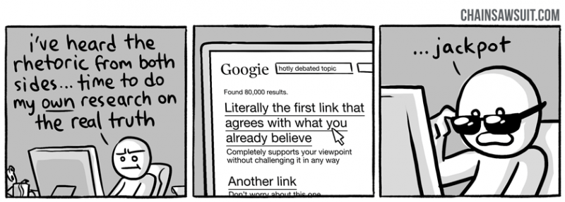
http://chainsawsuit.com/comic/2014/09/16/on-research/
https://en.wikipedia.org/wiki/World_Trade_Center_controlled_demolition_conspiracy_theories
https://en.wikipedia.org/wiki/Collapse_of_the_World_Trade_Center
J. Henley and N. McIntyre, Survey Uncovers Widespread Belief in ‘Dangerous’ COVID Conspiracy Theories, The Guardian, Oct. 26, 2020, https://www.theguardian.com/world/2020/oct/26/survey-uncovers-widespread-belief-dangerous-covid-conspiracy-theories
Y.N. Harari, When the World Seems Like One Big Conspiracy, New York Times, Nov. 22, 2020, https://www.nytimes.com/2020/11/20/opinion/sunday/global-cabal-conspiracy-theories.html?action=click&module=Opinion&pgtype=Homepage
