
Steve Vigdor
April 6, 2020
We have dealt with issues surrounding global warming and climate change, as well as individual deniers of the science and data behind these phenomena, in various blog posts on this site. However, we thought it useful to consolidate discussions of the basic underlying science, the relevant data, and the most prevalent themes of climate change denial, in a single blog series. This pair of posts is based on a physics department colloquium I delivered at Indiana University in March 2020. In Part I we will briefly summarize relevant aspects of the basic science behind global warming and the major trends in global temperature data. Then in Part II, we will go through the common themes and logical flaws in most attempts to deny the scientific reality. A number of the figures in these two posts have appeared in other blog posts on this site, but there are also a number of new figures included here to elucidate scientific issues further.
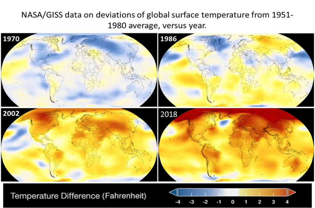
Figure I.1 below contains four snapshots from NASA’s annual global map of mean surface temperatures, available for every year from 1884 to the present. The four years chosen for inclusion in Fig. I.1 simply reflect the changes over 16-year intervals since 1970. The years are not cherry-picked. They illustrate the global trend toward the warming of the entire Earth over that period, with an average global mean temperature increase of 1.9F (1.1C) since 1880, but increases two to three times higher than that in many locations, especially at high northern latitudes. The entire globe is warming and scientists are working to understand the causes, whether the trend will continue, what the likely impacts will be, and what measures can mitigate those impacts.
A Brief Review of the Basic Science of Global Warming
The Earth comes to an equilibrium temperature when the power it radiates outward, as a heated body, is equal to the power input it receives from the Sun. Figure I.2 shows the spectrum of solar radiation that reaches Earth, spanning ultraviolet, visible and near-infrared light. The band colored yellow in the figure shows the radiation reaching the top of Earth’s atmosphere, while the red band shows the spectrum of sunlight reaching Earth’s surface. The missing wavelength regions in the red band reflect absorption of sunlight in the atmosphere, primarily by water molecules, but also, and quite importantly, by stratospheric ozone in the deep ultraviolet region. The solid black curve in Fig. I.2 represents the spectrum we would expect for emission by a blackbody at the Sun’s very high temperature.

The total solar irradiance (power per unit area) at the top of Earth’s atmosphere is approximately 1360 watts per square meter (W/m2). But about 25% of this incident power is absorbed in the atmosphere. Thus, if you stand at Earth’s equator at noon on a clear day, you would be exposed to an irradiance of 1000 W/m2. However, if you average that incident power over a year, and over the more glancing incidence angles of sunlight over much of the globe, the global mean insolation at Earth’s surface corresponds to about 230 W/m2. That is a number worth keeping in mind for what follows.
There is also power generated within the Earth itself, for example, by the decay of radioactive nuclei in Earth’s interior. But that internal power accounts for only 0.03% as much as solar irradiance at Earth’s surface, so it is negligible for our considerations here.
The Earth then emits its own thermal radiation, corresponding again to a roughly blackbody spectrum, but for a blackbody at far lower temperature than the Sun. Hence, the Earth’s outgoing radiation is in the infrared region of the electromagnetic wave spectrum, with essentially no overlap with the incoming power spectrum from the Sun. A considerable fraction of the Earth’s outgoing radiation is absorbed, and then re-radiated, by greenhouse gas molecules in the atmosphere, as sketched schematically in Fig. I.3. Some of that re-radiated infrared energy is retained in the atmosphere and some of it is returned to increase the warming of Earth’s surface.

The spectrum of infrared radiation emitted by Earth and reaching satellites beyond Earth’s atmosphere is shown by the blue band in Fig. I.4. The horizontal axis in Fig. I.4 is wave number, which is the inverse of wavelength, so that wavelength increases toward the left in this figure. The longest wavelength included in the solar irradiation spectrum in Fig. I.2 is far off to the right of the scale in Fig. I.4, so there is essentially no overlap between the incoming and outgoing radiation spectra.

The blue band in Fig. I.4 again shows prominent missing regions in comparison with the expected blackbody spectrum represented by the red curve. Those missing regions correspond to the absorption of infrared radiation by greenhouse gases, primarily by carbon dioxide (CO2), methane (CH4), nitrous oxide (N2O) and water vapor (H2O). Those absorption bands contribute to the power retained by Earth. Hence, as greenhouse gas concentrations in the atmosphere increase, they are bound to contribute to an increased warming of the Earth. This basic atmospheric science has been understood for well over a century. The basic question to be dealt with below is a quantitative one: how much extra warming is introduced for a given increase in greenhouse gas concentrations? In the discussions that follow, the impact of all greenhouse gases is included as CO2-equivalents, based on the known strengths of the various absorption bands and staying power in the atmosphere of the various relevant gases.
Overall, about 30% of incoming solar power is reflected back out to space from Earth’s surface, especially by the polar ice caps. But a comparable percentage of Earth’s radiated power is retained via greenhouse gas absorption in the atmosphere. The total radiated power from Earth is proportional to the fourth power of Earth’s absolute temperature, as dictated by the well-established (Stefan-Boltzmann) theory of blackbody radiation. The absolute temperature, measured in Kelvin units, refers to a scale at which the lowest possible temperature corresponds to T = 0. The Celsius or centigrade temperature scale is related to the Kelvin scale by T(ºC) = T(Kelvin) – 273.15. Currently, the global mean temperature of the Earth is about 285 Kelvin, again a number worth keeping in mind.
There are a number of drivers of Earth climate which alter the basic balance between input and output radiation power, but they do so over an extremely wide range of characteristic time scales. One set of climate drivers is associated with periodic changes in Earth’s orbit around the Sun and in the orientation of Earth’s rotation axis with respect to the plane of that orbit. These so-called Milankovitch cycles are indicated in Fig. I.5. They represent variations in the eccentricity of Earth’s orbit (i.e., in the extent to which the orbit deviates from a circle, blue curve in Fig. I.5), in the average tilt of its axis (or obliquity, green curve in Fig. I.5), and in the wobble or precession (red curve) of the axis about that average tilt orientation. These variations, arising primarily from the gravitational attraction of Earth by other planets and by the moon, in addition to the Sun, have characteristic periods from tens to hundreds of thousands of years.

By affecting the range of distances of Earth from the Sun during its orbit, and the relative exposure of northern and southern hemispheres to solar irradiation, the Milankovitch cycles affect seasonal and geographical variations in solar input power, and hence, they affect the corresponding variations in climate. As shown in Fig. I.5, the eccentricity variations in particular are correlated with the periodic occurrence of ice ages and deglaciation eras in Earth’s geologic history, with a typical period of 100,000 years. In part II of this post we will deal with the detailed variations seen during the emergence from Earth’s most recent ice age about 20,000 years ago.
While the Milankovitch cycles affect Earth’s exposure to sunlight, it is also true that the output power from the Sun itself varies over time, but with a much longer characteristic time scale. That variation is shown in Fig. I.6. The Sun generates its energy by burning hydrogen in nuclear fusion reactions. As it uses up some of its hydrogen fuel, its interior temperatures increase and the region where the temperatures are high enough for nuclear fusion to proceed expands outward. The luminosity of the Sun thus increases gradually as it, in common with all so-called ‘main sequence’ stars, moves along an evolutionary path toward eventual red gianthood. As indicated by the red curve in Fig. I.6, the Sun currently outputs about 4% more power than it did 500 million years ago. It might seem that such a long characteristic time should be irrelevant to concerns about ongoing global warming on Earth, but some claims by climate change deniers make even this time scale relevant to the discussion.

The time scale of human impacts on climate is much different. As shown in Fig. I.7, human activities are significantly increasing greenhouse gas concentrations in the atmosphere on a 50-year time scale. The figure shows in blue the dramatic increase in worldwide carbon dioxide emissions from fossil fuel burning, growing from zero in the pre-industrial era to nearly 40 billion metric tons per year currently. Especially during the last century, those emissions are too strong to be completely absorbed by all the Earth’s vegetation, and have led to a substantial increase in atmospheric concentrations from the pre-industrial level of 280 parts per million (ppm) to the current value of about 413 ppm. Once in the atmosphere, CO2 remains there for many decades. There is no indication from ongoing trends or adopted governmental policies that this increase will flatten out any time soon. And as greenhouse gas concentrations in the atmosphere grow, the infrared absorption blanket surrounding the Earth contributes additional warming.

There are also climate drivers that operate on much shorter time scales, and we’ll get to some of those shortly. But we need to begin confronting the question of just how much warming we might expect from the buildup of greenhouse gases. The alterations caused by climate drivers in Earth’s power input minus output balance are characterized by radiative forcing changes. There is widespread agreement, even among skeptics, that if atmospheric CO2 levels were to double from the pre-industrial 280 ppm to 560 ppm, the primary effect would be a radiative forcing change of 3.7 W/m2. That estimate comes simply from the known absorption characteristics of the various greenhouse gases and understanding how many additional molecules would be present in the atmosphere to contribute to the infrared absorption.
Since the mean global insolation of Earth is 230 W/m2, that CO2 doubling would represent the equivalent of a 1.6% increase in solar irradiance at Earth’s surface – an increase that would affect all parts of the globe and all seasons. It is useful to compare that effect with other known changes in insolation. There is a well-established 11-year cycle in solar irradiance, but the peak-to-valley change in irradiance during those cycles is no more than about 0.1%. There is currently about a 6.8% seasonal variation in insolation from the Earth’s closest approach to the Sun (perihelion) to its furthest orbit point (aphelion). Our present location within the Milankovitch axis precession cycle places the perihelion at the height of southern hemisphere summer. This effect only magnifies the extreme summer temperatures experienced recently in Australia and even Antarctica. But the other edge of that sword is that southern hemisphere winter occurs near the aphelion of Earth’s orbit. In general, the peak-to-valley radiative forcing changes associated with the Milankovitch cycles, when averaged over the globe and over a year, is less than 1%. But their effect can be of order 10% seasonally at high latitudes.
Global warming analyses define the climate sensitivity as the mean global temperature change that would accompany a primary radiative forcing change of 3.7 W/m2, regardless of whether that forcing arises from doubling greenhouse gas concentrations or from a different driving mechanism. The primary effect is clear and indisputable. Since Earth’s output power varies as the fourth power of its absolute temperature, it would require a 0.4% increase in temperature to compensate for a 1.6% effective increase in incoming power. For the current global mean temperature of 285K, that corresponds to an increase in global mean temperatures by 1.1—1.2K, or equivalently, 1.1—1.2ºC. But this primary effect is only a small part of the story, and this is where most of the controversy arises.
The devil resides in the details of understanding a wide variety of secondary climate feedback mechanisms. Among the examples of positive feedback, which increases the overall warming, are the following phenomena:
- As the atmosphere warms, it holds more water vapor, and this increases infrared absorption and re-radiation.
- As the oceans warm, polar ice melts, reducing the reflection of incident sunlight and thereby adding to warming of the surface.
- CO2 is less soluble in warmer oceans, so they release yet more greenhouse gases to the atmosphere.
- As the Arctic permafrost thaws on a warming surface, it releases more CH4 to the atmosphere, again increasing greenhouse gas concentrations further.
- Increased water vapor in the atmosphere leads to more cloud formation, increasing the reflection of infrared radiation back toward Earth’s surface.
But there are also some negative feedback mechanisms:
- Increased cloud cover also leads to more reflection of incident sunlight above the clouds, producing a cooling effect at the surface.
- Cloud formation is furthermore affected by aerosols emitted from Earth by either natural or human-caused sources.
The bottom line is that in order to increase our quantitative understanding of climate sensitivity, one must rely on climate models that incorporate these various feedback effects, as well as such short-term climate drivers as volcanic eruptions and shifts (e.g., el niño) in Earth ocean currents. For example, volcanic eruptions emit sulfuric compounds, and these lead to sulfate aerosols that may lodge within the stratosphere for typically a couple of years, leading to short-term cooling spikes that result from such aerosol absorption of some incident sunlight.
The consensus among climate models is that the climate sensitivity is (3.0 ±1.5)ºC per 3.7 W/m2 change in primary radiative forcing. This modeling is not precision science, because the climate is a highly complex system of intricately coupled fluids (the atmosphere, the oceans). But the models are constrained by trying to account for historic trends in global Earth temperatures. So we next consider what the database of such historic trends shows.
Global Climate Data
The most reliable data on historic global temperature trends comes from averaging measurements made by a large number of meteorological stations around Earth’s surface. Though such analyses have gone on over decades, the database has been recently improved and extended by Richard Muller and his daughter Elizabeth Muller, via the Berkeley Earth Project. The Mullers launched this project in 2010 to correct what they perceived to be likely systematic errors, selection and correction biases in earlier analyses. They were particularly concerned that too many stations around the globe were omitted from those analyses, and that the chosen stations were too often located in so-called “urban heat islands,” which might bias the extent of warming inferred from the data. In the wake of the so-called “Climategate” e-mail controversy that emerged in the first decade of the current century, they were even concerned about possible fraud in “hiding” some data from earlier analyses. (The Climategate e-mails hacked in 2009 from a server at the Climatic Research Unit of the University of East Anglia were used by deniers to charge that climate scientists were manipulating data and suppressing alternative views to promulgate a global warming conspiracy. Investigations of the allegations by eight different committees found no evidence of fraud or scientific misconduct, but only the occasional use of sloppy non-technical language in e-mails describing research techniques.)

The Berkeley Earth team has expanded the number of stations included in the analysis from a previous high of about 7,000 to 39,000, producing the results shown in Fig. I.8. If one looks very closely, especially during the late 19th century, one can detect differences from the results of earlier analyses by up to 0.1C, although the earlier results all seem to fall within the uncertainty band the Berkeley Earth team assigns to their extractions. They have thus basically reproduced the earlier results, while also creating a highly detailed, and highly useful, publicly accessible record of temperatures by region. There can be little doubt at this point that the post-industrial record is marked by a significant rise in global mean temperature, particularly over the past half-century.
Furthermore, that rise follows the independently measured rise in global atmospheric greenhouse gas concentrations quite closely. This is illustrated in Fig. I.9, also taken from the Berkeley Earth site. Richard Muller has been highly skeptical of complex global climate models, so he decided to simply compare the surface temperature measurements directly to other data. The temperature data in Fig. I.9 have been extended even further back to 1750, although the number of available stations and the quality of the data grows substantially worse prior to about 1850. The solid curve in Fig. I.9 represents a simple scaled version of the atmospheric CO2 concentration record seen in Fig. I.7, with a set of added few-year negative spikes corresponding to known (and labeled) major volcanic eruptions. That curve, which involves no modeling, provides a quite good account of the surface temperature trend over a couple of centuries.

It is clear from Fig. I.9 that we have already seen about a 1.5ºC global mean temperature increase while atmospheric CO2 concentrations have increased by only 50% from the pre-industrial level. In comparison with the expected primary effect of a 1.1—1.2ºC increase for a doubling of the CO2 concentration, this observation already suggests that positive climate feedback mechanisms may dominate and produce an increased climate sensitivity.
Other measurements, shown in Fig. I.10, tell us that more than 90% of the heat returned to Earth’s surface during this warming period is stored in Earth’s oceans. The majority of that heat is stored at depths from the surface to 700 meters. These data come in part from satellite measurements, but mostly from worldwide robotic temperature-sensing floats embedded in the oceans, which move over a wide range of depth and record their data in remote archives.

The heat stored in Earth’s oceans is a “gift” that will keep on giving. The high heat capacity of water leads to high heat retention. As the water warms, it expands thermally and leads to polar ice melt, and both of these effects contribute to global sea level rise. That sea level rise will continue even if greenhouse gas concentrations in the atmosphere stabilize, thanks to water’s heat retention. And warmer oceans bleach coral reefs, spawn stronger storms, release more carbon dioxide, are increasingly subject to ocean current shifts, and otherwise have strong and long-lasting impacts on worldwide climate.
As shown in Fig. I.11, worldwide sea levels have been rising throughout the industrial era, but the rate of rise is increasing. The global average data in Fig. I.11 are based on worldwide tide gauge measurements, supplemented for the past 25 years or so by satellite radar altimetry data. Since 1970 sea levels have risen by about 10 cm, but the recent measurements indicate that the current rate of rise is more than 3 mm per year, and perhaps even greater based on the past few years of data. That rate can get rapidly worse as the melting of polar ice caps accelerates.

In order to trace the global temperature record further back in time before 1800 or so, it is necessary to use temperature proxies. These rely on various natural phenomena known to be sensitive to temperature, including: the width and density of tree rings, features of corals, oxygen isotope ratios in ice cores, and the species of organisms found in ocean and lake sediments. Such proxy determinations contributed heavily to the famous, and much maligned, “hockey stick” graph of Mann, Bradley and Hughes, an updated version of which is shown in Fig. I.12. The red curve in Fig. I.12 represents the temperature record from worldwide temperature stations beyond 1850 or so. The blue curve represents an average of the trend Mann, Bradley and Hughes extracted from a variety of northern hemisphere proxies, while the light blue band represents their estimates of uncertainties from the proxy record. The green points are 30-year averages from a much more recent analysis of global proxies by the PAGES 2K consortium, about which I will discuss more below. Clearly the PAGES 2K results agree well within the uncertainty band with the Mann, Bradley and Hughes extractions, and the figure makes the point that the post-industrial rise is unprecedented over at least the past millennium.

Various objections have been raised over the years to the hockey stick graph, centering on the omission of more recent northern hemisphere tree ring proxy data, which deviate from the record clearly established by the more reliable global meteorological stations, and on the cutoff of the plot at year 1000. Critics have argued that this cutoff misleads a viewer by leaving out part of the so-called Medieval Warm Period (MWP), which some critics argue was just as warm as today’s global temperatures. That objection, at least, has been addressed by the more recent PAGES (Past Global Changes) 2K analysis, which includes an exhaustive reconsideration of the full global proxy database over the entire Common Era (2000 years), utilizing seven different statistical methods to support the extraction of global averages.
Quoting from the conclusion of the PAGES 2K 2019 published papers: “even when we push our perspective back to the earliest days of the Roman Empire, we cannot discern any event that is remotely equivalent — either in degree or extent — to the warming over the past few decades. Today’s climate stands apart in its torrid global synchrony… global warming today is unparalleled: for 98% of the planet’s surface, the warmest period of the Common Era occurred in the late twentieth century.” The authors’ analysis does not encompass the continued warming in the first decades of the 21st century, because many of their proxy records were collected more than two decades ago. In particular, their results demonstrate that the Medieval Warm Period was, in contrast to today’s experience, not a truly global phenomenon, with no more than about 40% of the globe reaching maximum temperatures in the same time frame.
To go back still further in time to a pre-history record of Earth temperatures, the best evidence comes from oxygen isotope ratio measurements within deep Antarctic ice cores. Results going back 800,000 years are shown in Fig. I.13. The black curve (right-hand scale) shows inferred Antarctic temperatures, while the blue and red curves (with left-hand scales) show, respectively, the CO2 and CH4 concentrations inferred from air bubbles in the ice cores. There is a remarkably strong correlation among all three curves, each revealing the periodic occurrence of ice ages and interglacial periods. We will come back in Part II of this post to discuss the extent of that correlation further. But it is also hard to miss the upward spikes in both greenhouse gas concentrations that occur at the right end of the plot and are of completely different character than any of the previous inferred records. It is perhaps worth noting that we had a recent talk by a climate change skeptic at Indiana University, who managed to analyze the temperature data from Fig. I.13 and convince himself that all the temperature changes were completely random. Milankovitch rolls over in his grave!

The conclusion from this brief survey of data relevant to global warming is that there is an ample supply of historical data – both modern and paleoclimate – to which global climate models can be tuned, and from which to extract climate sensitivity to a given level of radiative forcing. The models, once tuned, are then used to project the range of possible future development of Earth’s climate for various scenarios concerning the evolution of atmospheric greenhouse gas concentrations. But it is important to keep in mind the sizable model-dependent uncertainties that accompany attempts to treat the complexities of Earth climate, with its intricately coupled large-scale fluids.
Armed with these introductions to the science behind, and the data supporting, global warming, we can proceed in Part II of this post to consider the most common themes of climate change denial, and the fundamental flaws in each of them.
