
In Part I of this post, I introduced some of the basic science concepts and measurements that underpin our serious concern about ongoing anthropogenic global warming. In this part, we will review some of the basic themes used by deniers of human-induced climate change, along with the flaws and misleading aspects of those arguments. There are many individual denial arguments. In fact, the Skeptical Science cite addresses nearly 200 of them! But I will boil them down to ten basic (plus a couple of “bonus”) themes I see running throughout the oft-repeated and oft-debunked deniers’ claims. You will see that the denial narratives are not very sophisticated scientifically, and that they are often self-contradictory. But they have been widespread and politically effective. We will address briefly toward the end of this post the relative sophistication of the deniers’ public relations approaches, though such approaches are, in fact, one of the major themes of our entire site here.
Deniers’ Claim #1: “Climate Changes All the Time”
As we have seen in part I of this post, the simple declarative statement that climate changes all the time is correct. But the characteristic time scales of natural changes in climate are very different – either far longer or far shorter – than what we are seeing now. And the rate of change in global temperatures and in greenhouse gas concentrations is of fundamental importance. Furthermore, the properties characteristic of natural climate changes differ from the properties of the ongoing changes.

One characteristic natural time scale discussed in part I, and repeated in Fig. II.1, is the 100,000 years associated with Earth orbit and axis tilt changes, and the associated occurrence of periodic ice ages and deglaciation eras. The ice core data in Fig. II.1 establish the close correlation between greenhouse gas concentrations (blue and red curves) and Earth temperatures (black curve). But as seen from the spikes at the extreme right edge of the figure, the ongoing rapid rise in CO2 and CH4 concentrations is unprecedented.
Global temperatures also change, though in more subtle ways, over millennia. Figure II.2 is a deniers’ favorite taken from the Heartland Institute’s booklet “Why Scientists Disagree About Global Warming.” We have debunked nearly all claims in this booklet elsewhere on this site. But note that in their attempt in Fig. II.2 to emphasize the fact that climate changes all the time, they have artificially cut off the graph at the year 1900 to direct a reader’s attention away from what is presently going on. Furthermore they have chosen their preferred historic temperature proxy trends that tend to overemphasize the Medieval Warm Period (MWP) and Little Ice Age (LIA).

The peer-reviewed presentation of the proxy data from multiple analyses, but now including the trends since 1900 as well, is shown in Fig. II.3. This figure illustrates the considerable spread in different proxy analyses, a feature missing from Fig. II.2 and from most deniers’ accounts. Note that the MWP appears in Fig. II.3 as a relatively minor warming in the northern hemisphere, with a gentle maximum 1-2 centuries later than suggested in Fig. II.2. The LIA did encompass a widespread cooling by a few tenths of a degree Celsius. But these trends look nothing like the rapid global temperature changes over the past half-century at the right edge of Fig. II.3.

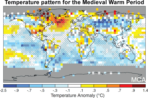
Deniers have often made the unfounded claim that the MWP was indeed warmer than the globe is presently. This claim is completely debunked by the extensive new analysis of the full global proxy database carried out by the PAGES 2K consortium, and described in part I of this post. The PAGES 2K analysis has pointed out that the MWP was not a global phenomenon at anywhere near the level of the ongoing global warming – no more than 40% of the globe attained peak temperatures during the same period within the MWP, as opposed to 98% presently. This is emphasized in Fig. II.4, which plots the reconstructed map of global mean temperatures for the years 950-1250 AD, relative to the average from 1961 to 1990. The map shows localized hot spots, rather than a global phenomenon. It should be compared, for example, to the truly global warming seen in the NASA global maps included in Fig. I.1 in part I of this post. And even during the Little Ice Age, the PAGES 2K analysis concludes that “two-fifths of the planet were subjected to the coldest weather during the mid-nineteenth century, but the deepest chill occurred several centuries earlier in other regions.”
We quote again from the conclusion of the PAGES 2K analysis: “even when we push our perspective back to the earliest days of the Roman Empire, we cannot discern any event that is remotely equivalent — either in degree or extent — to the warming over the past few decades. Today’s climate stands apart in its torrid global synchrony.”
The rate of current warming is especially concerning. Homo sapiens appears to be the first species on Earth capable of altering its own environment substantially over just a few generations. That time scale is too fast for the species to adapt to the change by evolutionary processes. There are other adaptation methods, such as mass migration. But the countries of the world have demonstrated rather convincingly over the most recent decade that they do not react well to human migration on even a much smaller scale than may be stimulated during this century by climate change.
Deniers’ Claim #2: “Global Warming Has Ceased”
This is a claim one heard from the deniers much more frequently several years ago than one does today. The reason for that is shown in Fig. II.5, showing the global mean temperature relative to the period from 1951 to 1980, recorded by averaging worldwide weather station data from 1880 to the present. Also shown in the figure is a 5-year running average of those annual measurements. It is clear from the data that since about 1970, global mean temperatures have risen almost linearly, on average, by 0.2ºC per decade.

However, it is also clear from Fig. II.5 that there are year-to-year fluctuations about the average warming trend by about 0.2ºC. These arise from short-term climate drivers such as volcanoes, el niño, polar vortex phenomena, solar cycles, etc. Because of these fluctuations, it is always possible to find a particular decade where short-term climate events conspire to give little net change. The red circle in Fig. II.5 surrounds the deniers’ favorite decade cherry-picked to make their point. It began in 1998, a year marked by an anomalously strong el niño warming that fluctuated well above the average trend. Unfortunately for the deniers, since their favorite decade ended, global temperatures have continued their steep, and mostly steady, rise.
Deniers’ Claim #3: “Blame the Sun, Not Humans”
Despite deniers’ attempts to absolve human burning of fossil fuels from responsibility, their shifting of blame to the Sun does not withstand any scrutiny. Solar activity does not track the trend nor the detailed characteristics of ongoing global warming. Figure II.6 compares measurements of global mean surface temperatures on Earth to solar irradiance arriving from the Sun, as measured by satellites at the top of Earth’s atmosphere. The annual solar irradiance data show very clearly the 0.1% level fluctuations associated with the well-known 11-year solar cycle. The darker curves in the figure represent running 11-year averages of both surface temperature and solar irradiance. As global surface temperatures have risen since 1970, solar irradiance has remained nearly constant or even slightly decreased during the present century.

Furthermore, the solar explanation is inconsistent with basic observed trends from the temperature records. If the Sun were responsible for the ongoing warming, we would expect days to warm more than nights and the upper atmosphere (stratosphere) to warm as well as the lower atmosphere (troposphere). As shown in Fig. II.7, the data contradict both those expectations. Since 1970, warm nights are occurring with greater frequency than warm days, and the stratosphere is cooling while the troposphere and the surface warm. The stratospheric cooling arises in part because most of the infrared absorption of Earth’s thermal radiation occurs in the lower atmosphere, and in part because of the still-depleted ozone layer, which reduces stratospheric absorption of deep ultraviolet radiation received from the Sun.

In contrast to the solar activity “explanation,” measurements are consistent with the greenhouse gas absorption account for ongoing warming. In particular, satellite measurements over the years of infrared radiation reaching the top of the atmosphere clearly show increasing atmospheric absorption within the wavelength bands characteristic of the CO2 and CH4 molecules.
Deniers’ Claim #4: “CO2 Doesn’t Cause Temperature Rise”
This claim, based on a flawed analysis of ice core data from Antarctica (to be discussed below), is in direct contradiction to the well understood science of greenhouse gas absorption of infrared radiation. The deniers’ claim is based on a report that reconstructed CO2 levels lagged behind temperature increases inferred from the Antarctic ice cores by several hundred years. Therefore, their argument goes, the CO2 increases seen in Fig. II.1 during Earth deglaciation periods could not possibly have caused the temperature increases. The argument is flawed both logically and by a failure to consider global changes.
As we discussed in part I of this post, Earth climate is complicated by a set of intricate feedback mechanisms. In a feedback loop, it becomes impossible to cleanly separate cause and effect. Even if emergence from ice ages was initially triggered by Milankovitch cycle changes to Earth’s orbit and axial tilt, the consequent initial warming is likely to have produced increased CO2 levels that could then, in turn, cause additional warming. CO2 concentrations could then be both effect and cause. The time lag proves nothing about the full evolution of the temperature change, but tells us only about what may have happened at the start.
The second issue is that Antarctic ice cores reflect Antarctic, rather than global, temperatures. The Milankovitch cycles that appear to have triggered ice ages and deglaciation affect mostly seasonal and regional changes in climate, more so than global changes. In order to get a sense of how the Antarctic and global temperatures may or may not have been historically correlated, it is useful to analyze temperature proxies around the globe during the deglaciation periods revealed in the ice core data. That is possible for the emergence from the most recent Earth ice age, about 20,000 years ago. Global proxy data for that extended deglaciation era, including northern hemisphere ice core and ocean sediment data, have been analyzed by Shakun, et al., with results shown in Fig. II.8.

The data in Fig. II.8 reveal that while Antarctic CO2 concentrations (yellow points) may have lagged slightly behind Antarctic temperature increases (the red band), they occurred well before the eventual global warming (blue band). The likely sequence of events begins with initial solar heating of Earth’s southern oceans and Antarctic ice melt, caused by Milankovitch cycles. In particular, 20,000 years ago the Earth would have been in a similar location as we are now with respect to the axial precession cycle. That implies that Earth’s closest approach to the Sun, in a then more eccentric orbit than our present orbit around the Sun, would have occurred, as it does now, during the height of southern hemisphere summer. Since CO2 is less soluble in warmer water, the consequent warming of the southern oceans would have released more CO2 into the atmosphere. The resulting increased greenhouse blanketing of Earth would then have contributed to the subsequent global warming.
Indeed, in the modeling of the period done by Shakun, et al., greenhouse gas (including CH4) emissions contributed a radiative forcing of 2.2 W/m2 and drove over 90% of the subsequent global warming over millennia. Independent of such quantitative model results, both our understanding of the physics of greenhouse gas absorption and data for this most recent deglaciation argue strongly that CO2 and CH4 increases in the atmosphere must lead to a warming Earth. The important question is how much, i.e., what is the climate sensitivity?
Deniers’ Claim #5: “Human CO2 Emissions Cannot Explain the Ongoing Warming”
When forced to give up on their claims that global warming is not happening and that CO2 increases can’t contribute to warming, deniers often fall back on statements to the effect that human emissions are a drop in the bucket of worldwide CO2 emissions from Earth vegetation, oceans, volcanoes, etc. Therefore, they argue, our paltry fossil fuel burning can’t possibly account for the extent of warming we’ve seen. This argument misses the point, because it is the incremental changes in greenhouse gas emissions that cause incremental warming, and as shown in Fig. I.7 in part I of this post, human burning of fossil fuels is by far the major source of those increased atmospheric concentrations.
Richard Muller began as a strong skeptic regarding anthropogenic global warming. But after overseeing his own (Berkeley Earth) team’s reanalysis of world weather station measurements of surface temperature, and comparing it to trends of other potentially correlated environmental changes, he became convinced of the human cause. The comparison that convinced him, also discussed in part I of this post, is shown in Fig. II.9. There is no real modeling that goes into the comparison in the figure. The solid curve in the figure is simply a scaled representation of the independently measured CO2 concentration in the atmosphere, with a superimposed set of few-year negative spikes associated with known large volcanic eruptions.

In a 2012 New York Times op-ed column, Muller explained the source of his newly found conviction that “Humans are almost entirely the cause” of ongoing global warming. Here is an excerpt from his column:
“How definite is the attribution to humans? The carbon dioxide curve gives a better match than anything else we’ve tried. Its magnitude is consistent with the calculated greenhouse effect — extra warming from trapped heat radiation. These facts don’t prove causality and they shouldn’t end skepticism, but they raise the bar: to be considered seriously, an alternative explanation must match the data at least as well as carbon dioxide does. Adding methane, a second greenhouse gas, to our analysis doesn’t change the results. Moreover, our analysis does not depend on large, complex global climate models, the huge computer programs that are notorious for their hidden assumptions and adjustable parameters. Our result is based simply on the close agreement between the shape of the observed temperature rise and the known greenhouse gas increase… Just as important, our record is long enough that we could search for the fingerprint of solar variability, based on the historical record of sunspots. That fingerprint is absent.”
Muller mentions the caveat that the compelling correlation seen in Fig. II.9 does not prove causation, and we will deal with that basic issue when we get to deniers’ claim #10 below. But in the light of this correlation, coupled with the known physics of greenhouse gas absorption discussed in part I, it is absurd to claim that human emissions of greenhouse gases can’t possibly account for the ongoing warming.
Deniers’ Claim #6: “Climate Model Projections Can’t Be Trusted”
We have so far paid scant attention throughout part I of this post and the subsections above to the complex global climate models that dominate discussion of future climate projections. But understanding a little about those models will be helpful in discussing the rest of the deniers’ claims. There are two basic aspects of claim #6 which appear to be mutually contradictory, but nonetheless are often made by the same deniers in the same documents or posts. The first aspect is the claim that climate models include so many adjustable parameters that they can fit anything. The second aspect is that they are completely incapable of explaining current warming trends.

Climate sensitivity – the global mean surface temperature increase expected for a primary radiative forcing of 3.7 W/m2 – is determined in the models by fitting global climate simulations to global temperature data from land and sea, from modern instrument stations, from millennial proxy reconstructions, and from even older paleoclimate indications. Radiative forcings associated with various climate drivers are adjusted to fit the observed temperature trends. An example is shown in Fig. II.10, comparing measured modern era global mean surface temperatures (red line) to the average (black line) of all so-called CMIP5 climate models that incorporate radiative forcings from human activities, from solar changes, from volcanic eruptions and from el niño and associated ocean current shifts. CMIP stands for the Coupled Model Intercomparison Project of the World Climate Research Programme, and the models included in Fig. II.10 are from the 5th phase of that project. It is important to understand that there is a spread in simulation results from the various included models, and the black line in Fig. II.10 represents a simple average over that spread.

Figure II.11 shows a similar comparison of model results to data, but now going back over 700 years, and thus requiring a comparison in the earlier centuries to the relatively wide spread among independent temperature proxy reconstructions. Figure II.12 compares results from different individual models within the CMIP5 ensemble for the relative impact of various climate drivers inferred from fits to global temperatures over the past millennium. While there are quantitative differences among the models, all of them agree that the global temperature increases over the past century have been dominated by human impacts.

From such detailed climate model fits to temperature records, the Intergovernmental Panel on Climate Change (IPCC) has, in its 5th Assessment Report, produced Fig. II.13, showing the cumulative (to date) estimated radiative forcings associated with human activities during the industrial era. The bands shown represent best estimates of the probability density functions associated with the primary anthropogenic climate drivers, while the horizontal error bars at the top of the plot indicate the range of radiative forcing values from 5% to 95% confidence levels. The probabilities reflect differences among fits with different models and uncertainties in the data that constrain the model fits. The conclusion is that long-lasting greenhouse gases in the atmosphere have already contributed more than 3 W/m2 of effective radiative forcing, with fairly high confidence, while human emissions of aerosols have led to a small cooling effect with a rather large uncertainty. The net anthropogenic radiative forcing to date corresponds to a warming effect of (2.2 ± 1.1) W/m2.

Despite the fact that climate models have been fitted to a wide variety of historical data, with largely consistent results, and that much work has been done to estimate model-dependent uncertainties, the significant number of adjustable parameters in the models makes many professional scientists nervous. This attitude is exemplified by a quote from the distinguished physicist Freeman Dyson: “Concerning the climate models, I know enough of the details to be sure that they are unreliable. They are full of fudge factors that are fitted to the existing climate, so the models more or less agree with the observed data. But there is no reason to believe that the same fudge factors would give the right behavior in a world with different chemistry, for example in a world with increased CO2 in the atmosphere.”
Dyson’s concern is understandable to professional physicists, like the authors of this blog site, who may be willing to wait 100 years for technology to advance enough to test a fundamental prediction (namely, of gravitational waves) of Einstein’s much more highly developed theory of general relativity. The problem is that the “test” of whether climate model projections would work in an era of greatly increased atmospheric CO2 might doom us to survive the highly undesirable impacts. The fastidiousness of basic research scientists is not always a good match to the exigencies of political decision-making in the real world. What we do have already is a solid understanding of the basic physics of greenhouse gas infrared absorption, and recent studies showing that global climate models have been reasonably successful so far in predicting short-term future temperature trends.
The true climate change deniers give up their game when they combine complaints like Dyson’s about the ability to fit anything with simultaneous claims that the climate models can’t account for the already observed global temperature changes! For example, the Heartland Institute booklet “Why Scientists Disagree About Global Warming” makes these two contradictory claims mere pages apart from one another: they dismiss the global climate models as “little more than an exercise in curve-fitting,” and then present Fig. II.14 as prima facie evidence for the “failure of climate models to hindcast global temperatures.” You can’t have it both ways!

Figure II.14 is indeed the poster child for attempts to dismiss global climate models. The graph was prepared by Dr. John Christy of the University of Alabama—Huntsville (UAH) for Congressional testimony he delivered in 2016, and he’s presented it numerous times since, despite the fact that its flaws have been pointed out in detail by other experts. The plot is misleading in multiple ways.
First of all, the data it includes are not the quite reliable Earth surface temperatures averaged over worldwide meteorological stations. Rather, they are atmospheric temperatures determined from balloons and from a pair of NOAA and NASA polar-orbiting satellites. The satellite data are ones Christy himself extracted, with his UAH colleague Roy Spencer. The satellite measurements are proxy data, extracted from the measured strengths of microwave emission lines from O2 molecules throughout the lower and upper atmosphere. An attempt has been made to produce a weighted average of the measurements in a way that represents the mean temperature of the mid-troposphere, but Christy, in contrast to other groups who have analyzed similar satellite data, makes no correction for the non-negligible contributions to the satellite data from the cooling stratosphere. Thus, his data differ significantly from other extractions, in a way that deliberately underestimates the observed tropospheric warming.
The red curve to which Christy compares his data in Fig. II.14 is his average of CMIP5 model calculations for the mid-troposphere temperature, although plotted with somewhat anomalous choices for smoothing pattern and for baseline (forcing all model linear trends to cross zero in a single year and thereby exaggerating their spread in later years). The model calculations presumably do eliminate stratospheric cooling influence on the troposphere temperature, because they appear quantitatively similar to model calculations shown by the RSS group, which claims to have corrected models for the stratospheric contribution. Thus, the comparison in the Christy plot does not appear to be an apples-to-apples comparison. The corresponding plot from the RSS group is shown in Fig. II.15, and paints a very different picture regarding the level of agreement between climate models and satellite data.

Although the aspect ratio and choice of baseline unfortunately differ between Figs. II.14 and II.15, the model average shows a quite similar rise by about 0.9ºC over the same time interval. But the data as extracted by RSS rise by about 0.8ºC, in comparison to just a 0.3ºC rise of Christy’s extracted data. Thus, what appears to be a factor of 3 discrepancy between model and data in Fig. II.14 becomes a much smaller 0.1—0.2ºC discrepancy in Fig. II.15. And both figures ignore the quite considerable spread in the model simulations. The quite large discrepancy between different extractions of effective temperatures from satellite data make it less suitable for conclusions than the reliable surface temperature data shown back in Fig. I.8.
It is certainly possible that climate models tuned to reproduce surface temperature records have some quantitative shortcomings in predicting stratospheric cooling, which has substantially different sensitivities, e.g., to volcanic eruptions and to the depletion of the stratospheric ozone layer. Earth’s climate involves a complex system of coupled, dynamic fluids, and the models are certainly imperfect, though improving. One should pay attention to the range of model projections, and not just the average often shown. But there is no reason to completely dismiss the models, despite deniers’ claims of prima facie evidence of failure to reproduce the data they were tuned to fit.
Deniers’ Claim #7: “The Climate Models are Too Pessimistic”
If they can’t completely dismiss global climate models, the deniers nonetheless claim that the assumptions and conclusions of the models are too pessimistic. The basis for this claim is very weak. It centers on extractions of the climate sensitivity, the anticipated global mean surface temperature increase for a radiative forcing of 3.7 W/m2, corresponding to a doubling of atmospheric CO2 concentrations from pre-industrial levels. As explained in part I of this post, the primary effect of such a radiative forcing is, straightforwardly, 1.1—1.2ºC. But this effect can be amplified by positive feedback effects on the climate, or reduced by negative feedback mechanisms.
Figure II.16 shows the distribution of climate sensitivity extractions from a variety of global climate models applied to a variety of historical temperature records. The most frequent determination is about 3.0ºC, but the vast majority of extractions are above 2.0ºC. Thus, in nearly all applications of sophisticated global climate models, positive feedback mechanisms appear to enhance the climate sensitivity.

Climate change deniers, however, use either “hunches” or grossly oversimplified models to claim that negative feedback mechanisms dominate the climate, and that the actual sensitivity is under 1ºC, a claim supported by zero applications of legitimate models to actual historical records. With such low sensitivity, coupled with deniers’ disregard of CO2 concentrations as a climate driver (see claim #4 above), the deniers cannot account for historic temperature changes, such as those in Fig. II.8. But then, explaining observations is not their goal. They are interested only in sowing doubt about scientific analyses.
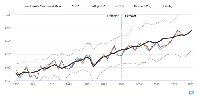
It is furthermore difficult to accept that the global climate models are too pessimistic because they have done a pretty good job of projecting future temperature rise so far, while related climate phenomena have occurred at rates near or beyond the upper limit estimates of the climate models. Zeke Hausfather has recently compared projections from a number of climate models put forward since 1973 to subsequent temperature records, and concluded: “Climate models published since 1973 have generally been quite skillful in projecting future warming. While some were too low and some too high, they all show outcomes reasonably close to what has actually occurred, especially when discrepancies between predicted and actual CO2 concentrations and other climate forcings are taken into account.” Figure II.17 shows just one example from his compilation of model projections, this one from the IPCC 4th Assessment Report. That particular projection is noteworthy because it was made near the start of the decade that climate deniers often claim marked the end of global warming (see Fig. II.5). Although one still sees up to 0.2ºC year-to-year fluctuations about the average projection, the models do pretty well in predicting the trend.
Meanwhile, as seen in Figs. II.18 and II.19, polar ice melt rates have exceeded the most pessimistic of the IPCC model projection range, while observed sea level rise has been at the upper end of the IPCC projections. There is no serious analysis that suggests global climate models have been too pessimistic.


Deniers’ Claim #8: “High CO2 Levels are Good for Us”
Since it is difficult for deniers to dismiss the rapid rise in atmospheric CO2 concentrations, they have instead focused on claims that we will all benefit from a large increase in “plant food.” Will Happer has become the patron saint of this claim, and we have debunked his detailed claims elsewhere on this site. It is worth commenting here on only a few of his quotes.
In a 2014 CNBC interview, Happer said: “The demonization of carbon dioxide is just like the demonization of the poor Jews under Hitler. Carbon dioxide is actually a benefit to the world, and so were the Jews.” In fact, carbon dioxide is neither “good” nor “evil.” It is a molecule with many attributes and effects. It is true that it contributes to plant health, but it is equally true that it absorbs infrared radiation from the Earth and contributes significantly to global warming. Whether the benefits of CO2 outweigh the dangers is a question that can be addressed with climate models, but a question that is in no way advanced by the hyperbolic comparison to the Holocaust.
The following two quotes are from a 2011 article by Happer, which we have debunked in detail in our Happer profile. “Plants grow better and have better flowers and fruit at higher CO2 levels. Commercial greenhouse operators recognize this when they artificially increase the CO2 concentrations inside their greenhouses to over 1000 ppm.” What Happer neglects to mention here is that commercial greenhouses, unlike the Earth, are controlled environments, where operators also maintain optimal temperatures and other nutrient supplies for the plants. In our global climate, all these issues are coupled and models suggest that the net effect of continued rapid rise in CO2 concentrations will be detrimental to world agriculture, on average.
In that same article, Happer wrote: “About fifty million years ago, a brief moment in the long history of life on earth, geological evidence indicates, CO2 levels were several thousand ppm, much higher than now. And life flourished abundantly.” Of course, there was no human life at that point, and certainly nothing like the population density of humans that characterizes our current situation. The inexorable rise of sea levels associated with ongoing global warming induced by greenhouse gas concentrations will end up causing massive human migrations from coastal areas, and we’ve gotten a glimpse over the past several years into how poorly human civilizations adjust to massive influxes of foreigners. Furthermore, evolution allows adaptation of species to gradual environmental changes, including higher greenhouse gas concentrations. But what we are currently seeing is not at all gradual, it is on track to double greenhouse gas concentrations over just a few human generations.
In other contexts, Happer has pointed to the flourishing of life forms several hundred million years ago, when CO2 levels in the atmosphere were much higher than they are presently. We have pointed out in part I of this post that there are many climate drivers, and if one wants to go back several hundred million years, it is imperative to note that the Sun’s power output was appreciably weaker then (see Fig. I.6). Furthermore, life forms flourished sometimes during such prehistoric eras, while at other times they were extinguished. The track record, as best we have been able to reconstruct it from geologic and fossil records, is not encouraging with respect to the correlation between mass extinction events and rapid rises in greenhouse gas concentrations.
Ken Caldeira, a paleoclimate expert from Stanford University, hassaid: “Atmospheric CO2 concentrations have never risen so much so rapidly as they are today without being accompanied by a mass extinction event. The geologic record gives us no reason to be sanguine about current rates and amounts of CO2 increase.” The geologic record to which Caldeira refers is illustrated in Fig. II.20. That figure compares the timelines deduced from fossil records for Earth’s mass extinction events to the timelines for periods of massive volcanic eruptions forming so-called Large Igneous Provinces (LIPs). Those eruptions provide the closest analog in Earth’s geologic history to the rapid rise we’re seeing today in atmospheric greenhouse gas concentrations. While the eruptions resulted in massive emissions of CO2 and CH4, it is estimated that the concentration increases occurred typically over a time period an order of magnitude longer than that associated with ongoing anthropogenic emissions. Nonetheless, the correlations seen in Fig. II.20 suggest that the buildup of greenhouse gases was still too rapid to allow evolutionary adaptation of many species to a changing climate.

The most recent extinction event included in Fig. II.20 corresponds to the extinction of the dinosaurs some 65 million years ago. While that event is often attributed in recent research to a massive meteor impact in the Yucatan, there is also geologic evidence of massive volcanic eruptions in what is the present-day Indian sub-continent at just about the same time. The volcanic eruptions might have been triggered by earthquakes and other geologic events resulting from the meteor impact. But in any case, we do not know for sure what, specifically, killed off the dinosaurs. In any case, Fig. II.20 gives us, as Caldeira said, “no reason to be sanguine about current rates and amounts of CO2 increase.”
Deniers’ Claim #9: “Ill Effects Are Too Far in the Future to Worry About”
I have been concentrating throughout this post on the evidence for anthropogenic global warming, and haven’t dwelt much on the projected climate impacts. But suffice it to say that impacts of climate change are already being felt around the globe – this is not just a problem for future generations. Climate models have predicted that the warming Earth temperatures would lead to storms of increasing intensity (spurred by warming oceans), floods in some areas and severe droughts in others, more frequent forest fires and intense heat waves. Deniers are quick to suggest that any evidence tying recent events of this type to global warming is purely anecdotal. But it’s not. The evidence in Fig. II.21 is actuarial, not anecdotal.

The statistics on natural catastrophes in Fig. II.21 are maintained by the world’s largest reinsurance company Munich RE, at their NatCatService. Each event counted in the figure has caused at least one fatality and/or major economic losses. The brown bars at the bottom of each column, representing geophysical events unrelated to global warming, show a roughly constant frequency since 1980 for earthquakes, tsunamis and volcanic eruptions. But the other colored bars, representing the various types of climate-related catastrophes have more than tripled in frequency between 1980 and 2018. In addition to that evidence from catastrophes, there is also the ongoing nuisance of sunny-day flooding in coastal cities such as Miami.
The impacts of climate change are already being felt seriously in places like Alaska, which is experiencing much greater warming, glacial recession and permafrost thawing than mid-latitude locales, and low-lying Pacific coral atolls, like the Marshall Islands, whose future is immediately threatened by rising sea levels. Deniers claim that none of this evidence is proof of causation by anthropogenic global warming. And that brings us to the catch-all deniers’ claim #10.
Deniers’ Claim #10: “Correlation Doesn’t Prove Causation”
This claim is certainly true as a general reminder. But the past 50 years have seen:
- Human CO2 emissions double
- CO2 atmospheric concentrations rise by 25%
- Global surface temperatures rise by 1ºC, and much more in many locations
- Heat stored in Earth’s oceans increase by 2 x 10²³ Joules, equivalent to ~300 years of worldwide energy consumption at present rates
- Sea levels rise 10 cm, with the rise accelerating
- Severe storms, floods, droughts and forest fires triple in frequency
- Arctic and Antarctic ice melt rate increase 6-fold
- And so forth.
All of these impacts are connected within steadily improving global climate models, and no convincing alternative explanations to human-caused greenhouse gas emissions have been offered. The effects do not represent a “Chinese hoax,” as once claimed by President Trump, or a conspiracy among thousands of climate scientists worldwide.
If this much correlation doesn’t cause you concern, you’re either not paying attention or being paid to ignore the issues.
“Bonus” Deniers’ Claim #1: “Winter is Coming”
Occasionally, you will hear climate change deniers argue that Earth’s next Ice Age will solve all the problems that “alarmists” think may be caused by anthropogenic global warming. This claim makes the standard denier mistake of ignoring the very different time scales associated with different climate drivers. The detailed causes of ice ages are not completely understood, but the periods are of order tens to hundreds of thousands of years. If there is a next Ice Age, it’s not going to come soon enough to “save us” from human-induced warming occurring on a century time scale.
An analysis of where Earth is presently within Milankovitch cycles suggests that, in the absence of other radiative forcing mechanisms, Earth orbit changes would likely induce the next Ice Age roughly 50,000 years from now. But even that estimate could be subject to further delay if the greenhouse gas blanket warming the Earth continues to increase in concentration.
“Bonus” Deniers’ Claim #2: “It’s All a Conspiracy of Governments and IPCC scientists”
I’m sorry to disappoint the many climate change deniers who are also conspiracy theorists, but in fact, projections of serious global warming concerns predate the establishment of the IPCC and global climate accords. And the early projections are remarkably consistent with later, much more detailed, modeling.
For example, a 1983 study “Changing Climate” carried out by the U.S. National Academy of Sciences included the following projections:
- CO2 concentrations likely to double by 2065
- Global mean temperatures would rise by 1.5-4.5ºC as a result
- Warming 2—3 times as great would occur over polar regions
- Sea levels likely to rise by 70 cm by 2100
- Sea levels could rise 5—6 meters over a few centuries, depending on the extent of polar ice cap melting
Perhaps even more impressive are internal documents of fossil fuel companies that have been unearthed over decades by the Climate Investigations Center at the University of California at San Francisco. Among the documents now archived at the UCSF site is an internal Exxon memo dated May 15, 1981 and entitled “Exxon’s Position on the Growth of Carbon Dioxide.” Projections in that document include the following:
- CO2 concentrations to 380 ppm by 2000, doubling over ~100 years
- 3ºC global average temperature rise, 10ºC at the poles for CO2 doubling
- Anticipate major shifts in rainfall and agriculture
- Polar ice may melt
The extent of the problem has been understood pretty well by scientists, governments and even the fossil fuel industry for decades, but it is only recently that the public has started to pay serious attention. The efforts of climate change deniers have set back efforts to mitigate the problems more gradually.
Public Opinion is Shifting
The semi-annual U.S. public attitude surveys carried out by the Climate Communication Centers at Yale and George Mason Universities have documented the steady rise in public acceptance of the reality of anthropogenic global warming over recent years. As shown, for example, in Fig. II.22, the significant dip in public acceptance that occurred in the wake of the “Climategate” e-mail hacking during the first decade of this century has now been overtaken by growing personal experience with impacts of climate-related disasters, like those included in Fig. II.21, and by the coming of age of a generation who sees their own future seriously compromised by climate change. In addition to the 50% or so of respondents indicated in the figure, who are either “extremely” or “very” sure global warming is happening, another 20% are currently pretty convinced.

As seen in Fig. II.22, only 7% of the public is extremely or very sure that global warming is not happening, and all the climate change deniers reside in that category. So it is fair to ask how so few can influence so many, especially in government positions. That is really the general subject of this entire blog site, across many issues at the interface of scientific research and public policy. Here, I only want to briefly mention some of the rather sophisticated public relations approaches that the deniers use in combination with their quite unsophisticated scientific arguments.
The climate change deniers have made extensive use of the “toolbox” of methods established from earlier battles – often involving the same players – against government regulations for DDT, second-hand smoke, acid rain, ozone depletion, etc. For example, they have widely adopted the technique of “astroturfing:” the planting of faux grassroots supported by the roughly simultaneous formation of multiple, apparently independent, “think tanks” in different regions, all focused on implanting the same lines in local media, with the same, often hidden, funding sources.
They have fed and exploited political tribalism. In the U.S. on the climate change issue, those efforts have centered on the hacking and release of the Climategate e-mails and on pushing antipathy toward Al Gore, in addition to heavy financial support to accommodating political candidates. They have more recently used widespread social media exploitation. For example, a recent Brown University team studied 8.5 million tweets put out during the period when Donald Trump was considering, and then announcing, a U.S. withdrawal from the Paris Climate Accord. The study identified about 38% of all tweets about “fake (or junk) climate science” as coming from mechanized “bots.”
Despite all those efforts in denial, it is not too late to institute serious mitigation and accommodation efforts for anthropogenic global warming and its diverse climate impacts. We have outlined some of the features a coherent mitigation strategy could adopt in our blog on Climate Change Problem Solving. The real issue remaining at this point is whether we will reach a tipping point in public demand for global action before we pass too many tipping points for irreversible impacts of climate change.
References:
https://climate.nasa.gov/news/2948/milankovitch-orbital-cycles-and-their-role-in-earths-climate/
https://geol105.sitehost.iu.edu/images/gaia_chapter_4/milankovitch.htm
https://en.wikipedia.org/wiki/Solar_luminosity
U.S. Energy Information Administration, https://www.eia.gov/
https://en.wikipedia.org/wiki/Urban_heat_island
https://en.wikipedia.org/wiki/Climatic_Research_Unit_email_controversy
D. Nuccitelli, R. Way, R. Painting, J. Church and J. Cook, Comment on Ocean Heat Content and Earth’s Radiation Imbalance. II: Relation to Climate Shifts, https://skepticalscience.com/docs/Comment_on_DK12.pdf
https://www.skepticalscience.com/SkS_Analogy_05_Linear_Non-linear_Coastal_Flooding.html
M.E. Mann, R.S. Bradley and M.K. Hughes, Northern Hemisphere Temperatures During the Past Millennium: Inferences, Uncertainties and Limitations, Geophysical Research Letters 26, 759 (1999) http://www.meteo.psu.edu/holocene/public_html/shared/research/ONLINE-PREPRINTS/Millennium/mbh99.pdf
http://www.pastglobalchanges.org/science/wg/2k-network/intro
R. Neukom, et al., No evidence for globally coherent warm and cold periods over the pre-industrial Common Era, Nature 571, 550 (2019), https://www.nature.com/articles/s41586-019-1401-2
S. St. George, The Aberrant Global Synchrony of Present-Day Warming, Nature 571, 483 (2019), https://www.nature.com/articles/d41586-019-02179-2
https://en.wikipedia.org/wiki/Vostok_Station
https://skepticalscience.com/argument.php
M.E. Mann, et al., Proxy-based reconstructions of hemispheric and global surface temperature variations over the past two millennia, Proceedings of the National Academy of Sciences 105, 13252 (2008), https://www.pnas.org/content/pnas/105/36/13252.full.pdf
M.E. Mann, et al., Global Signatures and Dynamical Origins of the Little Ice Age and Medieval Climate Anomaly, Science 326, 1256 (2009), http://www.meteo.psu.edu/holocene/public_html/shared/articles/MannetalScience09.pdf
https://chiefio.wordpress.com/2011/12/26/s-america-mwp/
https://sos.noaa.gov/datasets/el-nino-1997-1998/
https://skepticalscience.com/docs/Guide_to_Skepticism.pdf
J.D. Shakun, et al., Global Warming Preceded by Increasing Carbon Dioxide Concentrations During the Last Deglaciation, Nature 484, 49 (2012), https://www.nature.com/articles/nature10915
R. Muller, The Conversion of a Climate Change Skeptic, New York Times, July 30, 2012, https://www.nytimes.com/2012/07/30/opinion/the-conversion-of-a-climate-change-skeptic.html
M.E. Mann, et al., The Likelihood of Recent Record Warmth, Scientific Reports 6, 19831 (2016), http://www.nature.com/articles/srep19831
https://en.wikipedia.org/wiki/Coupled_Model_Intercomparison_Project
https://www.wcrp-climate.org/wgcm-cmip/wgcm-cmip5
M.E. Mann and L.R. Kump, Dire Predictions: Understanding Climate Change, 2nd Edition (© 2016 Pearson), https://www.pearson.com/us/higher-education/product/Mann-Dire-Predictions-Understanding-Climate-Change-2nd-Edition/9780133909777.html
Anthropogenic and Natural Radiative Forcing, Chapter 8 of Working Group 1 in IPCC 5th Assessment Report (2013), https://www.ipcc.ch/site/assets/uploads/2018/02/WG1AR5_Chapter08_FINAL.pdf
http://gaplauche.com/blog/2007/05/23/freeman-dyson-on-scientific-organizations-and-climate-models/
https://www.skepticalscience.com/climate-models-basic.htm
http://www.realclimate.org/index.php/archives/2016/05/comparing-models-to-the-satellite-datasets/
B.D. Santer, et al., Comparing Tropospheric Warming in Climate Models and Satellite Data, Journal of Climate 30, 373 (2017), https://atmos.washington.edu/~qfu/Publications/JC.Santer.Dec2016.pdf
Z. Hausfather, Why Troposphere Warming Differs Between Models and Satellite Data, https://www.carbonbrief.org/study-why-troposphere-warming-differs-between-models-and-satellite-data
https://www.ipcc.ch/assessment-report/ar4/
https://en.wikipedia.org/wiki/Large_igneous_province
https://www.munichre.com/en/solutions/for-industry-clients/natcatservice.html
Changing Climate: Report of the Carbon Dioxide Assessment Committee (National Academy Press, 1983), https://www.nap.edu/read/18714/chapter/1
https://www.industrydocuments.ucsf.edu/fossilfuel/
https://climatecommunication.yale.edu/
O. Milman, Revealed: quarter of all tweets about climate crisis produced by bots, The Guardian, Feb. 21, 2020, https://www.theguardian.com/technology/2020/feb/21/climate-tweets-twitter-bots-analysis
