
John Christy Profile in Denial Part I
John Christy is a Distinguished Professor of Atmospheric Science and the Director of the Earth System Science Center at the University of Alabama at Huntsville. After receiving a BA in Mathematics at Cal State University-Fresno in 1973, Christy worked as a missionary teacher in Kenya for two years. He then earned a Master of Divinity degree from Golden Gate Baptist Seminary and served for four years as a mission pastor and math teacher in South Dakota. Christy then went back to college and earned his PhD degree in Atmospheric Science at the University of Illinois in 1987.
Beginning in 1989, Christy and his colleague Roy Spencer calculated temperatures in the atmosphere, using data derived from satellites that carried out measurements by means of microwave sounding units. Their results are commonly called the UAH record of atmospheric temperatures (after the initials of the University of Alabama-Huntsville). Christy’s work has been recognized in his field. He was elected a Fellow of the American Meteorological Society (AMS) in 2002, and he received a 1991 NASA Medal for Exceptional Scientific Achievement and a 1996 Special Award from the AMS “for developing a global, precise record of Earth’s temperature from operational polar-orbiting satellites, fundamentally advancing our ability to monitor climate.”
Christy was a lead author on a section of the Intergovernmental Panel on Climate Change (IPCC) 2001 report. He also was one of the authors of a report by the U.S. Climate Change Science Program (CCSP) in 2005 titled Temperature Trends in the Lower Atmosphere – Understanding and Reconciling Differences. This review summarized what was known about temperature trends at the Earth’s surface and in the troposphere, a region extending from the Earth’s surface to the lower boundary of the stratosphere, some 6-10 km above the Earth’s surface. This is particularly relevant since the original UAH results appeared to show that the troposphere was cooling. We will discuss this issue at more length later in this post.
John Christy signed the 2003 statement on climate change issued by the American Geophysical Union that discussed the issue of global warming. However, since that time he has become increasingly critical of the consensus expressed by the IPCC and statements by the climate-science community. Christy said that the 2003 AGU statement “did not put forth a magnitude of the warming. We just said that human effects have a warming influence, and that’s certainly true … I was very upset about the [2007] AGU statement. It was about as alarmist as you can get.”
John Christy claims that because of his status as an eminent atmospheric scientist and as co-author of the 2003 AGU statement on climate change, he is one of the estimated 97% of active scientists who are in general agreement regarding trends in the global climate. However, that claim is disputed by many climate scientists. Over the past 15 years, Christy has become one of the more outspoken critics of the scientific consensus on global climate change. In the upcoming sections we will review some of his statements on this topic. Christy was a “Roundtable Speaker” for the George C Marshall Institute, one of the leading institutes that criticizes mainstream climate scientists. He has given interviews for the CO2 Coalition, the successor to the Marshall Institute on matters of climate. He is listed as a climate expert by the Heartland Institute, a public policy think tank that espouses free-market solutions to policy issues (it is generally opposed to governmental regulations, and is even more strongly opposed to multi-national regulatory policies).
John Christy emphasizes that he is not influenced by companies that might benefit from his statements. That is, he is not paid directly by firms in the extraction industries or by companies involved in fossil fuels. However, the think tanks for which he consults have received significant support from companies and individuals with strong political agendas. Thus, the George Marshall Institute received support from the Exxon Education Foundation. They also were funded by the Earhart Foundation, the John M. Olin Foundation, and the Sarah Scaife Foundation. The Heartland Institute received significant funding from ExxonMobil and Philip Morris (in the 1990s, the Institute focused on efforts to discredit reports on health risks of second-hand smoke, and to lobby against restrictions on smoking). The CO2 Coalition receives support from the Koch brothers, and from the Mercer Family Foundation and Rebekah Mercer.
In 2019, Christy was appointed to the Environmental Protection Agency’s (EPA) Scientific Advisory Board by EPA administrator Andrew Wheeler; in this role Christy will be instrumental in shaping EPA policies and regulations.
John Christy has been a “go-to” expert invited by Republicans to challenge the scientific consensus on global climate change. He appeared before Congress on March 29, 2017 at the House Committee on Science, Space and Technology; on Feb 2, 2016 to the same committee; on Dec 8, 2015 before the Senate Committee on Commerce, Space & Transportation, Subcommittee on Space, Science and Competitiveness; on August 1, 2012 before the Senate Committee on Environment and Public Works; and on March 8, 2011 before the House.
A crucial issue here is the difference between skepticism in science and science denial. This has been discussed in previous posts on our blog. Since there is a continuous line from skepticism to denial, it is sometimes difficult to make clear distinctions between the two. On the other hand, there are situations where the differences are stark. We have several concerns with John Christy. First, as we will show in the next section, his comparisons of experiment vs. model predictions regarding global temperatures are highly misleading. Furthermore, he continues to show the same figures, despite the fact that they have been disputed by many climate scientists. Also, many of his remarks on related issues are slanted, and are either false or misleading. These will be summarized later in this post. A hallmark of denial is that new data is produced and scientific issues are raised and are settled by the community, yet the conclusions of the deniers never change.
The mainstream science community has been active in reviewing and challenging John Christy’s remarks on climate change. In addition to peer-reviewed papers in the scientific literature (several figures shown in Christy’s Congressional testimonies have never been submitted for peer review), there are some online sites that we found particularly useful. First are the sites Skeptical Science.com and Real Climate.org. Both of those sites review these issues in considerable detail. They provide detailed arguments on the issues and cite the major peer-reviewed papers on which their conclusions are based. They also allow comments from readers, so one can follow various scientific arguments online. Another useful site is deSmogBlog.com. This has a section on John Christy and discusses his public statements on global climate change.
The UAH Measurements of Atmospheric Temperatures:
The work for which John Christy is most famous is his long-standing collaboration with Roy Spencer on temperatures in the atmosphere. The UAH group has used data taken by satellites to extract temperatures in the atmosphere and to provide a record of these temperatures over time.

The data from satellites complements data from ground-based measurements and from balloons. This gives us three different (and somewhat independent) measurements of global temperature change. The satellites scan the Earth’s atmosphere using microwave sounding units that detect microwave emission lines from O2 molecules. They calibrate their measurements using a warm target on board the satellite. The accuracy with which the atmospheric measurements are calibrated affects the accuracy of their inferred temperature measurements of the atmosphere. In addition, the satellites are looking down through the Earth’s atmosphere, detecting microwave emissions from near the warming surface of Earth, from the warming troposphere, and from the cooling stratosphere. So in order to extract temperatures on the surface or in the troposphere, they must account for the varying temperatures of different regions of the atmosphere.
In addition, the orbits of satellites can drift over time. The satellites are designed to pass over the same part of the Earth at the same time each day. However, over time this changes as the satellite’s orbit decays. The satellite will be measuring temperatures at different times of day, and this must be corrected. In addition, the satellites must make corrections for diurnal variations in temperature, and an individual satellite will eventually become obsolete. By now, there are a number of satellites in orbit, but only a few of these satellites are current. Furthermore, newer satellites use upgraded versions of the microwave sounding units. So the choice of which satellites to use, and the exact methods used to correct the data, can influence the extracted results.
In summary, the assumption that satellite measurements should be more accurate than ground-based or balloon results is not true. One of the major teams analyzing satellite data is a group from Remote Sensing Systems or RSS. Carl Mears, co-founder of the RSS group, has stated that “In general, I think that the surface datasets are more likely to be accurate than the satellite datasets. The between-research spreads are much larger [for the satellite data] than for the surface data, suggesting larger structural uncertainty.” Indeed, there are persistent disagreements between the RSS and UAH satellite measurements, and those disagreements have been increasing since 2000.
There are now several different collaborations that analyze satellite data to calculate temperatures in the atmosphere. There is a group from the National Oceanic and Atmospheric Administration (NOAA), the RSS group and the University of Alabama-Huntsville (UAH). There was a period of several years where data from other satellite groups and balloon measurements showed a warming trend in the atmosphere, while the UAH group reported that the atmosphere was cooling.
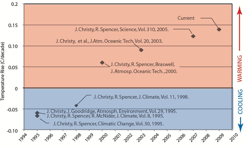
As shown in Fig. I.3, the UAH analysis of satellite data initially showed atmospheric cooling. However, a re-analysis in 2000 now showed a small amount of atmospheric warming. The amount of warming kept increasing with further re-analyses up to 2009. However, that is not the end of the story. In 2015, a group (Po-Chedley et al.) re-analyzed three sets of satellite measurements of atmospheric temperatures: from RSS, NOAA and UAH. This paper attempted to resolve differences between the three groups in average patterns for the temperature of the mid-troposphere (TMT). While the RSS and NOAA groups were in general agreement, the UAH group found much smaller TMT increases over time.
A major source of difference was in the way the groups accounted for diurnal temperature variation from the satellite data. The RSS and NOAA groups used a diurnal correction factor obtained from a global climate change model, while the UAH group produced a diurnal correction factor based on comparisons between three co-orbiting satellites. The group led by Po-Chedley devised a scheme for diurnal corrections by solving for a common diurnal correction using data from all orbiting satellites. When they applied this independent correction factor to the data from the mid-troposphere in the tropics (between 20° North and 20° South latitudes), the RSS and NOAA results experienced only small changes, while the UAH measurements were greatly affected. Before this re-analysis, the UAH group reported a temperature warming of +0.029° Celsius/decade from 1979-2012; with the new diurnal temperature correction, this increased to +0.114° C/decade. The RSS and NOAA results were +0.124° C/decade, close to the corrected UAH results.
Climate models had predicted that mid-tropospheric temperatures in the tropics would be higher than at the Earth’s surface, a phenomenon called “tropospheric amplification.” While the RSS and NOAA results showed such an amplification, UAH reported no amplification. The new analysis found an amplification factor of 1.4. If the diurnal cycle was removed using the climate models, the result would have been 1.49. The RSS and NOAA factors had been 1.31 and 1.10, respectively; however, the UAH reported amplification factor was 0.56. After applying the improved diurnal corrections, the UAH results increased by a factor of 2.5, changing from a “tropospheric decrease” to a “tropospheric amplification!” Once again, the UAH results before correction showed much smaller warming than the other satellite measurements.
Christy and other climate change deniers have accused NOAA of fudging or cherry-picking their data to produce the desired result. In 2016 Lamar Smith, former chair of the House Science Committee, stated that “Instead of hyping a climate change agenda, NOAA should focus its efforts on producing sound science and improving methods of data collection. Unfortunately, climate alarmism often takes priority at NOAA.” And in a Congressional Hearing in March 2011, John Christy stated, “IPCC-selected lead authors are given significant control over the text, including the authority to judge their own work against the work of their critics…this process has led to the propagation of incorrect and misleading information in the assessments, and thus should lead you to question the IPCC’s general support for a catastrophic view of climate change.” In a March 2017 appearance before a House committee, Christy advocated creation of a government-funded “Red Team” that would produce reports on climate change that were closer to his own results, and that would counter the conclusions of the vast majority of climate scientists.
The leaders of the UAH group, Christy and Spencer, have been among the most highly publicized climate-change deniers. It is not clear that there is any direct correlation between their measurements and their political views. However, their temperature measurements, coupled with the vocal attacks by both Christy and Spencer on the climate-science consensus, have been widely used by climate-change deniers to bolster the view that global warming was either non-existent or nothing to worry about. The satellite temperature results have been touted by the denial industry as the most definitive climate data, and the UAH measurements have always showed less warming than analyses from other groups using satellite measurements.
As is clear from Fig. I.3, the UAH data have seen dramatic changes over time; in every case, the revised UAH results show increased warming of the atmosphere near the Earth and the lower troposphere. It is ironic that Christy accuses other climate scientists of producing unreliable data. I am not aware of other climate data that has undergone so many significant revisions as the UAH satellite data shown in Fig. I.3, and in every case the UAH revisions have produced increased warming over previous announced results.
Comparing Global Temperature Data With Model Predictions:
John Christy has made comparisons of global temperature data with the predictions of a number of climate models. He has shown these predictions at several Congressional hearings. Fig. I.4 shows one of his plots of atmospheric temperatures, compared with satellite measurements of temperature (open squares) and balloon measurements (blue circles). The red curve is the average of more than 100 global climate models tuned to fit surface temperature trends. This curve has been annotated by Skeptical Science.com, as discussed in our earlier blog post.
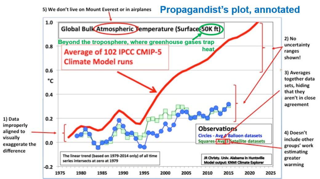
Christy showed this figure in at least three appearances before Congressional committees. This curve is displayed by a large number of climate-change deniers, and is widely touted as definitive evidence that climate models do not work and have been ‘proved wrong.’ For example, that curve was included in the booklet by the Heartland Institute that was mailed to every K-12 science teacher in the U.S. As we will show, Christy’s figures provide a misleading comparison of data vs. models. First, the climate model calculations are predictions for temperatures at the mid-troposphere (the so-called TMT region). The satellite data are averages from elevations of 0 to 15 kilometers. This region includes a significant contribution from the upper troposphere and lower stratosphere.
In addition to the mid-troposphere, there are two other atmospheric regions that are considered for temperature measurements. The first, “temperature of the lower troposphere” or TLT, ranges in elevation from 0 to 10 km, while a third region, the temperature of the lower stratosphere or TLS spans the region 10 to 30 km. As we will discuss later, climate models predict that the lower atmosphere will be warming, while the stratosphere is expected to cool. Thus, satellite data averaged from 0 to 15 km combines cooling and warming regions, while the climate models only predict warming in the mid-troposphere region. All the data from surface meteorological stations support the warming trend.
Note that both the satellite and balloon data are averaged over several runs; this hides the fact that there is significant spread in individual data. Also, the climate models and these data sets are improperly aligned, in order to exaggerate the difference between data and models. A detailed list of the steps taken by Christy to magnify the differences between data and models is given in Real Climate.org. Various issues with Figure I.4 are: choice of baseline; inconsistent smoothing; model spread; and no depiction of the structural uncertainty in the satellite observations.
The Real Climate.org website has re-calculated the “Christy plot” comparing CMIP5 climate-model predictions for “Temperature of the Mid-Troposphere” (TMT) region with satellite data. In 1995, the World Climate Research Programme’s Working Group on Coupled Modelling developed the Coupled Model Intercomparison Project or CMIP, for global coupled ocean-atmosphere general circulation models. CMIP5 represents climate predictions released as part of Phase 5 of this project. The Real Climate.org update for global TMT models and data is shown in Fig. I.5 below. In contrast to Christy, they have used more reasonable choices for the baseline (instead of picking a single year, 1979, they have used different choices for baseline averaging of climate models, and chosen the mean model values to go through the same average in 1979). Instead of using only the average of all climate models, they include an “envelope” inside which 95% of the climate models lie. The black line is the average of all climate models. They also show the results from five groups that use satellite data.
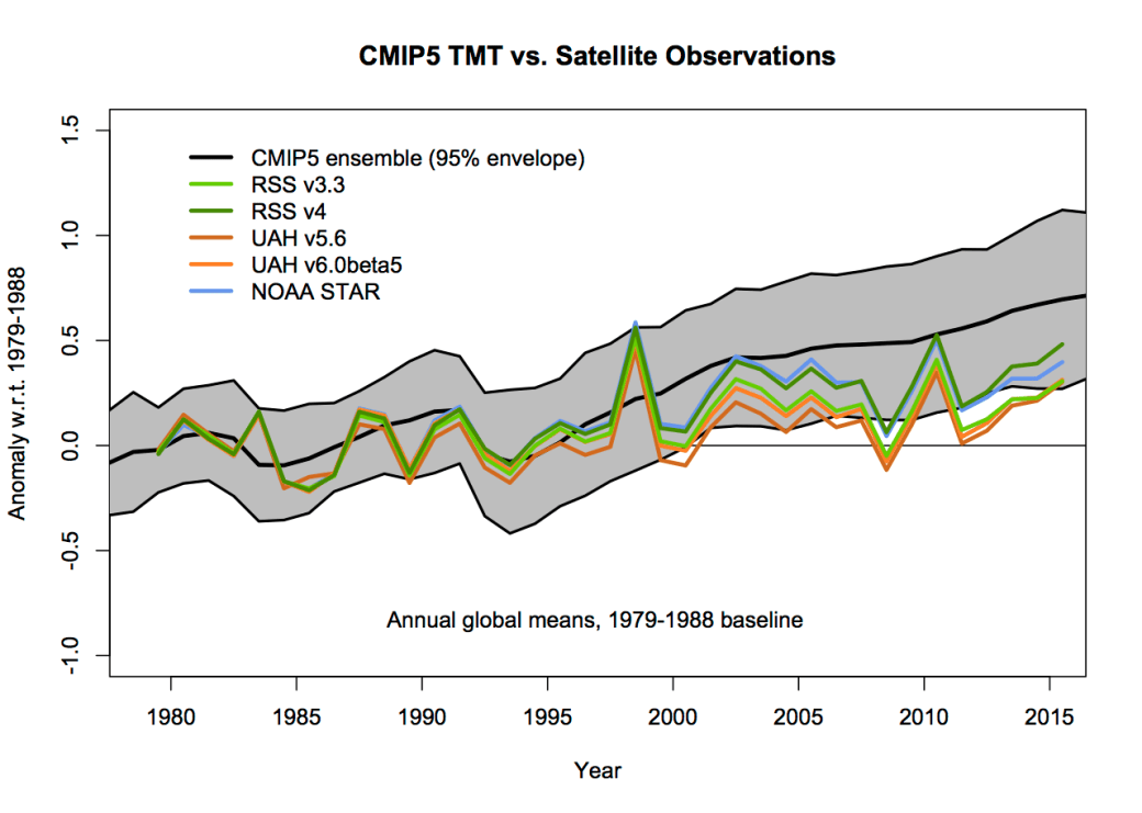
First, in Fig. I.5 the climate models give a much better representation of the satellite data than the graph shown by Christy in Fig. I.4. The global TMTs have increased slightly less rapidly than climate-model predictions in recent years, but with the exception of the UAH data, are within the 95% envelope of climate predictions. The fact that climate model predictions of mid-troposphere temperatures do not agree with data as well as surface temperatures suggests that there may be some forcings in the TMT region that are not completely under control. One should remember that the UAH results of Christy and Spencer, the lowest satellite temperature data, are lower than all other satellite results and have been revised upwards several times (see Fig. I.3).
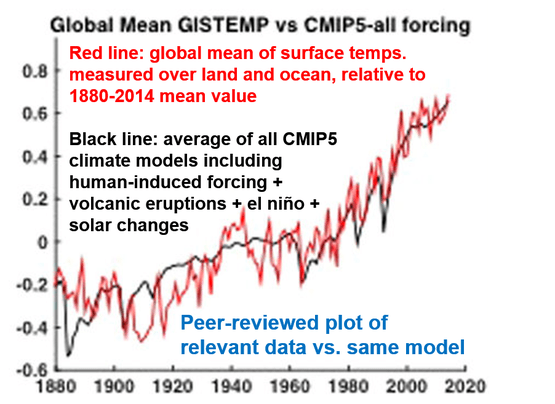
Fig I.6 plots climate models and surface temperature data. The red curve is the global average of mean surface temperatures averaged over land and ocean, from 1880-2014. The black curve is the average of all CMIP5 climate models that include human-induced forcings (contributions), volcanoes, El Nino contributions and changes in solar intensity. It is obvious that the climate models provide good average fits to surface temperatures; deviations from the data represent the fact that global models do not include all drivers of temperature change.
John Christy has been showing the same graph (Fig I.4), with some updates, for several years to Congressional committees. And he has been making the same claims that his results “demonstrate” that climate model predictions of temperature rise have been proved wrong. By now, many climate scientists have debunked Christy’s claims. They have shown that the satellite data are in substantially better agreement with model predictions than claimed by Christy, and that when combined with surface and balloon measurements of temperature, the climate models do very well in predicting temperature increases.
Using his own graphs of models vs. satellite data, John Christy has repeatedly claimed that global warming is very small, may not be the result of human activity, and is nothing to worry about. In April 2011 Christy said “What we’ve found is that the rate of warming due to carbon dioxide must be pretty small because the Earth is not warming very rapidly .… I don’t think it’s something to be alarmed at.” He continued, “You know, by looking at the evidence – we have satellites and so on – we do not see any dramatic or catastrophic changes at all.” And he also said “climate model output does not match up to the real world.”
In 2017, Santer et al. attempted to compare the climate models with the satellite data. They used methods to account for the cooling effects in the stratosphere. These methods have been tested and shown to agree with data from the stratosphere. They then ‘corrected’ the satellite data to remove the stratospheric cooling, so that the corrected satellite data could be more accurately compared to climate models that do not include this cooling. Santer and collaborators then examined how the climate models would change when they varied the magnitude of the forcings from various climate inputs, including CO2 content. They could then test various of the claims made by John Christy in his Congressional testimony.
First, using the corrected satellite data dramatically decreased the disagreement between the climate model predictions and the corrected data. So Christy’s claims about the failure of climate models were significantly overstated. Second, Christy had claimed that the dominant source of the difference between climate models and the satellite data was that the models assumed that global temperatures were too sensitive to increases in CO2. Santer found that this statement is also untrue. One of Christy’s most provocative claims (made in 2015) was that “there has been no significant global warming in the past 18 years.” We will discuss this claim in more detail in a later section. Note that all climate-change deniers use as their starting point the year 1998, because the El Nino effect that year was one of the largest in the 20th century; as a result temperatures in 1998 were anomalously high. However, even taking this into account, Santer found that nearly all datasets show warming between 1998 and 2015 (the results depend on the number of years chosen for the averaging, and the starting year chosen for comparison). Using the years after 2015 would only make the global warming trend much more evident (see Fig I.6).
However, even after correcting the satellite data for the cooling in the stratosphere, there still remains a discrepancy between the “corrected” TMT satellite data and the climate-model predictions. The top graph of Fig. I.7 shows the RSS corrected satellite data vs. the climate-model predictions (a multi-model average or MMA) as a function of time. Prior to 2000, the models shift between over-predicting and under-predicting the TMT values. However, after 2000 the models tend to consistently over-predict the mid-troposphere temperatures. This is highlighted in the lower graph, which plots the difference between the satellite and MMA results vs. time. The MMA values consistently over-predict the corrected satellite results after 2000. To be sure, the differences between the models and data are much smaller than claimed by Christy; however, some discrepancies still remain.
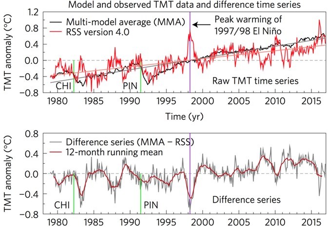
Santer et al. did check whether the observed differences resulted from the models being too sensitive to CO2 concentrations, as claimed by Christy. They found no relationship between model sensitivity to CO2 and the ability to predict temperatures in the mid-troposphere. The next round of climate-model calculations, CMIP6, is currently beginning. One aim will be to see if updated values for various forcings are able to reproduce the TMT data.
In summary, several of John Christy’s claims to Congress have been disproven by subsequent peer-reviewed work. Upon re-examination, Christy’s claims that climate models radically disagree with experimental data have been seriously over-stated.
Some Climate-Change Denier Arguments About Global Warming:
Here are some other arguments used by climate-change deniers, which have been endorsed by John Christy.
“It’s an Urban Heat Island Effect”
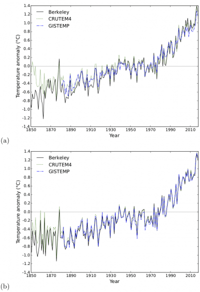
Christy joined other climate-change deniers in suggesting that temperature measurements at the Earth’s surface were biased, because many instruments measuring those temperatures were located in or near urban areas. The argument was that cities were warming faster than rural areas, and that this would bias the measurements towards higher temperatures. This was an attempt to support the dubious claim that satellite measurements were more reliable than those from thermometers. In April 2011 Christy said “Inside a city it’s a lot hotter than out in the countryside, so these thermometers do have problems in that regard.” Since that time significant effort has gone into measuring surface temperatures in both urban and rural areas. One such project is the Berkeley Earth Surface Temperature project or BEST, led by Berkeley Professor Richard Muller and his daughter Elizabeth Muller. They began this project because Richard Muller had expressed his suspicion that surface temperature measurements were likely skewed by the ‘urban heat islands,’ and in addition he suspected that prior data sets may have been faulty or even fraudulent. First, BEST dramatically increased the number of temperature-sensing stations they used, from approximately 6,000 stations to 39,000 stations.
BEST improved their capability for comparing urban to rural thermometer measurements. They confirmed findings that there was no “urban heat island effect” in measuring ground temperature increases. Rural stations show the same warming trend as urban stations and poorly-sited stations measure the same results as well-sited stations. BEST now has a land-based set that produces a surface temperature record from 1701 – present. Next, they included land and ocean measurements and have produced sets of temperature data from 1850 – present. They can now compare their estimates with those from earlier calculations of temperature using a subset of the stations. Fig. I.8 shows comparison of BEST global surface temperatures vs. time with those of earlier analyses, from the period 1850-present. Fig I.8a uses inferred temperatures over regions covered with sea ice, while Fig I.8b uses data from the nearest sea surface temperature sensors. With the exception of some fluctuations prior to 1930, agreement between the earlier analyses of surface temperatures and the BEST temperature values is extremely good. The new BEST data shows an unequivocal rise in global mean temperatures over the past 50 years.
“Global Warming Ceased in 1998”
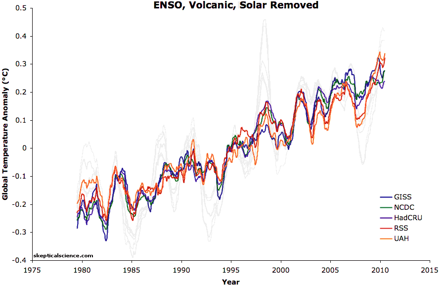
Another denier argument is that “the temperature increase stopped in 1998.” This is due to the fact that 1998 was a year with very high surface temperatures, due largely to a monster El Nino effect in that year. If one was so inclined, one could interpret the decade beginning in 1998 as showing an end to global warming. Indeed, climate-change denier Bob Carter stated “For the years 1998-2005, temperature did not increase. This period coincides with society’s continued pumping of more CO2 into the atmosphere.” The origin of this claim is shown in Fig. I.9, where one can envision a “pause” in warming in the decade beginning in 1998 (inside the red circle).

However, now that data is available from later years it is clear that global warming has continued unabated. In fact, despite the fact that 1998 was an anomalously warm year, the years 2005, 2010, 2014 and 2015 were all warmer than 1998. Another way to show this is to plot global temperatures from models with cyclical variations and irregular contributions removed. Fig I.10 shows two plots of global temperatures vs. time. In the first graph, effects due to the El Nino Southern Oscillation (ENSO), volcanic eruptions and changes in solar irradiance are included, while those effects are removed in the second graph. This is plotted together with five data sets that measure global temperatures (the light curves show the data before removal of the variable effects]. It is clear that the “pause” was merely a temporary slowdown in warming and did not affect the fact that global temperatures are steadily rising.
To summarize, global temperatures are increasing rapidly, just as predicted by climate models, and in contradiction to arguments made by John Christy and climate-change deniers. As stated by the Skeptical Science.com website in 2016, “Every component of the Earth’s climate has continued to warm since 1998. The myth of no warming during that time was based on the satellite record of atmospheric temperatures, which now shows warming. Surface and ocean temperatures have risen, as have sea levels, while ice has melted, spring is starting earlier, and so on … Earth has continued warming rapidly over the past 18 years.”
