
September 5, 2017
In addition to ignoring the vast majority of the historical data supporting human contributions to climate change, the Heartland Institute booklet seeks to discredit the global climate models developed to project future impacts of continued greenhouse gas emissions at current rates. In this post we illustrate how the booklet deliberately misrepresents both the general role of model-building in science and the particular comparison of climate model calculations with measurements. We also note that the booklet’s authors then proceed to rely on much more simple-minded models, together with neglect of historical evidence, in an attempt to combat the consensus estimates of global temperature sensitivity to carbon dioxide buildup in the atmosphere.
4b. Imperfect Models
In Part I of this blog post, we demonstrated that the Heartland booklet intentionally ignores the vast majority of available data on climate change. It then goes further to dismiss projections of future developments with the following remarkable statement: “Global climate models produce meaningful results only if we assume we already know perfectly how the global climate works, and most climate scientists say we do not.” That statement represents a recipe not only for permanent inaction, but more generally for the death of science (and perhaps that is Heartland’s underlying goal).
As we have described in a previous blog post (Scientific Disagreements vs. Science Denial), science progresses through a number of different stages. But the longest stage in most active scientific fields is that of model-building. In this stage, data have already established the primary factors influencing the behavior of the systems considered. Models are built with approximate treatments of these influences, in an attempt to account simultaneously for a wide variety of experimental or observational results. The models almost always contain a number of adjustable parameters that are varied to provide the best global fits to data. The models with parameters thereby adjusted are then used to predict as yet unmeasured behavior. Comparison of these predictions to subsequent experiments then may allow improvement to the fitted parameter values or to the approximations that were made in modeling their effects, or it may point the way to so far omitted additional factors that influence the systems and that need to be incorporated in later generations of improved models.
Such models are never perfect, but they are essential to progress. The determination of parameter values by fitting to existing data is not, as the Heartland booklet claims, “little more than an exercise in curve-fitting.” It is a way to quantify predictions of as yet unmeasured phenomena, and also the uncertainties in those predictions. The uncertainties also often include estimates of possible contributions from other factors known to be of possible consequence, but which are not yet incorporated in the model. The ultimate goal is always to develop more fundamental theories, from which the values of these adjusted parameters may eventually emerge naturally as predictions.
The usefulness of such models never relies on having achieved the ultimate goal of “perfect understanding”, but rather on the ability to account for many more data points than the number of parameters adjusted to fit them. The Standard Model of particle physics, which incorporates the fundamental theories of Quantum Electrodynamics and Quantum Chromodynamics, still relies on more than 20 parameters whose values are determined from experiment, and are not yet predicted by a higher theory. But the Standard Model accounts for vast amounts and varieties of data. Many experiments are performed to compare with its predictions, in the hope of exposing some new physics not yet incorporated in the model.
Earth’s climate is a very complex system to model. It has many interacting parts and is subject to many driving and feedback mechanisms. Some of these occur more or less randomly and unpredictably, such as volcanic eruptions, solar activity fluctuations, and fluctuations in ocean circulation currents. But with the rapid progress in available computing power, scientists have taken on modeling and sophisticated simulation of comparably complex systems, from the evolution of the universe to exploding supernovae to biological regulatory mechanisms to information technology and social networks. Modeling in all of these cases requires combining information from a multitude of disciplines and incorporating random elements. Such models are never perfect, but they aspire to capture and predict average behavior of the complex systems correctly.
The central question for climate science is whether the projections of the Global Climate Models (GCMs) used, for example, by the IPCC form a suitable basis for influencing policy regarding human-induced emissions of greenhouse gases, despite the models’ advertised uncertainties and our still imperfect understanding of all aspects of climate behavior. The Heartland booklet seeks to discredit the GCMs in part by a list of somewhat nit-picky and misrepresented complaints about effects they claim are not yet included. But the crux of its argument is two-fold: GCM predictions have been falsified by existing data, and they are based on serious overestimates of positive feedback effects that amplify greenhouse gas influences on global temperatures. We will examine aspects of the first of these points in this subsection and then deal with the critical issue of sensitivity to greenhouse gas concentrations in the following subsection.
The centerpiece of the dismissal of GCM predictions is shown in Fig. 13, taken from Dr. John Christy’s Congressional testimony in 2016, but now annotated by www.skepticalscience.com and further by us. The Heartland booklet labels this figure as the prima facie evidence for the “failure of climate models to hindcast global temperatures” from 1979 to 2015. It seems rather odd for the same document to claim that the GCMs can be adjusted to fit anything and that they can’t even fit the data to which they have been adjusted.

The comparison in Fig. 13, which has been presented to Congress but not published in a peer-reviewed journal, is deliberately misleading. IPCC climate models used to predict global surface temperatures on Earth are compared to cherry-picked temperature measurements spanning altitudes up to 50,000 feet above Earth’s surface. This altitude extends well into the stratosphere, where increasing atmospheric concentrations of greenhouse gases are predicted (and observed, see Fig. 5 in Part I) to cause cooling, as opposed to warming near the surface and in the lower atmosphere. Even with this gross misrepresentation, the satellite data used have been cherry-picked, including data sets with known problems. And the temperature changes in the model and the data appear to be referred to different baselines, so that the curve is always displaced from the measurements. This plot was produced for political effect, eschewing scientific honesty.
The peer-reviewed counterpart to Fig. 13, comparing the same set of GCMs to actual surface air temperature readings globally, above both land and sea, is shown in Fig. 14, and paints quite a different picture. The model output (black line) is quite similar in average behavior to that shown in Fig. 13, but it matches the observed data trend pretty well when the relevant data are used. This overall agreement is not surprising, as the models are tuned to reproduce the average behavior seen in these data, but the models are also constrained by all the data discussed in Part I of this post and further data to be discussed below. The relatively minor remaining deviations of the model output from the measurements reflect fluctuations that are not yet properly included in the model.

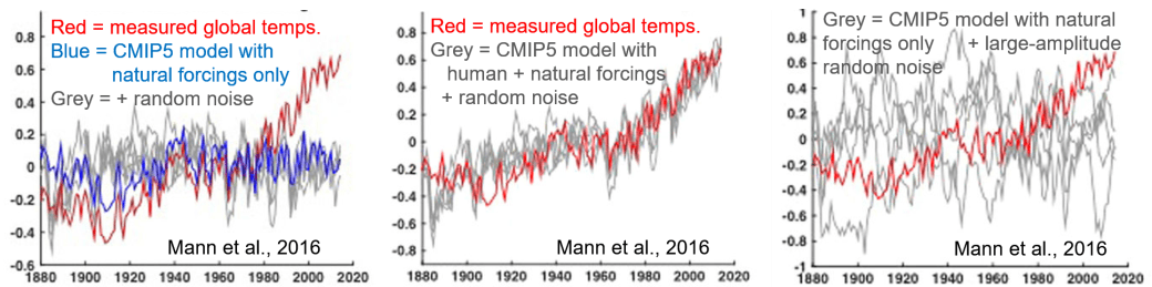
A question that can be addressed with this comparison is whether the late 20th century rise in temperatures can be understood within the framework of these current GCMs if one does not include human-induced warming. The answer is no, as revealed in the left-hand frame of Fig. 15, taken from the same 2016 paper by Mann, et al. One can still not reproduce the recent observed trends when (any of five different versions of) random noise is added to the model calculations (grey lines in Fig. 15) to mock up the climate fluctuations not yet incorporated within the model. However, as revealed in the middle frame of Fig. 15, the reproduction of data is quite convincing when the random noise is added to the full GCM including human as well as natural forcing mechanisms. One could try adding random noise of much larger amplitude to purely natural forcings, as in the right-hand frame of Fig. 15, but such attempts fail to reproduce the systematic observed temperature rise since 1970. Within the GCMs, human-induced greenhouse gas emissions are the primary driver behind the late 20th century global temperature rise. So it is no wonder the Heartland document seeks to discredit the models.
Figures 14 and 15 demonstrate that current GCMs are certainly capable of explaining the observed trend in global temperatures after the fact. But how can we judge their predictive power? The Heartland booklet claims several failed GCM predictions. The “jewel” of climate science deniers is the observation that global temperatures did not rise during the period 1997-2015, despite GCM predictions that human activities should have caused a 0.3°C increase during that interval. The Heartland booklet includes Fig. 16 (though without our annotation), taken from Monckton, et al. (2015), as evidence for this stabilization of global temperatures.

As we have explained, the climate is affected by many factors, including ones whose occurrence is difficult to predict years ahead of time: volcanic eruptions, small fluctuations in solar activity (beside the normal 11-year solar cycle), el niño and la niña ocean current phenomena. In addition, the GCMs clearly omit some effects, mocked up in Fig. 15 by random fluctuations of typical magnitude 0.2ºC. Furthermore, as we will see in the following subsection, there is some significant range in the possible sensitivity of temperature to greenhouse gas concentrations, so that GCM predictions always have an uncertainty band associated with them. It is then always possible to cherry-pick a time interval where the currently unpredictable factors may counterbalance a human-induced temperature change of only a few tenths of a degree. The GCMs are best used to predict long-term average trends, which are fairly clear in Fig. 14 and are not seriously affected by the relative stability of atmospheric temperatures since the turn of the century. The time interval spanned in Fig. 16 is also included in Figs. 14 and 15, and the GCMs have no difficulty reproducing the average trend through that time period as well as others.
Figure 17, not shown in the Heartland booklet, illustrates that within the GCMs the apparent stability of surface temperatures this century is attributed to the net effect of specific volcanoes, solar activity reduction (see Fig. 4, Part I) and el niño, superimposed on the ongoing, steady rise of temperatures associated with human activity. It is unreasonable to expect the unpredictable factors to continue to counterbalance the inexorable rise from greenhouse gas emissions throughout the century, without some inside information that the Sun will continue to weaken on a century-long time scale.

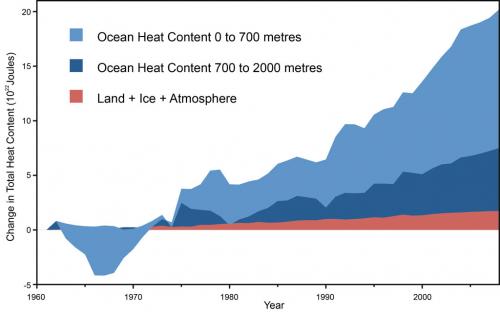
Furthermore, surface temperatures alone do not tell the full story about warming of the Earth. Global climate models indicate that more than 90% of the heat added to the planet is presently going into the oceans. And as indicated in Fig. 18, the heat content of Earth’s oceans has continued to rise steadily in the 21st century.
The next model forecast “failure” highlighted in the Heartland booklet is the “prediction” that there should exist a thermal hot spot in the upper troposphere in tropical regions. The authors use Fig. 19 to argue that the predicted hot spot is not there in measurements. This is an example of taking a fairly technical and peripheral issue, about which measurements from various sources disagree, and puffing it up as indisputable evidence of model failure.
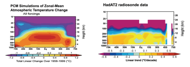
The left-hand frame of Fig. 19 is a blow-up of a figure shown in the IPCC 4th Assessment Report, representing climate model calculations of atmospheric temperature changes from 1890 to 1990. The thermal hot spot in question is a model result that has relatively little to do per se with the source of observed warming over that time period. Rather, it reflects the fact that surface warming by any mechanism releases moisture into the atmosphere, and increased moisture leads to a reduced rate of cooling as you go up in altitude. The effect is greatest in tropical regions, because they have the most moisture in the air. Such a hot spot would be expected for any source of warming, whether associated with human or with natural drivers. And since the climate models were tuned to reproduce measurements that clearly showed significant warming in the 20th century, they were bound to show such an effect. The fact that human activity was a major driver of the warming in these models showed up in these calculations via a cooling of the stratosphere, in contrast with the warming of the troposphere (see Fig. 5, Part I).
The predicted hot spot does, in fact, show up in measurements made over short timescales. But the data from different sources for long timescale changes disagree, and are somewhat spotty. Some temperature measurements by weather balloons, such as those represented in the right frame of Fig. 19, and by some satellites appear to not show the tropical hot spot, while other data from wind speed measurements by weather balloons or temperature measurements by other satellites are consistent with the predictions. The issue, then, is both unsettled and not really relevant to the primary question of whether human activity is contributing to global warming. But you wouldn’t know this from the Heartland booklet.
Another failed GCM prediction according to the Heartland booklet concerns the predicted warming of Earth’s polar regions. The booklet claims, “Late twentieth-century warming occurred in many Arctic locations, and also over a limited area of the West Antarctic Peninsula, but the large polar East Antarctic Ice Sheet has been cooling since at least the 1950’s.” It is true that land ice mass in East Antarctica appears to have been growing, although different satellite measurement methods disagree on the rate of that growth, and on whether the net land ice mass in Antarctica has been decreasing or slightly increasing. The satellite measurements to date do not take into account the very recent break-off of a major portion of the Larsen B ice shelf. But in any case, the evolution of the land ice mass does not imply cooling of the sea water east of Antarctica. Measurements indicate that Earth’s southern oceans have, in fact, been warming faster than the global average. A warming climate has been predicted to increase Antarctic snowfall. And the Antarctic ice mass is further affected by the late 20th-century ozone hole above Antarctica (see our post The Ozone Layer Controversy), by changes in ocean circulation currents, etc. It is a complicated local issue that does not, in any way, negate the observation of global warming.
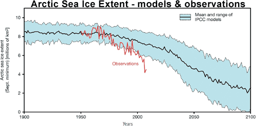
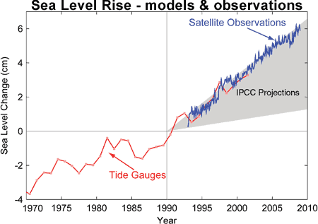
The Heartland booklet does not mention predictions of GCMs that have been shown by subsequent measurements to fall on the conservative side of global warming effects. For example, Fig. 20 shows that Arctic sea ice has been melting even faster than the projections from the IPCC 4th Assessment Report, while Fig. 21 shows that observed global sea level rise is at the upper end of the uncertainty band associated with the IPCC predictions. The melting of polar ice contributes to the overall sea level rise resulting from global warming.
4c. Feedback and the Sensitivity of Global Temperatures to Carbon Dioxide Concentrations
The Heartland booklet admits that greenhouse gas concentrations in the atmosphere have been growing, although it does not show any of the graphs (e.g., see Figs. 1 and 7, Part I) that illustrate the rapid rate of increase. The booklet furthermore accepts the basic physics of greenhouse gas absorption and re-radiation of infrared heat. It claims: “A doubling of CO2 from pre-industrial levels (from 280 to 560 ppm) would likely produce a temperature forcing of 3.7 Wm-2 [watts per square meter] in the lower atmosphere, for about ~1°C of prima facie warming.” This estimate is in basic agreement with the IPCC estimate of surface temperature sensitivity to a doubling of CO2 level of 1.2°C from direct warming via heat re-radiated toward Earth from carbon dioxide molecules in the atmosphere.
It is the effects of secondary feedback mechanisms on the climate that introduce the greatest uncertainty in global climate model predictions and allow the Heartland authors to claim that the consensus sensitivity values are much too large. Examples of feedback mechanisms include the following: the warmer atmosphere holds more water vapor, another greenhouse gas that further increases the warming; melting ice reduces Earth’s reflectivity of incident sunlight, thereby increasing the warming; increased water vapor in the atmosphere increases the formation of clouds that reflect infrared radiation back toward the surface (increasing warming further), but also reflect incident sunlight before it reaches the surface (thereby decreasing warming). The first three of these effects are sources of positive feedback, while the fourth is an example of negative feedback.
The Heartland document claims that, in contrast to IPCC estimates, the net feedback effect is negative because the IPCC has neglected or underestimated cooling effects from low-level clouds, from increased ocean emission of dimethyl sulfide, and from the effects of aerosols, among others. It quotes Monckton, et al. (2015) in citing 27 peer-reviewed articles “that report climate sensitivity to be below current estimates.” Thus, the Heartland authors claim that a doubling of CO2 levels will likely raise global temperatures by only ~0.3-1.0°C, as opposed to the estimate from the IPCC 4th Assessment Report: “likely to be in the range 2 to 4.5°C with a best estimate of about 3°C, and is very unlikely to be less than 1.5°C. Values substantially higher than 4.5°C cannot be excluded, but agreement of models with observations is not as good for those values.”
The important fact that the Heartland document ignores is that the feedback mechanisms they discuss (with the possible exception of commercial aerosols) are also active for any driver of past climate changes, whether those drivers are Earth orbit changes, changes in solar activity, volcanoes, or increased greenhouse gas levels. The basic question is how surface temperatures respond to a given change in radiative forcing, i.e., in the power imbalance between energy arriving at and leaving the Earth. For example, Fig. 22 shows estimates of climate sensitivity deduced from many analyses of the past large temperature changes that were illustrated in Fig. 1 (Part I), or even earlier in geologic time. If the sensitivity were as low as claimed in the Heartland booklet, we would have no understanding of how Earth temperatures increased by typically 4-8°C after the ends of previous ice ages. The estimates in Fig. 22 are all consistent with the IPCC sensitivity range estimate.
 Figure 22. Various paleoclimate-based estimates of equilibrium climate sensitivity (in ºC temperature rise for a radiative forcing change of 3.7 watts per square meter, equivalent to a doubling of pre-industrial CO2 levels), for a range of geologic eras. The horizontal bars give the uncertainty in the sensitivity deduced from each analysis. Nearly all the analyses give sensitivities in the 2—4.5ºC range.
One might be concerned that conditions today are sufficiently different from those characterizing the emergence from past ice ages that the sensitivity estimates in Fig. 22 are no longer applicable. But independent estimates of climate sensitivity deduced from GCM analyses of recent volcanic eruptions and of responses to the 11-year solar cycle (which changes radiative forcing by only about 1/4th as much as a CO2 doubling) fall in the same range of values as those shown in Fig. 22. Furthermore, the majority of global climate models give sensitivities in the same range. So how do Monckton’s 27 cited articles argue for much lower sensitivity?
Most estimates of low climate sensitivity result from analyses of recent (sometimes cherry-picked) temperature measurements with models that are much less sophisticated than the GCMs. For example, they may rely on overly optimistic estimates of the time scale needed for Earth’s climate to reattain thermal equilibrium after it is perturbed. The actual time scale is likely to be substantial when so much of the increased heat is stored in the oceans, as indicated in Fig. 18, and released to the surface only slowly over time.
The Heartland arguments for low climate sensitivity highlight a few serious internal inconsistencies in their booklet. They claim that CO2 increases lagged behind all temperature changes in past deglaciation periods (a claim refuted in Part I, in the discussion of Figs. 10 and 11), and therefore did not cause any of the reconstructed temperature increases. But if this were true, then the climate sensitivity to the radiative forcing from Earth orbit changes would have to be even much larger than the IPCC estimates to account for the large temperature changes following emergence from past ice ages. They seek to discredit global climate models because they are imperfect, but the references they include for low climate sensitivity rely instead on far less sophisticated models that omit many more effects.
The imperfections in the GCMs are reflected in the substantial uncertainty bands accompanying IPCC projections. The fact that the projections have uncertainties is not sufficient reason to ignore them. Rather, the uncertainties should be included, along with measurement uncertainties, in any comparison of the GCM projections with climate data.
Some suggestions for leading student discussions of material in Part II of this post:
- Discuss with students how science progresses and the central role of building and testing “imperfect” models
- Ask students what they note in the comparison of Figs. 13 and 14. Are the model calculations very different between the two figures? Are the experimental results very different? Where might the observed differences come from? How do those differences affect one’s conclusions?
- Discuss uncertainties in model predictions: how might they arise? How should they be taken into account? Can they think of other instances where we are faced with uncertain predictions, but nonetheless act upon the predictions (the projected paths of hurricanes could be one example)?
- Ask students how they would estimate the quantitative reliability of climate model temperature calculations from the comparison in Fig. 14.
- Discuss Fig. 17 and how unpredictable year-to-year events like volcanoes and el niño may have effects larger than global climate model uncertainties, without affecting the average climate behavior over long time periods.
- Allow the students to discuss whether they find the comparisons in Fig. 15 to offer convincing evidence of an important human role in recent global warming.
- Ask students why they think so much heat might be stored in Earth’s oceans, and how this might contribute to sea level rise.
- Ask students if they can find any inconsistency between the Heartland booklet’s claims that the warming after past ice ages was entirely due to Earth orbit changes and that the sensitivity of global temperatures to changes in Earth’s energy imbalance is much smaller than global climate model estimates.
— To Be Continued in Part III —
