
August 10, 2026
I. Introduction
If you have the feeling that extreme weather events – extended heat waves, severe storms, floods, droughts, forest fires – are occurring more frequently in recent years than they used to, actuarial statistics back you up. For example, Fig. I.1 is a graph we have used in several of our previous posts, showing statistics of worldwide natural catastrophe events from 1980 to 2018 maintained by the world’s largest reinsurance company Munich RE. Over that period the frequency of geophysical catastrophes – earthquakes, tsunamis, and volcanic eruptions – has remained approximately constant, as revealed by the red sections at the bottom of each bar in the graph. In contrast, the extreme weather events included in the green, blue, and orange bars, have more than tripled in frequency over the same time period.
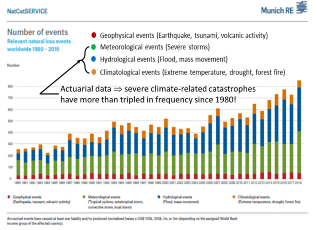
In order to be counted in Fig. I.1 loss events must have caused at least one human fatality and/or losses equivalent to at least $3 million for first-world countries, with costs adjusted for inflation. Critics who deny the existence or severity of ongoing climate change often discount the relevance of financial damages in such accounting. For example, the Heartland Institute has claimed that “the number of climate-related disasters, as well as the number of victims from those disasters, has been declining over the past hundred years” by ignoring financial damages and focusing only on human victims. Similarly, Bjorn Lomborg has stated that “far fewer people are dying from natural disasters such as hurricanes and wildfires than they did a century ago.“ These contrarian claims fail to point out that rapid improvements in weather forecasting, building construction, air conditioning, etc. over the past half-century have vastly improved preparations and evacuations in anticipation of approaching extreme weather. Those improvements have limited human fatalities but not the frequency of extreme weather events.
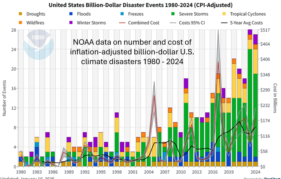
The situation in the U.S. is at least as bad as the worldwide statistics shown in Fig. I.1. Figure I.2 shows statistics maintained by the National Oceanic and Atmospheric Administration (NOAA) for the number and cost of billion-dollar extreme weather disasters in the U.S. from 1980 to 2024, with the costs adjusted for inflation. The number of events in this class, and particularly of severe storm disasters, has increased by almost an order of magnitude since 1980. The average time between the disasters included in the figure has dropped from 82 days in the 1980s to 19 days over the past decade. The average annual cost of dealing with extreme weather disasters in the U.S. is now about $150 billion. Because the growth is alarming, the second Trump administration has now ordered NOAA to stop monitoring U.S. climate disasters. This action is typical of the Trump administration; when their narratives are challenged by data, their solution is to cease measuring the data.
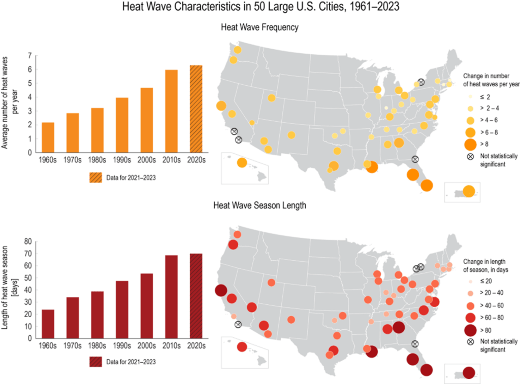
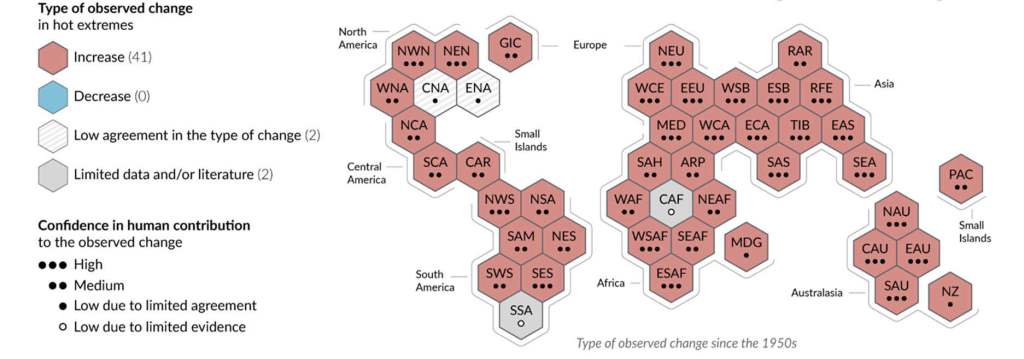
Temperature records from 50 large U.S. cities reveal that the frequency and length of heat waves have both tripled from the 1960s to the 2020s, as revealed in Fig. I.3. The Intergovernmental Panel on Climate Change (IPCC) concluded with a high degree of certainty in its Sixth Assessment Report that extreme heat has been a global consequence of climate change, with hot extremes increasing in frequency and intensity, while cold extremes were decreasing in frequency and intensity, over 80% of global land surfaces. Their synthesis of these trends for all regions of the globe and their confidence in the human contribution to these trends are summarized in Fig I.4.
21st-century heat waves have been responsible for many hundreds of thousands of human deaths worldwide. U.S. deaths have been limited by the wide availability of air conditioning: U.S. heat-related deaths increased from 1069 per year in 1999 to 2325 per year in 2023. The largest death toll from extreme heat has been in Europe and Asia. For example, “in 2003, 70,000 people in Europe died as a result of the June–August event. In 2010, 56,000 excess deaths occurred during a 44–day heatwave in the Russian Federation.” Exposure to intense heat is getting rapidly worse: “Heat-related mortality for people over 65 years of age increased by approximately 85% between 2000–2004 and 2017–2021.”
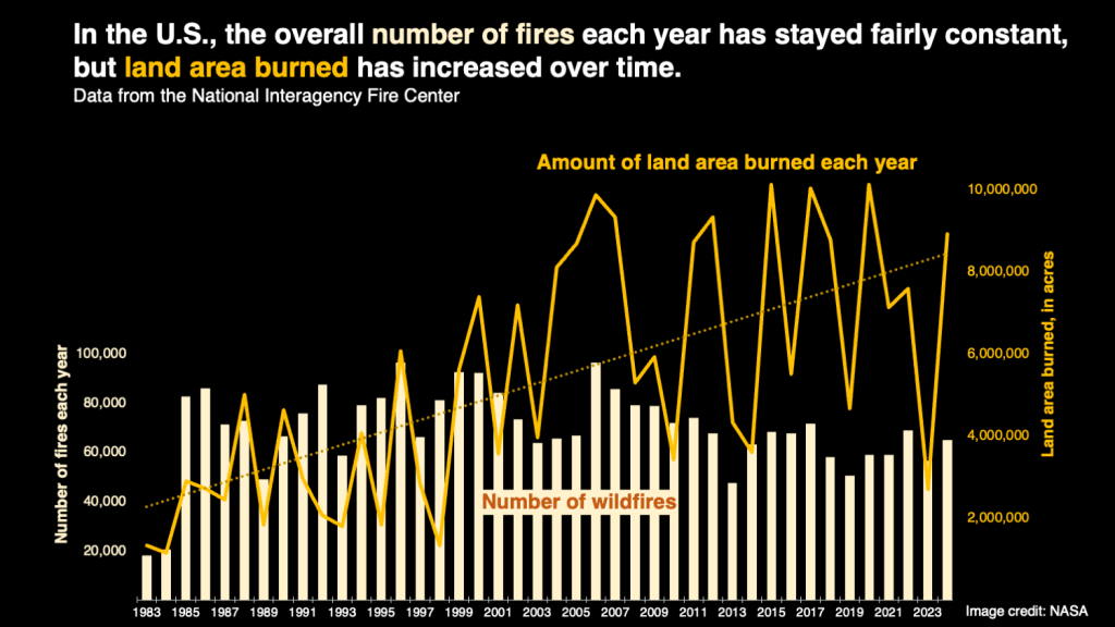
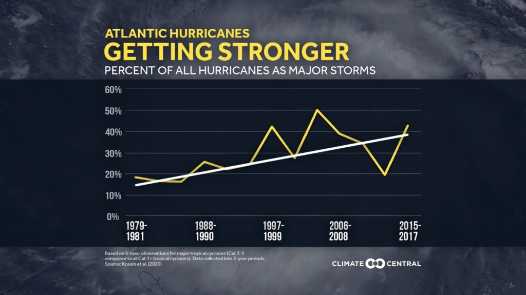
Some types of extreme weather events have not increased in frequency but have increased in severity over the past half-century. For example, statistics maintained by the National Interagency Fire Center reveal (Fig. I.5) that the overall number of wildfires in the U.S. has stayed fairly constant since the 1980s, but the total land area burned has increased in recent decades. Similarly, while the number per year of hurricanes forming in the Atlantic Ocean has held relatively constant, the fraction of those hurricanes that reach severe status (Categories 3-5) has increased significantly since 1980 (Fig. I.6). In both of these cases, there are large year-to-year fluctuations, but the overall trend is clear.
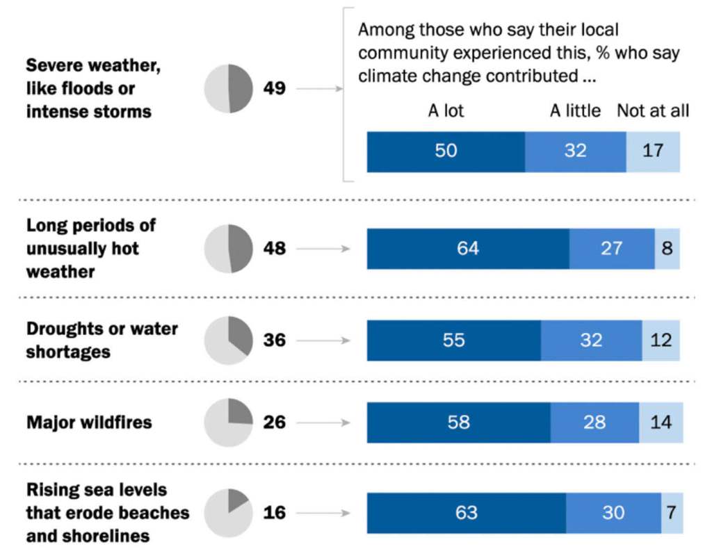
It seems natural to attribute the growing impact of extreme weather events to ongoing climate change caused primarily by human emissions of greenhouse gases into Earth’s atmosphere. The Heartland Institute, Bjorn Lomborg, and other holdouts deny this causal relationship, but the American public increasingly accepts it. As indicated in Fig. I.7, 80-90% of Americans whose communities have experienced extreme weather events recently judge that climate change has contributed either a lot or a little to the occurrence.
Despite the growing statistics and the widespread belief that climate change is playing an important role, it is not possible to state with certainty that any specific extreme weather event has been caused by climate change. But over the past decade there has been rapid growth in a new scientific subfield – Extreme Event Attribution (EEA) – that aims to assess quantitatively how much climate change may have increased the probability of occurrence or the severity of any particular event. The status of research in this field has been very recently reviewed in a report by the National Academies of Sciences, Engineering and Medicine (NASEM), Attribution of Extreme Weather and Climate Events and Their Impacts (2026).The report (Fig. I.8) was made public several days before Donald Trump and several Republican Senators started talking about removing federal funding from NASEM, despite its long track record as the most trusted scientific organization in the U.S.
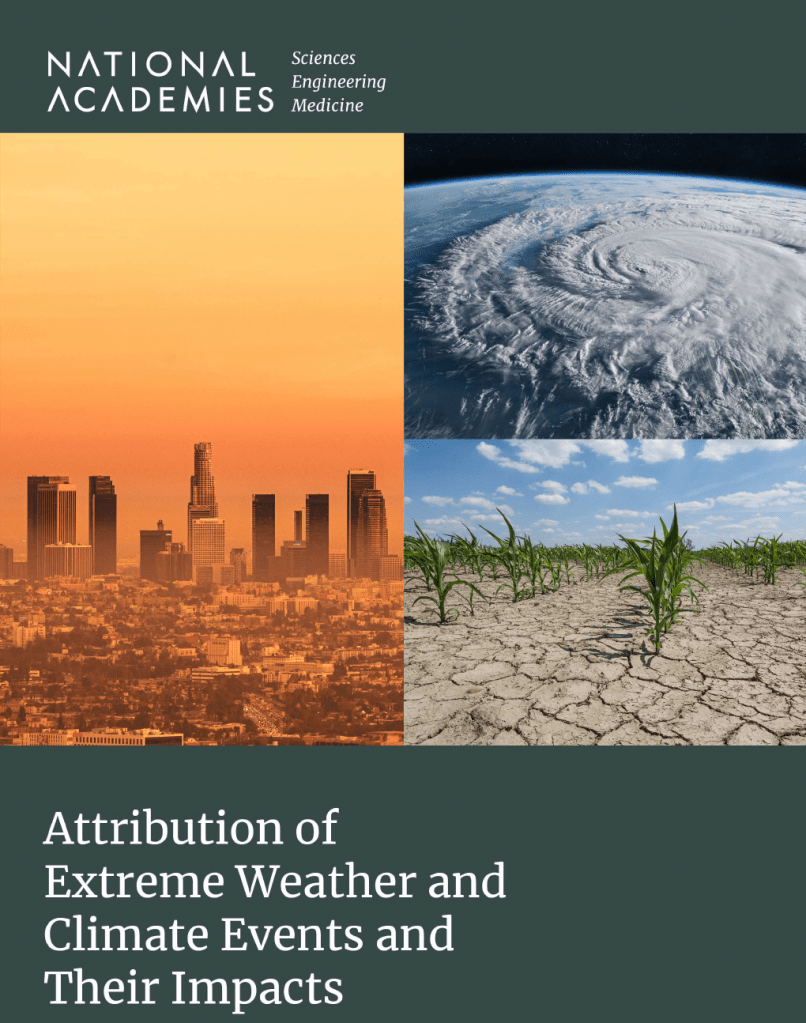
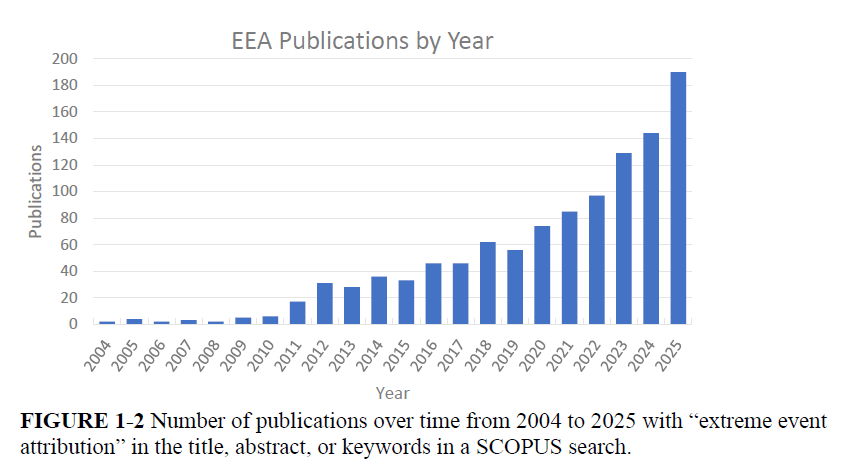
Figure I.9, taken from the NASEM report, shows the rapid growth in EEA publications over the past decade. In this post we will describe the basic approaches to EEA (Section II), several examples of analyses for particular extreme weather events (Section III), and an assessment of the current status and outlook for EEA efforts (Section IV).
You may wonder why it matters how much we can attribute specific extreme weather events to human-caused climate change. If we understand how human activities have affected past extreme events, that understanding can inform risk assessments, insurance rates, and preventive or adaptive measures for possible future events, as well as informing design improvements for vulnerable structures to withstand future extreme weather events across a warming globe. Many fossil fuel companies are also deeply worried that their legal liabilities may explode if litigants rely on credible scientific assessments of the degree to which extreme weather events they have suffered through have been exacerbated by the burning of fossil fuels.
II. Basic Approaches of EEA
We often characterize climate change in terms of the increases in global mean temperature. But extreme weather events are far from the mean; they represent fat tails in climate probability distributions. Figure II.1 illustrates how a modest shift in a climate probability distribution can dramatically alter the likelihood of extreme events. The curves in the figure might represent a schematic indication of the daytime temperature probability distribution at a particular time of year in a particular location, with (dashed) and without (solid) climate change taken into account. Climate change increases the most probable temperature but also slightly broadens the probability distribution, perhaps because global warming enhances the year-to-year fluctuations associated with the oscillation between El Niño and La Niña episodes. The result is that the likelihood of extreme hot weather events, shaded in dark red in the figure, is greatly enhanced while the likelihood of extreme cold weather (dark blue shading), already small without climate change, is greatly reduced. In fact, the IPCC, in its 6th Assessment Report, claims with high certainty that “hot extremes have increased in frequency and intensity, while cold extremes have decreased in frequency and intensity over more than 80 percent of the global land surface” (see Fig. I.4).

The curves in Fig. II.1 could equally well represent distributions for different climate observables, such as maximum daily rainfall in a region that is growing wetter with climate change or vapor pressure deficit, which measures the dryness of the air – literally, the amount by which moisture in the air falls short of its saturation value for given conditions – in a region that is growing more prone to drought with climate change. The basic aim of extreme event attribution (EEA) efforts is to assess how shifts in climate variables induced by climate change affect the likelihood or the magnitude of extreme weather events. Although there are different approaches to EEA, all of them follow the four basic stages outlined in Fig. II.2.
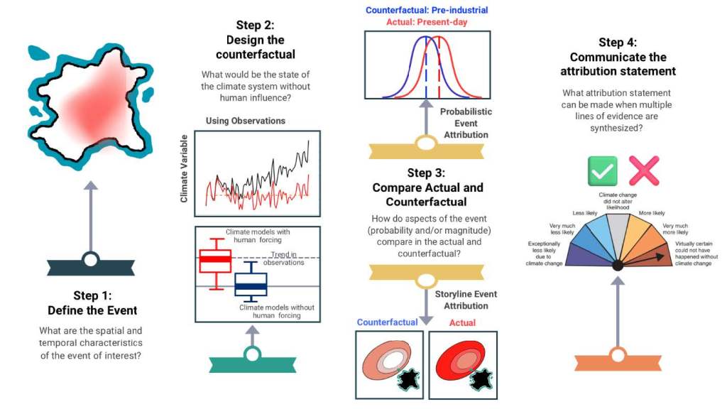
The first step in any EEA study is to carefully define the extreme weather event of interest: its relevant climate variables and its spatial and temporal boundaries and distributions. For example, a heat wave in a specific region might be characterized by several relevant variables: the maximum daily temperatures reached, the weekly average temperatures, a metric combining temperature and humidity, the number of consecutive days above 100°F, or the strength of the atmospheric high-pressure system associated with the heat wave.
A crucial second step is to design the “counterfactual event,” that is, what the distributions of the relevant climate variables would look like in the absence of human-caused climate change. This can be done most reliably if one is dealing with a region and climate variables that have been well measured and recorded over a long period of time, so that one can use or extrapolate from measurements made at a time before the onset of serious global warming, for example, in the preindustrial period. When such an extended track record is not easily accessible, EEA analysts may rely instead on sophisticated climate models tuned to reproduce the current observations, in which one can turn off the climate forcing caused by human emissions of greenhouse gases. This approach introduces model uncertainties and can be complicated if one is dealing with a localized event because current global climate models do not always have sufficient spatial resolution to treat the locality of interest accurately. Alternatively, one may rely on previously established correlations between the climate variables of interest and global mean temperature and use that correlation to assess the variable distributions before global warming took serious hold.
The critical third stage is to compare the actual measurements during the extreme event of interest to the counterfactual event, in order to assess how much the event has been influenced by human-caused climate change. Here, there are two distinct EEA approaches. In probabilistic EEA, the aim is to assess how climate change has altered the likelihood or the intensity of the type of extreme event under study. In storyline EEA (also called conditional EEA), one focuses less on probability distributions and tries to assess how climate change has altered the thermodynamic drivers of a specific event, given similar dynamic conditions (e.g., air or ocean circulation patterns), and thereby determine how climate change has affected the magnitude or intensity of the event — for example, the wind strength or rainfall associated with a hurricane that has formed in a particular ocean region and followed a particular trajectory toward landfall.
In probabilistic approaches one aims to assess the probability of the event’s occurrence under actual (Pa) and counterfactual (Pc) conditions. The metrics usually used to quantify the climate change influence are either the risk ratio of Pa/Pc or the fraction of attributable risk (FAR) given by
FAR = 1 – Pc/Pa.
When there is no climate change enhancement (Pc=Pa), FAR = 0. When climate change doubles the event’s probability (Pa=2Pc), FAR = 0.5. And for an event that is extremely unlikely without climate change FAR approaches 1.0. Sometimes the probability of a rare event is characterized by its return period (e.g., a once-per-hundred-year storm or flood), and the climate change effect is given by the change in the return period in the actual vs. counterfactual conditions.
Examples of storyline EEA conclusions are that a 2023 heat wave in Mexico and Texas was about 1.3°C warmer than it would have been without human-caused climate change and that 2022 floods in Durban, South Africa, involved at least 40% more rainfall due to climate change. The latter case is one of the specific examples of EEA we will discuss in Section III. The examples there will help to elucidate the range of approaches to extreme event attribution. Storyline analyses are especially effective in considering the impact of a single aspect of climate change on the magnitude of a particular event.
The final step in EEA analyses is to formulate the attribution statement, preferably with quantitative estimates and uncertainties of the effect of climate change on a particular event or a class of events in a given region. According to Swain, et al., “Most EEA approaches use a very high bar for attribution: the typical null hypothesis is that human-caused climate change did not influence the magnitude or probability of the event, and rejecting that null requires a ‘beyond a reasonable doubt’ standard. If there is sufficient evidence of a statistically distinguishable difference in the actual versus counterfactual climate, the null hypothesis can be rejected, and an affirmative attribution statement can be made at a specific confidence level. Given the multiple sources of uncertainty, attribution statements often include multiple components (i.e., ‘there is a 95% likelihood that global warming increased the probability of the event by at least a factor of 2.86’).”
Uncertainties arise in EEA studies from the construction of the counterfactual and its comparison to the actual event. If one uses past measurements to construct the counterfactual there can be uncertainties associated with changes over time from sources other than human emissions of greenhouse gases. The uncertainty can be sizable if one is dealing with very rare events, for which there is sparse historical data. If one uses climate models to construct the counterfactual, one can try to assess model uncertainties by comparing results for comparison to counterfactuals constructed with different models. There can also be uncertainties arising from inexact matching of spatial boundaries between the actual and counterfactual events, since there is not enormous freedom in choosing model boundaries. In storyline approaches there is additional uncertainty arising from inexact matching of the dynamic conditions that surround the actual event.
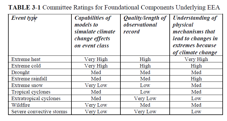
The degree of confidence in EEA analyses for different event classes depends basically on three factors: the level of understanding of the physical mechanisms that lead to changes in extremes as a result of climate change; the quality and length of the observational record that may inform the construction of the counterfactual event; and the degree of confidence in climate models used to simulate climate change impacts on the event class. Figure II.3 contains a table recording the National Academies committee’s ratings of the current level of confidence in those three factors for various extreme event classes. Some of the event types with the lowest model capability ratings, including extreme snowfall, wildfires, and convective storms, represent the fact that global climate change models of necessity use very large spatial and time grids to calculate observables. Since these extreme events generally occur over much smaller areas and smaller time intervals, new techniques are needed to model the specific event on a much finer spatial grid and then match those local conditions with the much coarser grids for global climate change models. Such techniques are now being employed for some types of events, as described in Section III. However, it may take some time before the uncertainties of such models are fully understood.
III. Examples of Extreme Event Attribution
In this Section we will review the analysis of four extreme events and show how they were analyzed and the conclusions drawn by the authors of these studies. We will look at both probabilistic and storyline analyses of events, and we will include examples of four different types of extreme events. These examples should show how the methods of attribution science are applied to real-world extreme events.
Extreme Heat Waves:
Global climate change has caused temperatures to rise across the globe. One type of event for which human-caused, or anthropogenic, effects play a major role is in heat waves of unusual severity. Here, we will consider a heat wave that occurred in Europe from June to August 2003. As far as we can tell, the European summer of 2003 was the hottest since at least 1500 B.C.E. It is estimated that this heat wave caused 70,000 additional deaths across Europe, and particularly in Germany, France and Italy. Figure III.1 shows European temperatures during the period July – August 2003, compared to average summer temperatures over the period 2000 – 2004. Temperature increases of up to 10o C (or 18o F) were recorded in areas of France, Germany and Italy. The hottest temperature during that period was 47.3o C (117.1o F) at Amareleja, Portugal. Figure III.2 shows the daily mortality rate in Baden- Wurttemberg, Germany from January 2002 through August 2003. The black spiky curve is the daily mortality rate for that state, while the red curve shows the mean seasonal average mortality. The peak in August 2003 represented 900 – 1,300 extra deaths in a state with a population of 10.7 million people.


Stott and collaborators constructed a probabilistic model to assess the 2003 European heat wave. Their goal was to calculate how much anthropogenic effects in climate change may have increased the risk of a heat wave of the magnitude of the 2003 event in Europe. Theirs was really the first publication in extreme event attribution. The group used Hadley Centre Coupled Model version 3, or HadCM3, a general circulation model to calculate European land temperatures over a period from 1851 (preindustrial) to 2003 (industrial). They used a regression model to estimate the contributions of various factors to land temperatures. The counterfactual case here was one where all human-caused contributions to summer temperatures were set to zero in the model. Alternatively, they could use climate models from an earlier era when anthropogenic contributions were negligible. Figure III.3 shows the summer temperature changes in Europe in the 1990s. The horizontal line at 0.0 represents the average summer temperatures that occurred in pre-industrial times. The red curve centered at a temperature change of 0.5 Kelvin (equivalent to 0.5°C) is the result when all external climate drivers are included in the model, while the green curve centered at zero is the result when all anthropogenic effects have been removed. These early climate models undoubtedly underestimated the tails in temperature probability distributions. Nonetheless, Fig. III.3 shows that human-caused effects produced the dominant changes in high temperatures experienced during European summers around 2003.

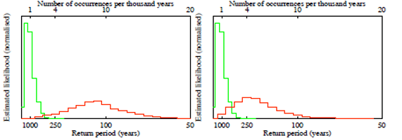
Next Stott and collaborators calculated the number of times a heat wave of the intensity of the 2003 event would occur every thousand years (the top scale on Fig. III.4). The green curve shows the “return period” calculated with no anthropogenic drivers included, while the red curve shows the result when human-caused factors are included. The “return period” is the average length of time before another heat wave of this magnitude occurred in Europe. In the left plot, an extreme value distribution was used for temperature probability distributions in both industrial and preindustrial cases; in the right plot a Gaussian distribution was used for the industrial case. The return period is sensitive to the choice of function, specifically for the size of the probability distribution tails, for the industrial and preindustrial cases. With the extreme event distribution, as many as ten massive European heat waves would occur in the next millennium, while approximately four heat waves would occur when the Gaussian distribution was used. However, in both cases without human-caused climate change, only about one such massive heat wave would occur in the next thousand years.
Next, Stott et al. calculated the fraction of attributable risk or FAR, where
FAR = 1 – Pc/Pa.
In this equation, Pa is the probability of the actual event (here, with summer temperatures exceeding preindustrial results by 1.6°C on average) including all contributions, and Pc is the “counterfactual” result. In this case, Pc represents temperature increases where all human-caused contributions are set to zero. Figure III.5 shows the FAR calculated using two different functional forms; on the left, an extreme value distribution was used for both industrial and preindustrial cases; in the right plot a Gaussian distribution was used for the industrial case. The vertical lines represent the average FAR for both situations.

In the left plot of Figure III.5, the average FAR is about 0.85, while for the right plot the average FAR is roughly 0.75. The precise quantitative results for the FAR are sensitive to the choice of functional form for the probabilities, which also affect the return periods shown in Fig. III.4. However, the qualitative features of this scenario are the same. Stott, et al. concluded that there is over a 90% probability that human-induced factors have at least doubled the risk (FAR > 0.5) of a record hot summer of the magnitude of the European heat wave of 2003.
Extreme Rainfall:
Global climate change has produced a situation where many parts of the globe will likely experience dramatic increases in drought in coming decades. At the same time, because of rising sea surface temperatures and other changes, some areas will experience significantly larger events of extreme rainfall. Here, we will examine one such event, centered around Durban, South Africa. During a few days in April 2022, this area experienced a period of extensive rainfall, which led to massive loss of life and damage to property. We will show how a South African group carried out calculations designed to deduce the extent to which the extreme rainfall was affected by climate change.
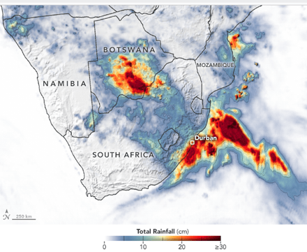
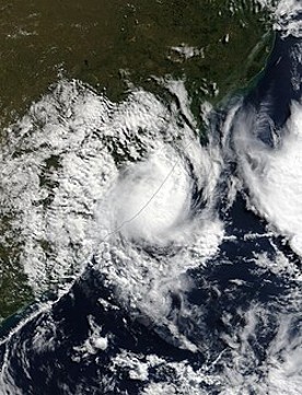
Durban is the third-largest city in South Africa, after Johannesburg and Cape Town. It is located on the east coast of South Africa, on the Natal Bay of the Indian Ocean. In 2022 the Durban metropolitan area had a population of 4.2 million people. On April 8, 2022, heavy rainfall occurred across central and eastern South Africa. Figure III.6 shows the total rainfall in the period April 7 – 13. The city of Durban was especially hard hit, with some areas recording as much as 45 cm (or 18 inches) of rain. This amount of rainfall is nearly 50% of the total yearly average precipitation in Durban. On April 11, Subtropical Depression Issa formed off the coast of Kwa-Zulu Natal province. Figure III.7 shows an aerial photo of Subtropical Depression Issa over the South African coast. Much of the rain that pelted Durban fell during the next few days. The provincial government reported that the storm caused 544 fatalities and greater than US $3.6 billion in damages. They reported that 3,927 houses were destroyed by the storm and another 8,097 houses were partly destroyed. Many roads were washed out and bridges collapsed.
By necessity, most global climate models do not have the spatial resolution to treat meso-scale events such as a single tropical cyclone, meso-scale low-pressure event, or thunderstorm. The group of Francois Engelbrecht, et al. analyzed the Durban floods using a “convection-permitting conditional extreme event attribution modelling system.” This represented a conditional or storyline approach, where a model was designed to apply to one specific situation, namely the extreme rainfall over Durban. Such a model was designed to determine the role of climate change in meso- and convective-scale extreme weather events. The calculation scheme starts with conventional climate models which have relatively low spatial resolution, and couples them to a high-resolution grid centered around the area of interest, in this case the Durban metropolitan area. The calculations were carried out on a high-performance computer in South Africa.
For these calculations, the counterfactual situation is one in which the changes in climate over the past 40 years have not occurred. The boundary conditions for this hypothetical “cooler world” are adjusted to account for changes in observables such as sea surface temperatures, atmospheric temperatures, moisture in the atmosphere, and circulation patterns. For this, the authors used ERA5 reanalysis data. This is a global climate data set compiled by the European Centre for Medium-Range Weather Forecasts, which provides information about the Earth’s atmosphere, land and oceans, and tracks changes in many quantities over several decades. This data set allows estimates of how observables have changed over time.
The Engelbrecht group solved the coupled equations to model the rainfall that preceded the Subtropical Depression Issa, and then the extreme low-pressure area that produced Issa. They ran a number of simulations for the climatic conditions that determined the extreme rainfall over Durban; they then simulated a “counterfactual cooler world” scenario where the contributions from global climate change had been subtracted out; and they projected what would happen in a hypothetical “future warmer world” that would be a likely result of continued climate change.
A crucial feature of their model is determining the location of the center of the low-mass system off the coast of Durban, that produced Subtropical Depression Issa. Figure III.8 shows the location of the actual low (green dot), as measured by the Metro-France weather tracking system. The results of the model calculation for the present (“2022 warmer world”) are the black dots; results for the counterfactual situation where driving forces due to climate change have been removed (“1979 cooler world”) are in blue, and results for a scenario where future climate change effects have been included (“future warmer world”) are shown in red. The results clearly show that without climate change effects, the low would occur significantly farther south than actually occurred. In the future, the low would occur at a point further north. The black dots are in rather good agreement with the actual event (green dot), and the spread of the black dots gives a qualitative picture of uncertainties in the model calculation.

Their median simulations produced the excess rainfall patterns shown in Fig. III.9 for the 2022 world compared to the counterfactual 1979 world (left frame) and for a hypothetical still warmer future world (middle frame) — constructed by doubling the changes in conditions from 1979 to 2022 – compared to the 2022 world. In the right-hand frame of the figure the ranges of model simulations for the two-day average rainfall within the greater Durban area are compared for five different sets of assumptions. The three middle boxes in that frame represent the changes from the counterfactual 1979 world (C ave) to the 2022 world (T) to the future warmer world (W ave), under the same climate changes as represented in the left and middle frames of Fig. III.9. The comparison of the bars labeled CM ave and WM ave indicate that the simulated change from 1979 to the future warmer world would be enhanced by taking into account also changes in atmospheric moisture levels, over and above sea-level pressure, sea surface temperatures, and atmospheric temperatures.

Based on their calculations, the Englebrecht group concluded that the rainfall experienced by Durban in the April 2022 event was at least 40% higher than it would have been in the absence of global climate change. Furthermore, continued global warming is likely to make such an extreme rainfall event even more severe. The method used by Engelbrecht (the large spatial grids used in global climate change models, coupled to a region around Durban with a much smaller grid) is quite promising for studying meso-scale effects. Similar calculations were carried out for Hurricane Harvey, a 2017 hurricane that emerged in the Caribbean but then “stalled” over Houston, dropping enormous amounts of rainfall on that city. However, this method is rather new, and it may take some time before uncertainties in the calculations settle down.
Tropical Cyclones (Hurricanes):
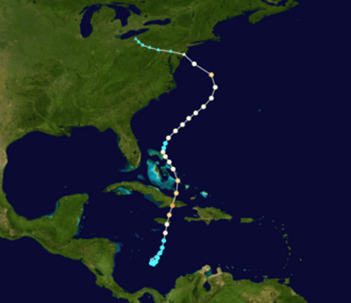
Hurricane Sandy was a large tropical cyclone that traveled through the Caribbean in October 2012. To date, it spanned the largest area of any Atlantic hurricane. The storm killed 254 people in eight countries and inflicted $70 billion in damage. However, most of the damage was inflicted on the Eastern seaboard of the U.S. after it became an extra-tropical cyclone. Figure III.10 shows the path taken by Hurricane Sandy. After originating in the Caribbean and reaching Category 3 as a storm, it continued up the Eastern seaboard of the U.S., where it was a Category 1 storm. Sandy took a sharp “left turn” when it reached the latitude of New Jersey and inflicted a great deal of damage in New York City.
Lin et al. investigated the Hurricane Sandy storm and the storm surge it created in New York City. They used a probabilistic model to examine the odds that a hurricane of this magnitude would be likely to hit New York City. They calculated the odds of a storm of this magnitude hitting NYC from 1800 to the present and extrapolated this to 2100. They also included the present and projected future contributions of anthropogenic climate change to the probability of a storm of this magnitude hitting New York City.
Climate change is causing significant effects that would increase the likelihood of very strong tropical cyclone impacts. First, we are seeing rising sea levels (RSL) around the globe. This is due to a combination of the expansion of sea water as its temperature increases, melting glaciers and ice shelves around the world, and subsidence of coastal lands due to increasing population and other factors. Calculations and measurements suggest that the average global sea level rise from 1800 to 2000 was between 13 and 18 cm. However, tide gauge measurements indicate that the sea level in New York City rose by 50 ± 8 cm during this same period. Variations in RSL around the world arise from changes in ocean circulation patterns, which can be impacted by climate change, from local tidal conditions, and from differences in land subsidence. Much of New York City’s land is currently sinking by 1-2 mm per year, providing an amplification of RSL that is independent of climate change.
In addition to RSL, warmer oceans provide more energy and evaporation to drive more intense hurricanes. Model calculations suggest that over the remainder of the 21st century, sea levels in New York will rise further between 0.5 and 1.0 meters. The analysis by Lin, et al., demonstrates that the rise in sea level means that New York City will be even more susceptible to damaging hurricanes with large and deadly storm surges. The storm surge from Hurricane Sandy was 2.8 meters (roughly 9.2 feet). There was extensive flooding in southern regions of Manhattan.
Lin and collaborators used the methodology of a 2012 paper on hurricane storm surges and climate change. For hurricane storm projections in 2000 they used an analysis from the National Centers for Environmental Prediction (NCEP). For climatic projections through the remainder of the 21st century, they used the results from four different global climate models (GCMs): one from the French Centre National de Recherches Météorologiques (CNRM); one from the Max Planck Institute (MCHAM); one from the Geophysical Fluid Dynamics Laboratory (GFDL); and one from Japan’s Center for Climate System Research (MIROC). Lin et al. assumed that the global climate models they used would determine the hurricane projections for the year 2100. They then connected the year 2000 conditions and those of 2100 through linear interpolation, to obtain predictions for conditions throughout the 21st century.
Figure III.11 shows the simulated variation in the hurricane return period in years as a function of the characteristic storm surge. The solid blue line, with the blue shaded region showing the uncertainty, represents the NCEP calculations that gave Hurricane Sandy a storm surge of 2.8 meters (the red horizontal line) and a return period of 398 years (here, the return period is the average predicted time between Hurricane Sandy and the next storm of equal size and strength). The predicted return period increases rapidly with the height of the storm surge. The dot-dashed and dashed blue lines represent the same NCEP calculations, but displaced, respectively, downward by the 50 cm lower NYC sea level in 1800 and upward by the mid-range predicted increase in NYC sea level by 2100. According to these simulations, the return period for a flood height of 2.8 m in 1800 would have been about 1200 years, three times higher than in 2012, simply because the sea level was much lower. By 2100 a storm reaching Sandy’s flood height would be expected to occur about once every 90 years under the NCEP analysis.

Using the four GCMs described earlier, the predictions for the storm surge of a hurricane in 2100, with the same return period (398 years) as Sandy, range from 3.5 m to 4.3 m. Conversely, if we look at the return periods of hurricanes in 2100 with the same storm surge (2.8 m) as Sandy, these return periods range from about 120 years to 22 years.
Figure III.12 shows the results as a function of year of various simulations using the NCEP analysis of Hurricane Sandy, together with the global climate model (GCM) projections from four different climate models. The top graph is the return period in years corresponding to the storm surge height (2.8 m) of Hurricane Sandy. The dashed curves are from the NCEP analysis, which includes only the results of rising sea levels. The solid curves include the results from different climate models, where the colors are those of Figure III.11. The return periods are sensitive to a number of different climate variables; but for this storm surge, the 2100 return periods range from 120 years to 22 years. The middle graph shows the storm surge height in meters vs. time, for a storm with the same return period (398 yr) of Hurricane Sandy. The bottom curve shows the estimated and projected sea levels at the Battery tide gauge in New York City vs. time. The green line represents measurements from the Battery, while the rectangles represent proxy measurements from Barnegat Bay, NJ gauges, and the blue line with shading represents climate-model predictions of future NYC sea rise.
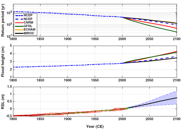
These results project that New York City is likely to see one to several more storms throughout the 21st century that pack the same storm surge as Hurricane Sandy (the devastation of the storm, both with respect to financial damages and to human lives lost, increases dramatically as the storm surge increases). Note that one of the climate models used here projects that by 2100, New York City will experience a hurricane with a 2.8 meter storm surge about every twenty years!
Wildfires:
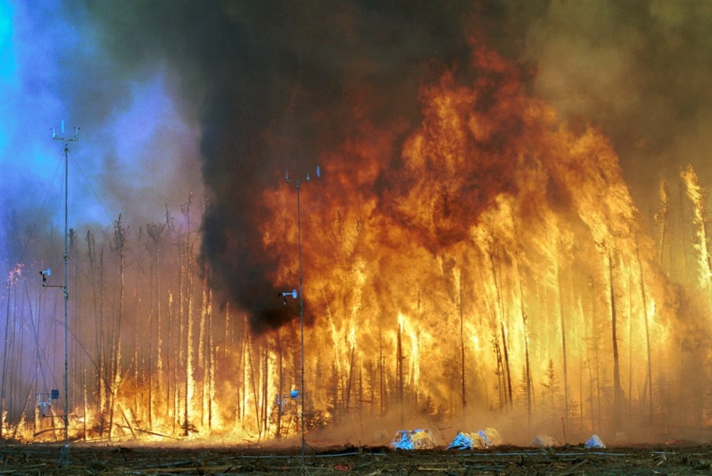
Although the number of forest fires in the western U.S. has not increased markedly in the past few decades, several fire activity factors have increased dramatically. These include the number of very large fires, the number of acres burned in large fires, and the length of the fire season. These features have also increased in other comparable temperate and mid-latitude ecosystems around the globe. Figure III.13 shows a crown fire, the most common type of fire in a boreal forest. Global warming has greatly increased the probability of severe fires in boreal forests, which cover 17% of the Earth’s land surface, and which contain 30% of all the carbon in the terrestrial biome. Canada’s boreal forests, for example, comprise 1.3 to 1.4 billion acres and account for 25% of the world’s original intact forests. Most of those forests contain no roads, so when they are struck by lightning which ignites a fire, the fire will simply burn itself out unless planes carrying loads of water are dispatched to the site within an hour of the lightning strike. Raking the forests, a “fire-prevention solution” advocated by Donald Trump, is impossible in these boreal forests. The primary exacerbating factor in the very large fires in these primeval forests is global climate change.
There are very strong correlations between the increases in forest fire factors that we mentioned and increases in metrics that lead to increased fuel aridity (i.e., vegetation dryness) in western forests. Abatzoglou and Williams carried out a probabilistic analysis to determine quantitatively the degree to which anthropogenic climate change (ACC) had increased the probability of increased fire activity in the western U.S.
To calculate the changes over time in temperature and vapor pressure in western forests, the authors used the Coupled Model Intercomparison Project, Phase 5 (CMIP5). This is a multi-model comparison project that was used in the Fifth Assessment Report of the Intergovernmental Panel on Climate Change (IPCC). The CMIP5 models were capable of calculating changes in monthly temperature and vapor pressure changes relative to a 1901 baseline. The counterfactual for this calculation was obtained by subtracting the ACC contributions to the daily and monthly temperature and vapor pressure measurements in western U.S. forests.
Figure III.14 plots the annual area burned in western continental U.S. forest fires from 1984 – 2015, in kilo-hectares or kha (1 kha equals 10 million square meters) vs. the fuel aridity in each year. Blue dots are from 1984 – 1999, while red dots are from 2000 – 2015. The later 16-year period represents a 3.3-fold increase in forest fire area relative to the earlier period. The black curve in Figure III.14 represents a best fit to the forest fire area vs. fuel aridity correlation. The curve shows a very strong relationship between the two quantities. The authors found this correlation to be clearest when they averaged eight different types of measurements related to fuel aridity, which will be summarized below. The dashed curves represent the 95% confidence limits for this fit. The inset shows in green the distribution of forested land in the western U.S. Figure III.14 makes it clear that in past decades, fuel aridity has been a dominant factor in the increase of forest fire area in the American West.

The authors found that anthropogenic climate change (ACC) was associated with substantial increases in all of the metrics related to fuel aridity. Figure III.15 shows the increases from 1979 to 2015 in these eight metrics.. These quantities are (see the Abatzoglou – Williams paper for more details and references on these quantities):
- PDSI: Palmer drought severity index
- FWI: Fire Weather Index
- ERC: Energy Release Component
- FFDI: McArthur Forest Fire Danger Index
- ETo: Reference Potential Evapotranspiration
- CWD: Climatic Water Deficit
- KBDI: Keetch-Byram Drought Index VPD: Vapor Pressure Deficit
The authors calculated the contribution to each of these quantities from ACC and then subtracted that contribution from the observed values in order to construct a counterfactual. The red bars in Fig. III.15 for each of these quantities represent the total measured changes in these quantities from 1979 to 2015, while the black bars were the same quantities but with ACC contributions subtracted out. In three of these cases (ERC, CWD and KBDI), the ACC contribution was somewhat smaller than for the rest. However, Fig. III.15 makes it clear that the contribution from ACC to each of these quantities, and hence to their mean, was substantial: climate change has been making western U.S. vegetation drier.

Figure III.16 shows the changes in two observable quantities from 1979 to 2015. Frame A plots the length of the fire danger season in the American west and frame B shows the number of days where the daily fire danger index was high (greater than 95%). The thick red curves show the average measured values of these quantities over time, while the thick black curves show the result with the calculated ACC contribution removed. In both of these cases the results show a clear increase over time, and furthermore the ACC contribution to each is both significant and increasing with time.

The authors found that the human contributions to climate change were increasing the annual extent of fires on western forested land by 75% compared to the mean from earlier years. To further quantify these results, they found that the increase in fuel aridity due to ACC contributed to about 4.2 million excess hectares of western U.S. forest fires during the period 1984 – 2015. This is about the area of Massachusetts and Connecticut combined, and accounted for nearly half of the total area that experienced forest fires during this period. This figure is consistent with some other estimates of ACC contributions to forest fire area. Ongoing global warming is exacerbating this threat. The increased area affected by forest fires poses a threat to the ecosystem, human health, and budgets for fighting fires.
IV. Assessment of EEA Efforts and Outlook
Extreme event attribution is a young but rapidly developing field of study. Its application has already made clear that some of the current century’s most extreme specific weather events have been significantly impacted by human-caused climate change, as illustrated by the examples discussed in Section III. It is important, however, to acknowledge its limitations. The approach works best for event types and global regions where there is a long and reliable observational record and where the understanding and simulation of climate change impacts is best developed. Based on a current assessment of EEA limitations and their ratings in Fig. II.3, the National Academies review team provided the graphic shown in Fig. IV.1, representing their estimates of where treatments of various event types fall in the current level of understanding of climate change impacts and the degree of confidence one can place in attributions.

The current level of understanding of the effect of climate change is strongest for temperature extremes, either extended heat waves or extreme cold spells. These are also the event types for which the observational record from before human activities had large effects are most robust. Understanding is somewhat less complete for precipitation events, either extreme rainfall or extended drought periods. While there is no question that human-caused climate change has increased the overall frequency of severe storms and wildfires, the localized triggers for particular events and the atmospheric and ocean conditions under which they develop are difficult to model reliably. Hence, understanding of how climate change has impacted particular storms and fires is weaker than for temperature and precipitation extremes, although still sufficient to support positive attributions in the most extreme cases covered in Section III.
According to the NASEM reviewers, they placed the circles for each event type in Fig. IV.1 below the dashed diagonal line to indicate “that there is potential for improvement in the individual event attribution capability (up to the 1:1 line) relative to the broader understanding of classes of events.” Nonetheless, Fig. IV.1 represents very strong progress in the field since NASEM’s last review of EEA in 2016. Considering the present status, it is particularly important that EEA analyses begin from the null hypothesis that human-caused climate change has not had appreciable effect on any individual extreme weather event. A positive attribution then requires a very clearly distinguishable impact of climate change and a rather conservative estimate of the confidence level researchers are willing to assign to their attribution. The handling of uncertainties in event attributions – for example, in quoting a range of possible risk ratios or contributions to event intensities – is still at a somewhat rudimentary level. As global climate models become more sophisticated, as their projections of future climate evolution become better matched by measurements, and as the spatial resolution attainable in the simulations improves, estimates of uncertainty and confidence levels in attributions will also improve.
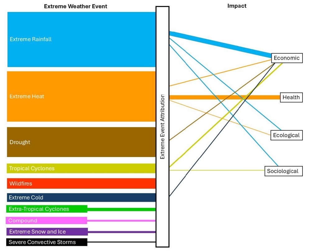
An emerging aspect in some recent EEA studies has been attempts to discern the contribution of climate change not only to the meteorological characteristics of an event, but also to the health, economic, sociological, and ecological impacts of extreme weather events. Such impacts can be informed in part by actuarial analyses of impacts of past extreme weather events as a function of their intensity. The contributions to these impacts need not be proportional to the contributions to meteorological measures; climate change may introduce nonlinear impacts. Impact attribution adds additional layers of uncertainty but can be particularly useful to governments in informing planning, prevention, and adaptation efforts.
Figure IV.2 summarizes the current status of such extreme event impact attribution (EEIA) studies. The widths of the colored bands for each event type at the left side of the figure reflect the number of EEA publications to date addressing that event type. The widths of the colored lines connecting those bands to impact areas reflect the number of publications that have specifically addressed those impacts for each event type. Where connecting lines do not show up there have not yet been relevant EEIA analyses. It is clear from the figure that most published EEIA studies to date have dealt with the economic impacts of extreme rainfall events and health impacts of extreme heat events.
It remains true that climate scientists can never with certainty attribute the very existence of a particular extreme weather event exclusively tohuman-caused climate change. But the burgeoning of extreme event attribution studies over the past two decades has made clear that there is real progress in estimating how climate change has affected the likelihood or intensity of particular events. Understanding those effects for past extreme weather events should inform how we plan for a future of more extreme events as the planet continues to warm.
We should also point out that the NASEM report is gathering organized criticism from groups aligned with fossil fuel companies that are very concerned about the report’s use in lawsuits claiming damages from the long neglect by those companies of their own internal research projecting the dangers of greenhouse gas emissions. The criticism includes a number of Congressional Republicans. We will report on this organized opposition in a separate post on this site.
References:
National Academies of Sciences, Engineering and Medicine Report, Attribution of Extreme Weather and Climate Events and Their Impacts 2026, https://www.nationalacademies.org/projects/DELS-BASCPR-23-02/publication/28590
D.L. Swain, D. Singh, D. Touma, and N.S. Diffenbaugh, Attributing Extreme Events to Climate Change: A New Frontier in a Warming World, One Earth 2, 522 (2020), https://www.cell.com/one-earth/fulltext/S2590-3322%2820%2930247-5
Munich RE NatCatService, https://www.munichre.com/en/solutions/for-industry-clients/natcatservice.html
DebunkingDenial, Still Deniers After All These Years: A Review of the Heartland Institute’s ‘Climate at a Glance’, https://debunkingdenial.com/still-deniers-after-all-these-years-a-review-of-the-heartland-institutes-climate-at-a-glance-part-i/
DebunkingDenial, Bjorn Lomborg, Cherry-Picker Extraordinaire, https://debunkingdenial.com/bjorn-lomborg-cherry-picker-extraordinaire/
NOAA National Centers for Environmental Information, U.S. Billion-Dollar Weather and Climate Disasters 1980-2024, https://www.ncei.noaa.gov/access/billions/events.pdf
Climate.gov, Heat Wave Characteristics in 50 Large U.S. Cities, 1961-2021, https://www.climate.gov/media/16371
A.B. Smith, 2024: An Active Year of U.S. Billion-Dollar Weather and Climate Disasters, Climate.gov, Jan. 10, 2025, https://www.climate.gov/news-features/blogs/beyond-data/2024-active-year-us-billion-dollar-weather-and-climate-disasters
Intergovernmental Panel on Climate Change, Sixth Assessment Report (2021), https://www.ipcc.ch/assessment-report/ar6/
The Lancet eClinicalMedicine Editorial, The Increasing Burden of Heat-Related Mortality, eClinicalMedicine 75, 102865 (2024), https://www.thelancet.com/journals/eclinm/article/PIIS2589-5370%2824%2900444-9/fulltext
World Health Organization, Heat and Health, https://www.who.int/news-room/fact-sheets/detail/climate-change-heat-and-health
Lancet Countdown on Health and Climate Change, Explore Our Data, https://lancetcountdown.org/explore-our-data/
National Interagency Fire Center, https://www.nifc.gov/
NASA, Wildfires and Climate Change, https://science.nasa.gov/earth/explore/wildfires-and-climate-change/
A. Wasula, North Atlantic Hurricane Season: Historical Stats and Seasonal Outlook, STM Weather, May 5, 2021, https://www.stmweather.com/blog/climate/north-atlantic-hurricane-season-historical-stats-and-seasonal-outlook/
A. Tyson and B. Kennedy, Americans’ Views on How to Address the Impacts of Extreme Weather, Pew Research Center, May 29, 2025, https://www.pewresearch.org/science/2025/05/29/americans-views-on-how-to-address-the-impacts-of-extreme-weather/
National Ocean Service, What are El Niño and La Niña?, https://oceanservice.noaa.gov/facts/ninonina.html
D.A. Kalashnikov, D. Singh, M. Ting, and B.I. Cook, Contributions of Atmospheric Ridging and Low Soil Moisture to the Record-Breaking June 2023 Mexico-Texas Heatwave, Geophysical Research Letters 52, e2025GL114987 (2025), https://agupubs.onlinelibrary.wiley.com/doi/10.1029/2025GL114987
F.A. Engelbrecht, et al., Extreme Event Attribution Using km-Scale Simulations Reveals the Pronounced Role of Climate Change in the Durban Floods, Communications Earth & Environment 6, Article #506 (2025), https://www.nature.com/articles/s43247-025-02460-5
P.A. Stott, D.A. Stone, and M.R. Allen, Human Contribution to the European Heatwave of 2003, Nature 432, 610 (2004), https://www.nature.com/articles/nature03089
S. Knight, The Urban Heat Island Experiment, https://www.slideserve.com/natala/the-urban-heat-island-experiment-powerpoint-ppt-presentation
Met Office, HadCM3: Met Office Climate Prediction Model, https://www.metoffice.gov.uk/research/approach/modelling-systems/unified-model/climate-models/hadcm3
European Union Climate Data Store, ERA5 Hourly Data on Single Levels 1940 to Present, https://cds.climate.copernicus.eu/datasets/reanalysis-era5-single-levels
D.J. Frame, M.F. Wehner, I. Noy, and S.M. Rosier, The Economic Costs of Hurricane Harvey Attributable to Climate Change, Climatic Change 160, 271 (2020), https://link.springer.com/article/10.1007/s10584-020-02692-8
N. Lin, R.E. Kopp, B.P. Horton, and J.P. Donnelly, Hurricane Sandy’s Flood Frequency Increasing from Year 1800 to 2100, Proceedings of the National Academy of Sciences 113, 12071 (2016), https://www.pnas.org/doi/full/10.1073/pnas.1604386113
DebunkingDenial, Climate Tipping Points: Coming Soon to a Planet Near You?, https://debunkingdenial.com/climate-tipping-points-coming-soon-to-a-planet-near-you/
NOAA Climate Program Office, New York City Experiencing Fast Sea Level Rise, Feb. 20, 2017, https://cpo.noaa.gov/New-York-City-experiencing-fast-sea-level-rise/
V. Saini, New York City’s Land Subsidence and the Challenge of Sea Level Rise, Climate Fact Checks, Jan. 17, 2024, https://climatefactchecks.org/new-york-citys-land-subsidence-and-the-challenge-of-sea-level-rise/
N. Lin, K. Emmanuel, M. Oppenheimer, and E. Vanmarcke, Physically Based Assessment of Hurricane Surge Threat Under Climate Change, Nature Climate Change, Feb. 14, 2012, https://legacy-assets.eenews.net/open_files/assets/2012/02/15/document_cw_01.pdf
NOAA Climate Prediction Center, NOAA: 2000 Atlantic Hurricane Outlook, May 10, 2000, https://www.cpc.ncep.noaa.gov/products/outlooks/hurricane2000/May/hurricane.html
J.T. Abatzoglou and A.P. Williams, Impact of Anthropogenic Climate Change on Wildfire Across Western US Forests, Proceedings of the National Academy of Sciences 113, 11770 (2016), https://www.pnas.org/doi/full/10.1073/pnas.1607171113
J.S. Littell, D. McKenzie, D.L. Peterson, and A.L. Westerling, Climate and Wildfire Area Burned in Western U.S. Ecoprovinces, 1916 – 2003, Ecological Applications 19, 1003 (2009), https://esajournals.onlinelibrary.wiley.com/doi/abs/10.1890/07-1183.1
P.E. Dennison, S.C. Brewer, J.D. Arnold, and M.A. Moritz, Large Wildfire Trends in the Western United States, 1984 – 2011, Geophysical Research Letters 41, 2928 (2014), https://agupubs.onlinelibrary.wiley.com/doi/full/10.1002/2014GL059576
A.L. Westerling, H.G. Hidalgo, D.R. Cayan, and T.W. Swetnam, Warming and Earlier Spring Increase Western U.S. Forest Wildfire Activity, Science 313, 940 (2006), https://www.science.org/doi/10.1126/science.1128834
E.S. Kasischke and M.R. Turetsky, Recent Changes in the Fire Regime Across the North American Boreal Region – Spatial and Temporal Patterns of Burning Across Canada and Alaska, Geophysical Research Letters 33, L09703 (2006), https://agupubs.onlinelibrary.wiley.com/doi/full/10.1029/2006GL025677
Wikipedia, Fire and Carbon Cycling in Boreal Forests, https://en.wikipedia.org/wiki/Fire_and_carbon_cycling_in_boreal_forests
K. Yandell, Major Driver of Worsening Canadian Wildfires is Climate Change, Not Forest Mismanagement, FactCheck.org, July 29, 2026, https://www.factcheck.org/2026/07/major-driver-of-worsening-canadian-wildfires-is-climate-change-not-forest-mismanagement/
Earth System Model Evaluation Project, CMIP5 – Coupled Model Intercomparison Project Phase 5 – Overview, https://pcmdi.llnl.gov/mips/cmip5/
Intergovernmental Panel on Climate Change, Climate Change 2014, https://www.ipcc.ch/site/assets/uploads/2018/05/SYR_AR5_FINAL_full_wcover.pdf
Wikipedia, Intergovernmental Panel on Climate Change, https://en.wikipedia.org/wiki/Intergovernmental_Panel_on_Climate_Change
National Academies of Sciences, Engineering and Medicine, Attribution of Extreme Weather Events in the Context of Climate Change 2016, https://www.nationalacademies.org/projects/DELS-BASCPR-15-03/publication/21852
C. Hiar, L. Clark, and C. Harvey, Inside the Campaign to Discredit a Key Climate Science Report, Politico, June 11, 2026, https://www.politico.com/news/2026/06/11/fossil-fuels-national-academies-climate-science-00897237

