
Note added on July 10, 2025:
On July 4, 2025 Donald Trump signed into law what he calls the “One Big Beautiful Bill.” The central features of this budget “reconciliation” package are a huge tax cut for the citizens who need it least, a huge cut in healthcare for the people who need it most, a big boost in funding for Immigration and Customs Enforcement (ICE), and an addition of more than $3 trillion to the cumulative national deficit over ten years. Republican politicians are now trying to spin the $1 trillion cuts to Medicaid in language straight out of George Orwell’s Newspeak in 1984. They are saying the deep cuts are needed to keep Medicaid secure by eliminating waste, fraud, and abuse. In fact, the Medicaid cuts will do little to address the low rate of Medicaid fraud and are only likely to accelerate the mortality gap we described in the post below between Republican and Democratic voters.
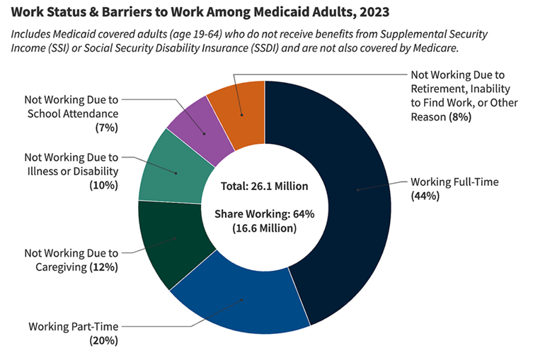
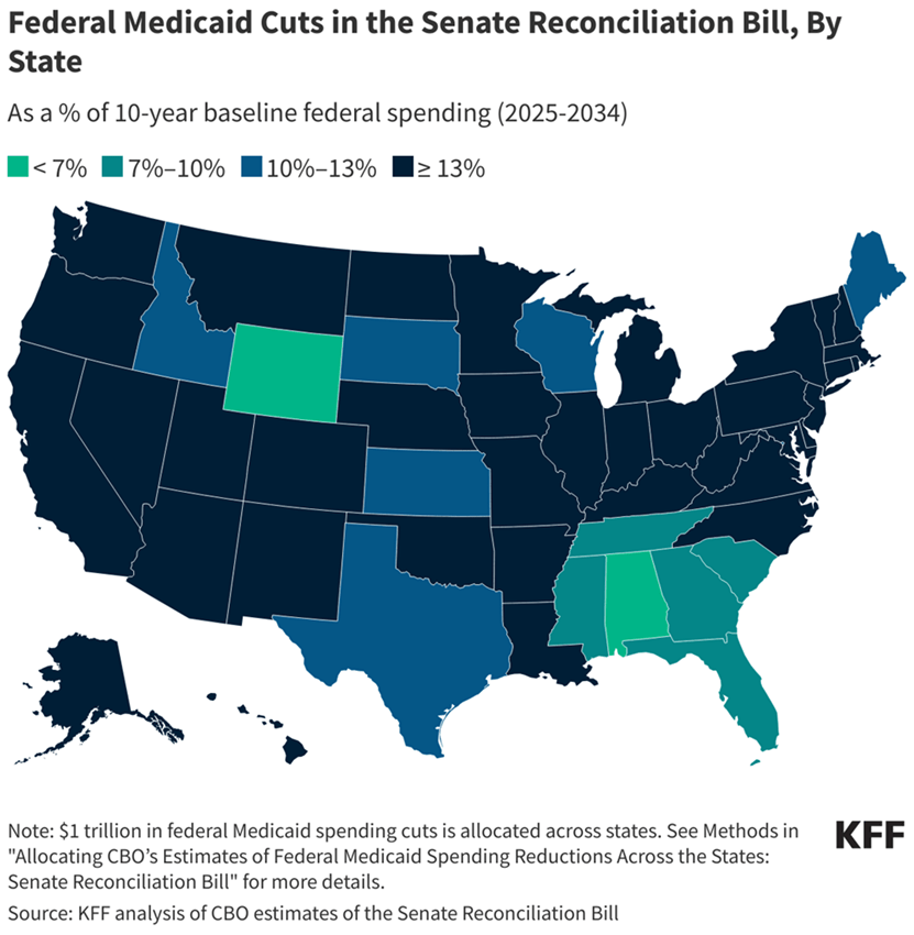
Medicaid currently provides healthcare insurance, sponsored in part by the federal government and in part by state governments, for more than 78 million Americans: people with low or limited income, a large fraction of pregnant women, seniors in long-term care, people with disabilities, and children. The bill would require many Medicaid recipients to show proof that they are working and all recipients to fill out paperwork frequently to prove that they still qualify for Medicaid. Among current Medicaid recipients of working age (19 – 64) 64% are already working full-time or part-time (see Fig. 1). Another 29% are unable to work due to illness, disability, caregiving, or school attendance. The bill would also limit federal Medicaid payments to states, with the largest percentage cuts for all those states that expanded Medicaid coverage under the Affordable Care Act. The distribution of projected cuts among states is shown in the map of Fig. 2.
The fact that states that did not accept Medicaid expansion will see the smallest percentage cuts under the new budget bill does not mean that they will see the smallest impacts of the enormous Medicaid cuts. As seen in Fig. 3, these same states currently have, unsurprisingly, the highest percentage of uninsured citizens among their inhabitants below the poverty level. The Congressional Budget Office projects that more than 11 million Americans will lose health insurance as a result of the enacted Medicaid cuts, and a majority of those will occur in red states that already have a high percentage of uninsured.

Furthermore, health outcomes will suffer not only for the uninsured but also for rural inhabitants who will see their nearby hospitals go out of business. Many rural American hospitals are currently on the brink of financial collapse and Medicaid is often their largest payer for the hospital services they render to their communities. When more of their community members lose Medicaid coverage and when the federal government provides less Medicaid funding to their states, a large number of rural hospitals are expected to shut down. The distribution among the states of rural hospitals “vulnerable to closure” is indicated in Fig. 4. In all, there are currently 216 at-risk hospitals in red states with a cumulative population of 170 million and 122 in blue states with a cumulative population of 167 million. The Medicaid cuts are thus likely to increase mortality rates more in Republican than in Democratic states. The mortality gap will grow further. The Deep South – the same region where we find (see Fig. IV.6 in the post below) the most rural hot spots for chronic disease prevalence – will be especially hard hit. The same is true of at-risk nursing homes: more than 2/3 of nursing facility residents in Georgia, Alabama, Mississippi, Louisiana, Arkansas, West Virginia, Alaska, and D.C. currently have Medicaid as their primary healthcare insurer.

Another serious potential impact of the Medicaid cuts is on pregnancy care and maternal and infant mortality rates. As shown in Fig. 5, 41% of all U.S. births in 2021 were funded by Medicaid and in a number of Deep South states the percentage rose above 50% to as high as 67%. Louisiana, which already has the highest maternal mortality rate in the country – higher even than the national average maternal mortality rates in Mexico and Nicaragua (see Fig. V.11 in the post below) – currently has 70% of rural births in the state covered by Medicaid and the state is projected to see the largest Medicaid cut (21% over ten years) under the new bill. Strict abortion laws in many red states have already driven many maternal care providers out of state and the cuts to Medicaid and rural hospital closures will drive many more away. Maternal and infant mortality rates will rise disproportionately in red states under this allegedly “Big, Beautiful” bill and Louisiana is likely to suffer the most.

By the way, the strict abortion laws signed in many red states after the Supreme Court’s 2022 Dobbs decision have actually managed to increase the rate of national abortions in the U.S. (see Fig. 6), while simultaneously increasing maternal and infant mortality rates in those states. Is this a record to be proud of?
One might have thought that Republican members of Congress and the Trump administration would be especially sensitive to harming the health outlooks of their own constituents. But recent flippant quotes from several Republican politicians make it look like they’re really just not that much into their constituents’ health. Senator Joni Ernst of Iowa faced a town hall with many audience members who were concerned that the Republican bill would lead to many more premature deaths in the state. Ernst’s response: “Well, we all are going to die.” Senator Mitch McConnell of Kentucky is reported to have told his Republican colleagues in a closed-door meeting: “I know a lot of us are hearing from people back home about Medicaid. But they’ll get over it.” Not if they lose the only health insurance they have, Senator!
But the prize for insensitivity goes to Vice President JD Vance. After casting the tie-breaking vote to pass the bill in the Senate, he posted about the bill on the platform X: “Everything else—the CBO score [the Congressional Budget Office cost estimate], the proper baseline, the minutiae of the Medicaid policy—is immaterial compared to the ICE money and immigration enforcement provisions.” Presumably, this administration considers the growing mortality gap documented in the post below as “minutiae.” All that matters is deporting more law-abiding, tax-paying immigrants to the U.S.
April 18, 2025
I. introduction
At the beginning of February 2025 Donald Trump’s Transportation Secretary, Sean Duffy, directed the U.S. Department of Transportation to give precedence in federal funding to “communities with marriage and birth rates higher than the national average.” We are not aware of any actual correlation between birth rates and the need for transportation infrastructure. Rather, this can be seen as a way to send more money to Republican states without appearing blatantly political.
As seen in Fig. I.1, the states with fertility rates higher than the national average of 1.66 children per woman are, for the most part, those “red” states that have voted for Republican candidates pretty consistently. As we have explained in our previous post on The Demographics of Persistent Partisan Polarization, birth rates tend to be somewhat higher in red states for several reasons: there are more rural families, and there is a worldwide tendency for birth rates to be higher in rural than in urban areas; women in these states are more likely to be religious and to believe in traditional families where the wife stays at home to raise children. In addition, many of these red states now have very restrictive abortion laws that make it illegal to terminate pregnancies. But even among the red states, there is only one – South Dakota — where the fertility rate has reached the replacement level (2.1) needed to maintain a constant population without adding new immigrants.

But by tying funding levels to lifestyle choices, Duffy is setting a dangerous precedent. A Democratic administration could choose instead to tie funding levels to mortality rates below the national average, in which case “blue” states would come out as the winners. As shown in Fig. I.2, the 21st century has seen a growing mortality gap between counties that voted for Democratic candidates and those that voted for Republican candidates in this century’s Presidential elections. From 2000 to 2019 age-standardized death rates fell by 22% in blue counties but only by 11% in red counties. The COVID-19 pandemic has only amplified that difference, as more prevalent vaccine hesitancy in red counties led to a significantly higher death rate from the pandemic.

While there are significant racial and ethnic differences in mortality rates, Fig. I.3 illustrates that the growing gap this century is almost entirely attributable to white people. Blacks have higher mortality because black people in the U.S. have, on average, less access to quality health care. Although there is also a small partisan mortality gap among blacks, it hasn’t changed much during the century so far. And there is essentially no mortality gap between Hispanics in Democratic and Republican counties, although Hispanic mortality rates are significantly lower than those for whites. (Since Hispanics have on average lower socioeconomic status than whites and less access to quality health care, the fact that Hispanic mortality rates are lower than for whites is called the ‘Hispanic paradox.’) Among whites, the study also indicates that the gap shows up essentially equally for males and females.

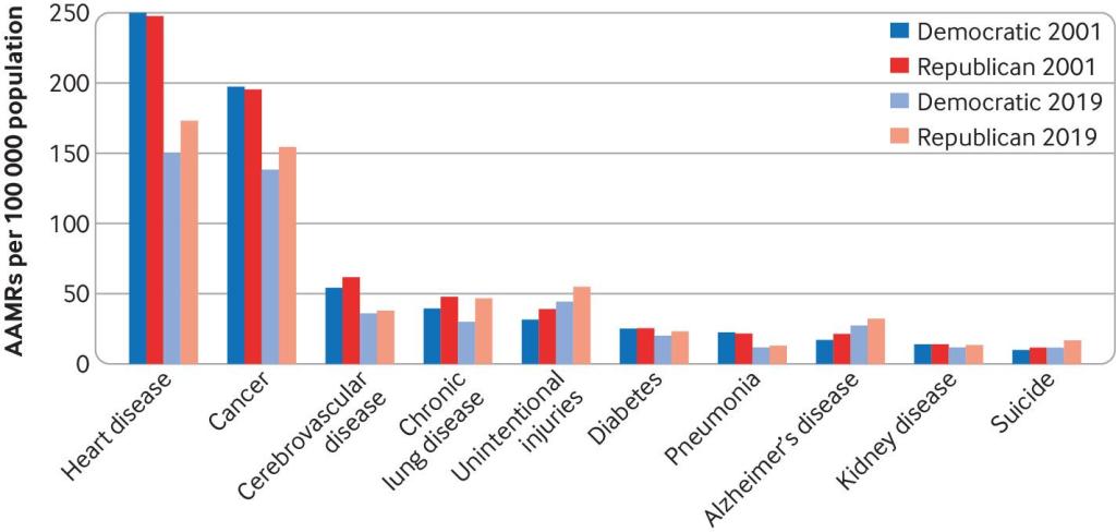
There is no single cause for the mortality gap growth between the beginning of the century and 2019. As shown in Fig. I.4, the partisan gap has grown from 2001 to 2019 in death rates from heart disease, cancer, chronic lung disease, unintentional injuries, diabetes, pneumonia, and suicide. The magnitude of the mortality gap in 2019 was just over 100 deaths per 100,000, or 0.1%. This may seem like a small difference, but we’ll see in Section II that it translates to a significant gap in life expectancy. What, exactly, is going on in Republican counties?
In this post we will explore the factors contributing to this significant mortality gap. To what extent does it reflect regional lifestyle differences, state health policies, or politically influenced attitudes toward government health guidelines on vaccines, diet, and medical treatments? Are Republican voters misinterpreting the New Hampshire state motto of “Live Free or Die” as “Live Free and Die?” We will survey the geographical distribution of life expectancy in the U.S. and its correlation with voting patterns in Section II. The impact of COVID-19 and partisan differences on life expectancy will be treated in Section III. Location-dependent chronic disease prevalence will be considered in Section IV and the impact of state laws in Section V. We will summarize our findings, draw conclusions and consider the outlook in Section VI.
II. life expectancy maps
In the pre-COVID era, a dramatic illustration of changes in life expectancy in red and blue states is seen by comparing average life expectancy in the states of Oklahoma and Connecticut. Figure II.1 plots the life expectancy averaged over the two sexes between 1959 and 2019. Over this 60-year period prior to the COVID pandemic, the life expectancy in the two states changed from being nearly identical in 1959 to a difference of four years in 2019, with Connecticut having the higher life expectancy.

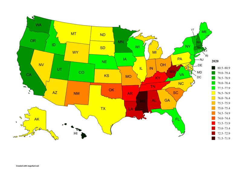
Figure II.2 shows the life expectancy in each U.S. state, as of 2020. The U.S. average for that year was 77.0 years, already reduced by COVID-19 from a peak of nearly 79 years in 2019. The nine states with the highest life expectancies averaged over both sexes were Hawaii (80.7), Washington (79.2), Minnesota (79.1), Massachusetts (79.0), California (79.0), New Hampshire (79.0), Vermont (78.8), Oregon (78.8), and Utah (78.6). Eight of these nine states are viewed as reliable blue states in politics, with Utah as the exception. The nine states with the lowest overall life expectancy were Mississippi (71.9), West Virginia (72.8), Louisiana (73.1), Alabama (73.2), Kentucky (73.5), Tennessee (73.8), Arkansas (73.8), Oklahoma (74.1), and New Mexico (74.5). All of these, with the exception of New Mexico, are reliably red states. There is a difference of 8.8 years between the life expectancy in the highest state (Hawaii) and the lowest (Mississippi).
A more detailed picture of life expectancy rates is found in Fig. II.3, which breaks down life expectancy per county in the U.S. Here, the lowest life expectancies are shown in red while the highest life expectancy counties are in blue. When broken down by county, there is a 20-year difference between counties with the highest life expectancy and those with the lowest. There is a general trend with the highest life expectancies occurring in large urban areas, particularly in blue political states, while rural areas, particularly in the deep South and Appalachian regions, tend to have lower life expectancy. One reason for this difference is that urban areas have more access to health care providers; in Section IV we will review how various chronic diseases break down.

Figure II.4 at left shows the number of medical residents in each state per 100,000 of population in the year 2020, and at right shows the percentage of physicians entering primary care in each state in 2020. In both cases, the darkest shades denote states with the largest numbers. The right frame indicates a general scarcity of primary care physicians in regions with lower life expectancy. The contrast between the left and right frames illustrates an interesting paradox: those states with the largest number of residents per capita also tend to have lower-than-average percentages of primary care physicians. The contrast arises primarily from three effects: first, states with the highest numbers of doctors per capita also tend to have large centers that employ significant numbers of specialized physicians; second, primary care physicians in those states tend to switch to a specialized practice; third, states with the fewest number of doctors tend to have large rural areas, where there are fewer doctors overall, but a larger fraction of primary-care physicians.

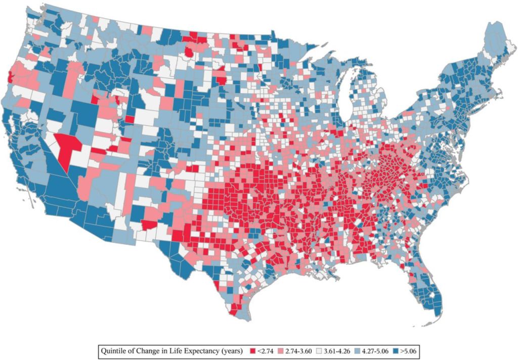
Figure II.5 shows changes in life expectancy in the U.S. by county, from the period 1980 to 2014. Although there is a great deal of granularity in this figure, in general the smallest increases in life expectancy are found in a group of Southern to Appalachian states ranging from Louisiana, Alabama, and Mississippi up through Oklahoma, Arkansas, Tennessee, Kentucky, and West Virginia. The differences in the increase of life expectancy over a 34-year period can be fairly large. Those counties with the lowest increases in life expectancy have less than 2.74 year increase, while counties with the highest increase in life expectancy have increases greater than 5.06 years.
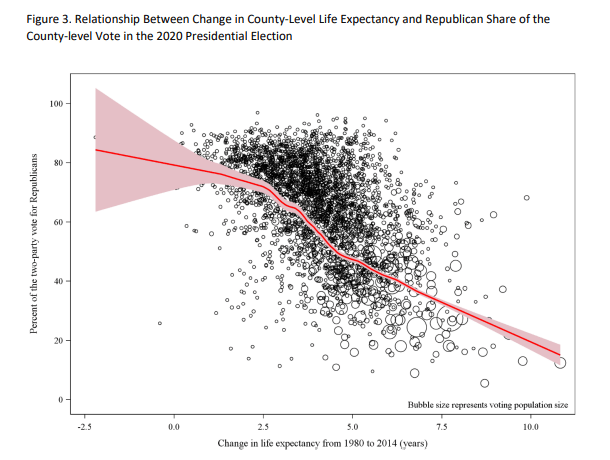
As shown in Fig. II.6, that increasing gap in life expectancy is very strongly correlated with county voting patterns. The highest increases in life expectancy occur in counties that voted primarily for Joe Biden in the 2020 Presidential election, while the lowest increases occur for counties that voted primarily for Donald Trump. In the remainder of this post, we want to probe the factors contributing to this growing mortality gap.
III. the effect of covid-19
In Section II we reviewed different outcomes on life expectancy for red vs. blue states and counties prior to the global COVID-19 pandemic. However, there were a number of developments during the pandemic that served to decrease life expectancy particularly in red counties. In other posts on our blog we have discussed the politics of the pandemic and their effects on death rates in different states (see here, here, here, here and here). A major cause of political polarization resulting from the pandemic was Donald Trump himself. In the early months of 2020, after public announcements regarding the virus, Trump falsely claimed that he had prevented the virus from reaching the U.S. from China. This led many of Trump’s MAGA supporters to reject statements that the coronavirus was spreading and that steps should be taken to prevent catching the virus.
In March 2020, Trump followed the advice of his scientific advisors and embarked on a campaign for citizens to wear masks and avoid crowds. However, this was followed by extensive posts on social media claiming that masks did not work, and in some cases denying that COVID-19 was a “real disease” – it was suggested that doctors were counting deaths by pneumonia as being due to COVID. There were also numerous social media claims of “miracle cures” for COVID; these were particularly centered around the anti-malaria drug hydroxychloroquine and the anti-parasitic drug ivermectin. These claims proliferated widely, but they were most effective with groups that were hostile to the advice of “expert” physicians. The growing alienation from conventional scientific advice stemmed in part from mis-steps made by scientists at the beginning of the pandemic. At first, it was not realized that the dominant form of transmission of this novel virus was from airborne particles. Thus, initially it was stated that masks were not necessary to halt the spread of the disease. But once it was understood that airborne particles were the main source of transmission, people were urged to use masks.
Social media was filled with misinformation, particularly regarding the issue of the efficacy of masks. Although robust clinical studies showed that masks confer a positive benefit against catching the virus, many people insisted that masks were useless. There was a great deal of pushback over requirements for wearing masks, and an active “medical freedom” movement that opposed any restrictions on behavior during the pandemic. Again, this was further exacerbated by Donald Trump’s insistence that the disease was going to “go away” any day now. The “Warp Speed” effort to develop a vaccine against COVID-19 succeeded at the end of 2020 in producing new vaccines, several of which used new mRNA techniques to produce a novel weapon to combat the coronavirus.
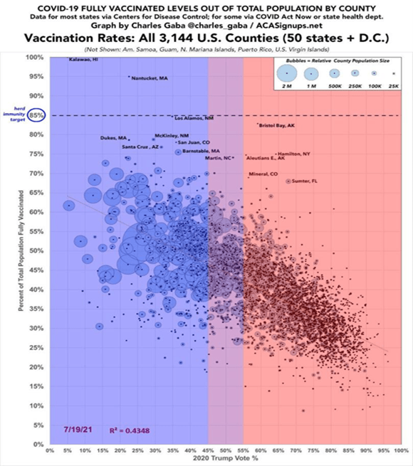
However, as soon as the vaccines were released, there were major disinformation campaigns against the vaccine and protests against vaccine mandates. We covered this in our blog posts on The Disinformation Dozen and America’s Frontline Quacks. The current Secretary of Health and Human Services, Robert F. Kennedy, Jr. was a leading voice opposing the vaccines, baselessly claiming in November, 2021 that “The Pfizer COVID-19 shot kills more people than it saves.” The net result was major differences in vaccination rates, mask-wearing and social distancing among supporters of Biden and Trump. In Fig. III.1 we show COVID vaccination levels in U.S. counties. The vertical axis shows the percentage of people in a given county who were fully vaccinated as of July 2021. The horizontal axis shows the percentage of voters in that county who voted for Donald Trump in the 2020 election. There is a very strong anti-correlation between the vote for Trump in a given county, and the number of people who were fully vaccinated. The size of the circle in Fig. III.1 denotes the population in that county. The graph also shows a significant correlation between large urban counties, which tended to vote for Biden in 2020, and smaller rural counties that frequently registered a strong Trump vote.
The COVID vaccines were highly effective in minimizing COVID deaths, especially in counties that reached herd immunity levels of vaccination to limit the spread of the virus. Hence, there was a serious political cost to vaccine refusal. Figure III.2 plots the number of COVID deaths in the U.S. over time, beginning in March 2020 when the first major steps were taken by the U.S. to urge wearing masks and avoiding large gatherings. The five curves shown in this figure represent five equally populated quintiles of the U.S. population ranked by their county’s support for Trump in the 2020 federal election. The darkest red line represents counties that voted most strongly for Trump, while the darkest blue line represents counties that voted most strongly for Biden. From March through June 2020, before vaccines were available, the largest number of COVID deaths occurred in large urban areas, where the high population density contributed to rapid spread of the virus. New York City and New Jersey, areas of strong support for Biden, were among the regions that had the most COVID deaths in that period.
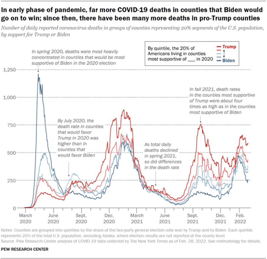
However, by July 2020, pro-Trump counties had more COVID deaths than strong Biden counties. In early 2021, after the release of COVID-19 vaccines, many Americans received the vaccines; the total numbers of deaths declined rapidly and there do not appear to be major discrepancies between pro-Trump and pro-Biden counties. But a new wave of the mutated virus in Fall 2021 caused coronavirus-related death rates that were four times higher in the most pro-Trump counties than in the most pro-Biden counties. And this discrepancy occurred despite the fact that the average population density, affecting the opportunities for viral spread, in those most pro-Biden counties was a factor of 16 higher than the density in the most pro-Trump counties. From Fig. III.1, it is clear that COVID deaths in strong pro-Trump areas reflect primarily a much lower rate of vaccination in those counties, but also strong sentiment in those regions opposing wearing masks and practicing social distancing. Republican voters claimed to treasure their personal freedoms, but those freedoms came with a serious cost in lives.
To summarize, the COVID-19 worldwide pandemic inflicted an incredible toll on world health. Globally, 704.8 million people contracted COVID-19 (counting stopped in April 2024, when many countries stopped keeping track of COVID deaths), and 7.01 million people died from the disease. Despite the great wealth of the U.S. and the fact that the mRNA vaccines against the disease were largely developed in this country, the U.S. was the developed country worst affected by the disease. This is in large measure a result of the spread of misinformation about COVID, largely by Donald Trump and by right-wing social media influencers. Figure III.3 shows life expectancy at birth, in years, from the period 1980 – 2022. The blue curve is an average of life expectancy for a number of developed countries, while the red curve shows life expectancy in the U.S. over the same period. The devastating effect of COVID-19 is highlighted by the dramatic drop in U.S. life expectancy during the first two years of the pandemic. The figure illustrates clearly how much worse the U.S., with its ineffective leadership, fared relative to other developed countries.

Unfortunately, we expect the partisan attitudes developed toward the COVID pandemic to increase the partisan mortality gap even more in the future, for two reasons. The first is that citizens of red counties have become more opposed to measures supported by scientists and physicians that would reduce exposure to disease through wearing masks and avoiding large public gatherings. Perhaps an even more ominous development is the “medical freedom” movement which celebrates groups that denigrate the advice of health professionals, and that encourage resistance to public health measures. Until the 2024 U.S. election, medical freedom groups were spread across the political spectrum. Opposition to masking requirements and limits on public gatherings was most heavily concentrated in pro-gun and pro-militia movements; on the other hand, opposition to vaccines and fluoridation measures was stronger in “Granola Moms” who provided support for organizations such as Children’s Health Defense, which was led by Robert F. Kennedy, Jr.
However, RFK Jr. came to an agreement with Trump when Kennedy ended his presidential bid in Fall 2024. After Trump’s election win, he nominated RFK Jr. to be Secretary of Health and Human Services. Despite opposition to this nomination from organizations representing tens of thousands of doctors and researchers, Kennedy was confirmed as HHS secretary. Thus, organizations such as Children’s Health Defense are now firmly aligned with the MAGA movement. Kennedy’s leadership at HHS appears to be on a course that will produce devastating results for American public health. In many cases, the effects on life expectancy should be more dire for red states.
At the present time, RFK Jr. is carrying out horrific cuts in personnel at the National Institutes of Health and the Centers for Disease Control. This has the potential to cripple research into various diseases, and to close down divisions that have long been the envy of the world. However, the cuts have not been entirely random; areas that are targeted areas have been criticized by either Kennedy or Trump. For example, RFK has closed down areas related to vaccines. He has fired top leaders in that field, postponed meetings of panels to determine vaccine schedules, and has forced the head of the FDA’s vaccine program to resign. The result will be more outbreaks of infectious diseases, and poorer efforts to shut down epidemics when they arise. We are already seeing a steep rise in measles cases; in March 2025 we already had more U.S. measles cases than in all of 2024. The most serious is an outbreak that began in West Texas, where measles vaccine rates are insufficient to approach herd immunity, and has spread to neighboring states and Mexico. The next pandemic, possibly from bird flu, will likely prove more deadly for voters who share RFK’s distaste for vaccines and fondness for false treatments (such as hydroxychloroquine and ivermectin for COVID-19) unsupported by clinical studies.
IV. chronic disease prevalence
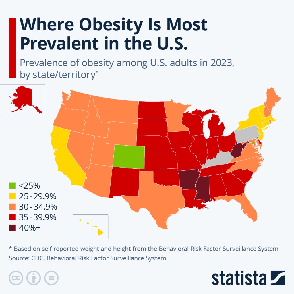
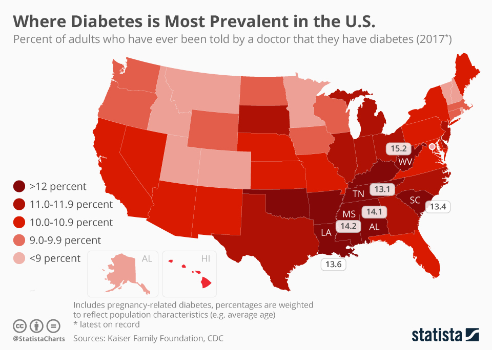
But what was causing the growing partisan mortality gap even before the COVID-19 pandemic? Five of the top ten leading causes of death in the U.S. are associated with chronic diseases. But the prevalence of chronic diseases is hardly uniform throughout the country. For example, America has an obesity problem, but Fig. IV.1 illustrates that states with 35% or more of the population classified as obese are concentrated in the southeast and midwest. Obesity is often associated with diabetes and Fig. IV.2 shows that diabetes among adults is most intense in the same states where we saw lower than average life expectancy in Section II.
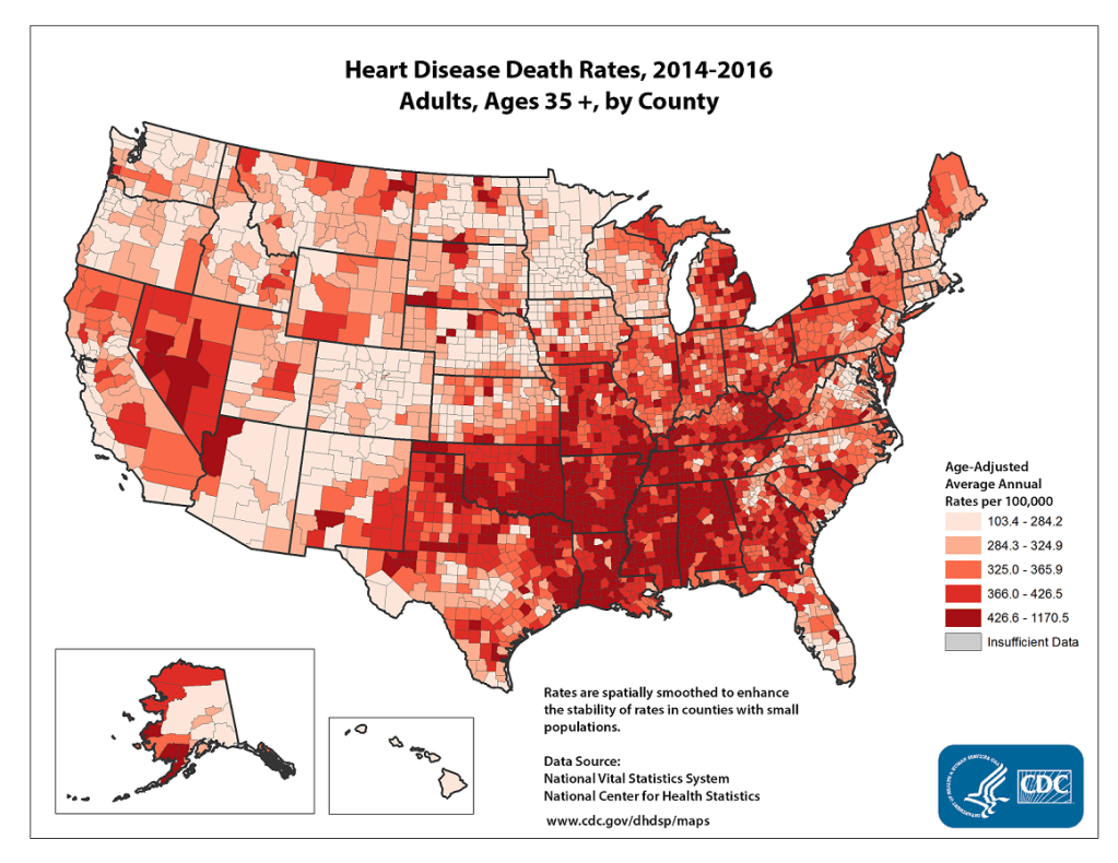
Obesity and diabetes are furthermore often associated with heart disease. Heart disease is the number one killer in the U.S., costing the nation about a quarter trillion dollars per year. But heart disease death rates, as shown in Fig. IV.3, are again highest in those primarily deep South, Republican states where life expectancy is lower than average.
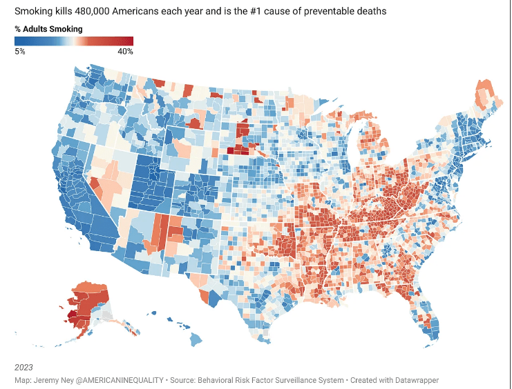
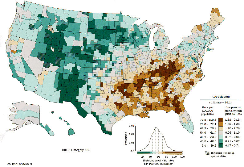
The greatest variation in cancer death rates around the country is associated with tobacco use. Figure IV.4 shows that smoking prevalence is again highest in Republican counties in the deep South and Appalachian regions, and also in Alaska. It should then come as no surprise that lung cancer death rates, as seen in Fig. IV.5, follow that same trend.
Benavidez, et al. have recently carried out an even more granular analysis of the incidence of chronic diseases throughout the U.S. They have used publicly accessible data to assess, for each of nearly 32,000 zip code tabulation areas (ZCTA), the prevalence of each of the ten most prevalent and costly chronic diseases: obesity, hypertension, high cholesterol, coronary heart disease, chronic obstructive pulmonary disease, asthma, chronic kidney disease, diabetes, cancer (excluding skin cancer), and depression. They created an overall composite score reflecting the prevalence of all of these diseases and then determined whether each ZCTA represented a hot spot or a cold spot for chronic disease. Because each ZCTA has, on average, a population of only about 10,000, this analysis lets us peer within states to look for significant variations. Their hot spot and cold spot results are displayed in Fig. IV.6.
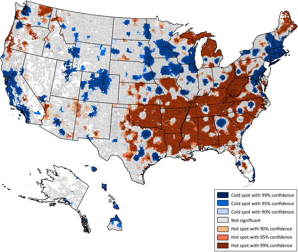
Figure IV.6 reveals a rather stunning urban-rural divide. Within the deep South and Appalachian regions where chronic diseases are most prevalent, one still finds clear cold spots in large cities: Atlanta, Nashville, Raleigh-Durham, Charlotte, Dallas-Fort Worth, Austin, and Houston. Over the rest of the country, as well, large cities and their suburbs show up as cold spots in New York, Philadelphia, Pittsburgh, Columbus, Cincinnati, Indianapolis, Chicago, Milwaukee, St. Louis, Kansas City, Des Moines, Omaha, Minneapolis-St. Paul, Denver, Phoenix, Tuscon, Los Angeles, San Francisco, Portland, and Seattle. These densely populated urban areas, mostly dominated by Democratic voters, hardly seem, at least from this perspective, to be the “death traps” that Donald Trump often tries to label them.
Benavidez, et al. have noted demographic characteristics of the mostly rural areas that have the highest prevalence of chronic diseases: “Compared with areas with the lowest prevalence, areas with the highest were significantly smaller in population size and had older, more socio-economically disadvantaged residents and a higher proportion of Black or American Indian/Alaska Native residents. Residents in communities with the highest prevalence had to travel substantially longer distances for health care services than people in areas with the lowest prevalence…Areas of high chronic disease prevalence and low real estate values likely lack community infrastructure conducive to physical activities and to interventions promoting it.”
While these characteristics contribute without doubt to lower life expectancy, we note that there are also very substantial black and poor communities within Atlanta, which shows up as a chronic disease cold spot in Fig. IV.6. And it is the health of white Republican voters, rather than black Republican voters, that accounts for the 21st century expansion of the mortality gap in Fig. I.3. So there are likely more than just socioeconomic factors that contribute to the growing mortality gap; some of it must arise from traditions, lifestyle choices, diet, government policies, and political influences.
V. impact of state laws
There are often very significant differences between Republican-led and Democrat-led states in state laws with impact on citizen health and well-being. These differences certainly contribute to the growing mortality gap. Figure V.1 illustrates that the most significant mortality gap occurs between states with Democratic governors and Democratic control of both houses of the state legislature versus states with full Republican control. Furthermore, that gap grew significantly in 2021 when vaccine resistance in Republican states led to more preventable COVID deaths.

State smoking restrictions are very clearly correlated with the smoking prevalence and lung cancer death rates seen in Figs. IV.4-5. Figure V.2 from the American Lung Association color-codes states with different levels of state bans on smoking in public places, from weak restrictions in grey, through much of the deep South and Appalachia, to limited bans excluding bars and/or restaurants in blue, and complete bans in green. Here, as in other cases to be considered below, it is not possible to distinguish whether citizens’ preferred lifestyle choices are responsible for the state legislation or vice-versa. In a state like Virginia, which is normally pretty evenly balanced between Democrats and Republicans, the lack of significant smoking restrictions may be strongly influenced by the state’s tobacco-growing interests.

Firearm restrictions:
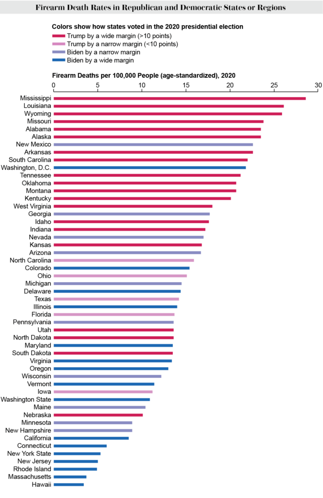
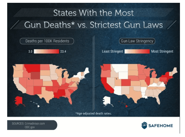
We have not yet considered firearm-related mortalities, which are one of the leading causes of death in the U.S. Figure V.3 shows the age-adjusted firearm death rate in each U.S. state for 2020, color-coded by the state’s level of support for Donald Trump (red) or Joe Biden (blue) in the 2020 Presidential election. Although Trump often rants about the out-of-control violent crime rates in big Democratic cities, the highest firearm death rates occur mostly in deep red states. The city that gets most mention as a hellhole by Trump is Chicago, but Illinois is about halfway down in this figure. The prevalence of red states near the top of the figure is not surprising because gun ownership tends to be highest in these red states and the prevalence of guns is a main contributor to firearm deaths (see Fig. V.4): more guns yield more deaths.

But gun ownership and gun usage are also correlated with state gun laws. The restrictions on who can purchase and sell guns, background checks, gun licenses, assault weapons, high-capacity magazines, and open or concealed carry permits vary enormously among states. The clear anti-correlation between state gun laws and gun death rates is shown in Fig. V.5: states with the strictest gun laws tend to have the lowest firearm death rates. Again, causality cannot be easily determined here: weak gun laws allow wider gun ownership, but more gun owners in a state makes it difficult to pass stricter laws.
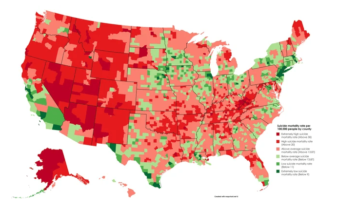
While more than half of gun deaths in the U.S. come from suicides, the suicide rate (Fig. V.6) does not seem to be so clearly correlated with state gun laws. The nation’s suicide rate has risen steadily throughout this century and is dominated in the western U.S., with the exception of most of California. Suicide rates seem most prevalent in rural and sparsely populated counties, suggesting that feelings of isolation and perhaps lack of opportunity are major contributing factors. Access to guns is, of course, also a factor, so state gun laws have some effect. The Republican Party’s strength in the U.S. is mostly centered in rural counties, so suicides most likely also contribute to the mortality gap.
State laws affecting healthcare access:
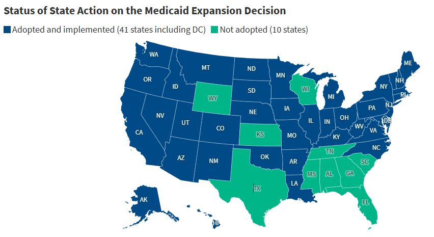
State laws in Republican-led states are also restricting citizens’ access to health care. As shown in Fig. V.7, mostly Republican states, particularly in the deep South, have still in 2025 chosen not to accept federal funds available through the Affordable Care Act to expand Medicaid coverage to families with household income below 138% of the federally defined poverty level. Medicaid is the largest source of health coverage for low-income individuals, including children, pregnant women, parents, seniors (including nursing home residents), and individuals with disabilities. It covers more than 70 million Americans. State decisions against expansion restrict health care coverage for many people and undoubtedly also contribute to lower than average life expectancy in the southern United States. The new budget reconciliation bill passed in Congress in March 2025 has the potential to cause major federal cuts in Medicaid funding, further harming health care access for many millions of Americans.
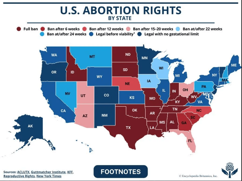
Women’s health care is severely restricted by anti-abortion laws adopted in a number of Republican states since the 2022 Supreme Court decision in Dobbs v. Jackson Women’s Health Organization, which overturned federal abortion protections up until fetal viability that had been in effect since the 1973 Roe v. Wade decision. The present status of abortion rights in each state is represented in Fig. V.8. Sixteen mostly Republican states now ban all abortions or those after six weeks of pregnancy. These laws place physicians in the impossible position of having to decide when the mother’s life is so endangered that an abortion can be performed without incurring severe legal penalties. The laws thus directly endanger maternal health coverage. They also do so indirectly by causing many physicians engaging in women’s health care to move out of state. Figure V.9 shows that states with strict abortion bans mostly now have much lower than average maternity care providers per capita. Those states are also now seeing steeper than average declines in applications for medical residency, so their maternity care is likely to get worse.

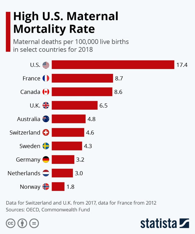
The U.S. maternal mortality rate was already the highest among first-world countries before the Dobbs decision. Figure V.10 plots the maternal death rate in the U.S. (deaths per 100,000 live births) vs. that in nine selected developed countries for 2018 (note: the French value in this chart is from 2012, while the maternal death rate for the U.K. and Switzerland is from 2017). The U.S. maternal mortality rate is twice that of the next highest countries France and Canada. One of the main components in the U.S. maternal mortality rate is the shockingly high maternal death rate for black women (37.3 deaths per 100,000 live births) vs. 14.9 deaths per 100,000 live births for non-Hispanic white women.
The maternal mortality rate is now getting significantly worse in those states with severe abortion bans. Figure V.11 shows the present maternal mortality rates for each state in comparison with the national average rates in the U.S. and other countries. The color-coding of bars in that chart indicates whether the state has no abortion restrictions and has expanded Medicaid coverage (green), has Medicaid expansion with abortion restrictions (orange), or has both abortion restrictions and no Medicaid expansion (red). With the single exception of New Jersey, the states with abortion restrictions have the highest maternal mortality rates, reaching the levels of Mexico and Nicaragua in both Georgia and Louisiana. The x marks in the chart indicate a weak correlation of state poverty level with maternal mortality rate. As the states with strong abortion restrictions continue to lose maternal care providers, their maternal mortality rates are anticipated to rise further. For example, “the rate of maternal deaths in Texas [which had already restricted abortion access before the Dobbs decision] increased 56% from 2019 to 2022, compared with just 11% nationwide during the same time period.”

Since the most draconian state abortion bans often require women to carry non-viable pregnancies to term, in addition to driving maternal care physicians away, those states are also seeing rising infant mortality rates. Figure V.12 shows that even before the Dobbs decision states with abortion restrictions were experiencing higher infant mortality rates than states with full abortion access, for all ethnic and racial groups. For example, in the year following Texas’ adoption of an abortion ban in 2021, the infant death rate rose by nearly 13%. In the year following the Dobbs decision and the introduction of even stricter abortion bans, the infant death rate rose by 7% nationally, while the death rate among infants with congenital anomalies rose by 10%. The adoption of abortion bans in Republican-led states has reversed a decades-long steady decrease in American infant mortality rates.

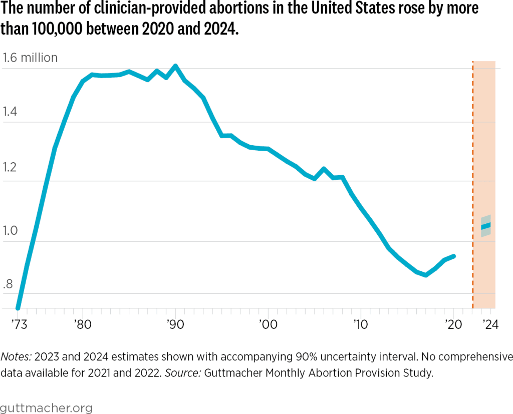
Interestingly, the national abortion rate in the U.S. has increased in the wake of the Dobbs decision. The number of abortions performed in 2023 was 11% higher than in 2020 and 26% higher in states without total abortion bans. Abortion locations shifted but abortion rates went up. So, what self-declared “pro-life” states have accomplished to date is an increase in the national abortion, maternal mortality, and infant mortality rates.
We do not expect American healthcare quality and research to improve in the near future. Donald Trump’s Department of Health and Human Services (HHS), under the direction of anti-vaxxer and conspiracy theorist Robert F. Kennedy, Jr., is firing many thousands of federal workers in the Centers for Disease Control, the Food and Drug Administration, and the National Institutes of Health, funding studies of long debunked vaccine-autism correlations led by a quack, and promoting false remedies for infectious diseases. Republican-led states, where citizens are more likely to pay heed to Trump’s HHS “recommendations,” will most probably bear the brunt in an increasing mortality gap.
Traffic Deaths:
There is one further significant contributing factor to the mortality gap: people in Republican states are generally involved in more fatal motor vehicle accidents per 100,000 licensed drivers than those in Democratic states. This is illustrated in the map of Fig. V.13, where the highest fatal accident rates in 2020 occurred, in decreasing order of rate, in Mississippi, Arkansas, Wyoming, New Mexico, South Carolina, Kentucky, Oklahoma, Montana, Tennessee, West Virginia, Louisiana, Missouri, Alabama, Georgia, and South Dakota. With the exception of New Mexico (also Georgia in 2020), each of these states has generally voted for Republicans in statewide elections. We are unaware of any state laws that would lead to this discrepancy between red and blue states. Rather, it may just be a reflection of the fact that drivers in these red states drive more miles per capita annually than in other states, as shown in Fig. V.14.


VI. conclusions and outlook
The trend is clear. The average life expectancy of American Republican voters is significantly less than that of Democratic voters and the gap is growing. It had been growing steadily throughout this century and was further boosted by the COVID-19 pandemic. The rate at which the gap is growing is highest for white voters, especially in the deep South and Appalachian regions of the country. There are many factors that contribute to the growth of this gap, including: lifestyle and diet preferences; access to quality health care services in rural areas and states from which doctors are fleeing; trust in scientists, physicians, and vaccines; state laws concerning Medicaid expansion, smoking and firearm restrictions, and abortion and women’s healthcare; susceptibility to medical misinformation spread increasingly by Republican politicians, Trump supporters, cabinet members, and Trump himself; and suicide rates driven by isolation and lack of opportunity in many rural areas.
Among the symptoms of the mortality gap are higher incidences of obesity, diabetes, heart disease, lung cancer, other chronic diseases, COVID deaths, firearm deaths, suicides, maternal and infant mortality, and even traffic deaths in Republican areas of the country. At this point in the American experiment, Republican voters and Democratic voters appear to have different understandings of the word “freedom.” The Republican version, including a growing distrust of experts, has a substantial cost in death rate, despite their adoption of a “pro-life” label. One of the primary aims of governments should be to protect and enhance the health and well-being of their citizens. The data indicate that American Republicans are doing a poor job of this.
WalletHub has recently carried out a comparison of “more than 180 of the most populated U.S. cities across 41 key indicators of good health.” Their indicators include weighted metrics covering aspects of:
- Health care, with example indicators such as premature-death rate, family doctors and dentists per capita, the costs of doctor and dentist visits, and the quality of the public hospital system;
- Food, with example indicators such as the percentage of adults consuming fewer than one serving of fruits or vegetables per day, the number of farmer’s markets and healthy restaurants per capita;
- Fitness, with example indicators such as the share of adults who engage in any physical activity and the city’s score in the “physical” section of the Sharecare Community Well-Being Index rankings;
- Green space, including the percentage of the population with adequate access to locations for engaging in physical activity, the parkland acres and hiking trails per capita.
On the cumulative ranking, WalletHub judges the ten healthiest big cities in the U.S. to be: San Francisco, California; Honolulu, Hawaii; Seattle, Washington; Salt Lake City, Utah; San Diego, California; Portland, Oregon; Denver, Colorado; Minneapolis, Minnesota; Washington, D.C.; and Huntington Beach, California. With the exception of Salt Lake City, these are all in blue states. The ten unhealthiest cities are judged to be: Brownsville, Texas; Gulfport, Mississippi; Shreveport, Louisiana; Columbus, Georgia; Laredo, Texas; Huntington, West Virginia; Corpus Christi, Texas; Fort Smith, Arkansas; Memphis, Tennessee; and Jackson, Mississippi. Every one of these is in a red state, but they don’t include any of the major city, blue-dot, chronic disease “cold spots” identified in Fig. IV.6. The WalletHub analysis is consistent with the conclusion that Republican leadership, even on the local level, is generally getting poor marks for promoting citizens’ health and well-being.
Unfortunately, the outlook for the future is not any brighter. The national Republican Party has jumped into the deep end of the medical misinformation pool by welcoming Robert F. Kennedy, Jr. as Secretary of Health and Human Services (HHS). For example, on April 6, 2025, RFK claimed that the measles cases in the Southwest measles outbreak were “flattening,” attributing this to the actions of the Centers for Disease Control (CDC) under his supervision. Figure VI.1 shows the cumulative number of measles cases in the Southwest as of Apr. 7, 2025. Blue denotes cases in Texas, red cases in Kansas, orange cases in Oklahoma and green cases in New Mexico. The curve is most definitely not “flattening,” but lies and misinformation represent RFK’s strategy in dealing with measles, rather than calling for a vaccination campaign. Increasing vaccination rates to near 95% is the only known way to prevent the spread of measles.

Many disease experts now believe that the Southwest measles outbreak will continue through 2025. This would be a public-health disaster, as it would mean that the U.S. could no longer claim to be free of endemic measles cases, a milestone it achieved in 2000. In March 2025, the CDC cancelled $11.4 billion in funds for state and local health departments; this has caused the closing of vaccination clinics in Arizona and Nevada, and halted plans to open vaccination clinics in areas such as Texas (!), Minnesota and Washington.
So we can expect measles outbreaks to proliferate in the U.S. They will almost always begin in areas with low vaccination rates, i.e., generally red states, but also in areas of blue states where some groups have very low vaccination rates. About one person in 1,000 who contracts measles will die from that disease; although only a small number of deaths will occur, it will contribute to lower life expectancy in those states. Given RFK Jr.’s antipathy towards vaccines, it is not unthinkable that other infectious diseases such as mumps, chicken pox, diphtheria and whooping cough could recur, with outbreaks centered around areas of low vaccination rates.
Americans are now in peril from future pandemics. The most likely pandemic candidate at the moment is bird flu. Since April 2024 there have been 70 human cases of avian influenza A(H5) virus infection reported in the U.S. Roughly 2/3 of these occurred from exposure to sick cows and 1/3 with exposure to virus-infected poultry. HHS is closing down units that do research on infectious diseases, and they have particularly targeted cuts to research on producing new vaccines. Presumably this reflects Robert F. Kennedy’s long history of vaccine denial and his many false statements regarding vaccine safety. A new pandemic would place all Americans at risk; it would be likely to spread in areas of large population density that generally lean to Democrats, but it would also be dangerous to citizens in Trump country who refuse to follow medical advice about masking and isolating. Recall from Fig. III.3 that the COVID pandemic led to a temporary loss of two years of life expectancy in the U.S.
Another area where American health will suffer because of the Trump-Kennedy partnership is HIV/AIDS. There has been great progress in developing antiretroviral therapies (ART) for HIV/AIDS. This involves regular ingestion of a combination of HIV medicines; often these meds are taken daily. Prompt treatment with ART reduces the person’s viral load to a level that is undetectable; when that is achieved, there is almost zero chance of transmitting HIV. The patient can live a long, healthy life and never develop AIDS. But today, programs at HHS that carry out research on HIV or that prescribe ART to HIV patients are under focused attack, with many such programs being eliminated or defunded. These programs are in jeopardy because Donald Trump has mounted a major attack on the LGBTQ+ community, presumably to gain favor from evangelical groups that demonize members of this community. ART is also under attack from Robert F. Kennedy, Jr., who claims falsely that AZT, a major component in antiretroviral therapy, kills more people than it saves. He also continues to spread doubts that HIV is the cause of AIDS, despite decades of conclusive research.
One of the more ominous developments in the National Institutes of Health (NIH) following Kennedy’s confirmation as HHS Secretary is a requirement on employees at the National Cancer Institute. In late March 2025 researchers were told they could not publish, present or communicate materials on a wide variety of topics without submitting them to an Institute “clearing team.” The list of “sensitive or controversial” topics is shown in Figure VI.2. It includes issues that RFK, Jr. has criticized, including “Vaccines, Fluoride, Measles, Obesity, Bird Flu.” It also includes political topics that are the focus of Trump Administration ire, including “Diversity/Equity Efforts, Gender Ideology, Environmental Justice.” The various agencies overseen by the federal government have stated that materials on government websites must “align with the President’s priorities.” This raises the possibility that scientific research that conflicts with Trump’s or Kennedy’s prejudices will either be halted or their politically disfavored results will never see the light of day. So much for the “radical transparency” that Kennedy keeps promising the American public.

When political ideology or biases trump scientific research and some forms of medical treatments and preventions, Americans’ health suffers. While we anticipate negative effects on all Americans, it remains likely that Republican voters will continue to suffer more because they have shown throughout this century a greater appetite for medical misinformation and misguided promotions of “medical freedom.” Live free AND die, indeed.
references:
H.J. Warraich, et al., Political Environment and Mortality Rates in the United States, 2001–19: Population Based Cross Sectional Analysis, BMJ 377, e069308 (2022), https://www.bmj.com/content/377/bmj-2021-069308.full
L. Denworth, People in Republican Counties Have Higher Death Rates than Those in Democratic Counties, Scientific American, July 28, 2022, https://lydiadenworth.com/articles/republican-counties-have-higher-death-rates/
DebunkingDenial, The Demographics of Persistent Partisan Polarization, https://debunkingdenial.com/the-demographics-of-persistent-partisan-polarization/
J. King, Which States Could Win and Lose from New Birth Rate Funding Link, Newsweek, Feb. 14, 2025, https://www.newsweek.com/birth-rate-fertility-rate-department-transport-states-2029310
Wikipedia, Hispanic Paradox, https://en.wikipedia.org/wiki/Hispanic_paradox
The Impact on Americans’ Life Expectancy of Living in Red vs. Blue States, https://www.reddit.com/r/socialscience/comments/18ofnzl/the_impact_on_americans_life_expectancy_of_living/
E. Arias, et al., U.S. State Life Tables, 2020, National Vital Statistics Reports 71, number 2, Aug. 23, 2022, https://www.cdc.gov/nchs/data/nvsr/nvsr71/nvsr71-02.pdf
Wikipedia, List of U.S. States and Territories by Life Expectancy, https://en.wikipedia.org/wiki/List_of_U.S._states_and_territories_by_life_expectancy
Life Expectancy by County USA, https://www.reddit.com/r/MapPorn/comments/1g1o9rt/life_expectancy_by_county_usa/
Intelliworx, Report Proposes Well-Researched Ideas for Solving the Primary Care Physician Shortage, June 12, 2024, https://intelliworxit.com/blog/primary-care-physician-shortage/
L.H. Curtis, M.N. Hoffman, R.M. Califf, and B.G. Hammill, Life Expectancy and Voting Patterns in the 2020 U.S. Presidential Election, SSM-Population Health 15, 100840 (2021), https://www.researchgate.net/publication/352232856_Life_expectancy_and_voting_patterns_in_the_2020_US_presidential_election#fullTextFileContent
DebunkingDenial, Science Denial and the Coronavirus, https://debunkingdenial.com/science-denial-and-the-coronavirus/
DebunkingDenial, Conservative Alternative Science Confronts and is Routed by Reality, https://debunkingdenial.com/conservative-alternative-science-confronts-and-is-routed-by-reality/
DebunkingDenial, Ten False Narratives About the Coronavirus, https://debunkingdenial.com/portfolio/ten-false-narratives-about-the-coronavirus/
DebunkingDenial, The Disinformation Dozen: Source of Lies About COVID Vaccines, https://debunkingdenial.com/the-disinformation-dozen-source-of-lies-about-covid-vaccines/
DebunkingDenial, America’s Frontline Quacks, https://debunkingdenial.com/americas-frontline-quacks/
J. Howard, et al., An Evidence Review of Face Masks Against COVID-19, Proceedings of the National Academy of Sciences 118, e2014564118 (2021), https://pmc.ncbi.nlm.nih.gov/articles/PMC7848583/
DebunkingDenial, The Pseudys: Initial Pseudoscience Awards, https://debunkingdenial.com/the-pseudys-initial-pseudoscience-awards/
A. Bardon, Political Orientation Predicts Science Denial – Here’s What That Means for Getting Americans Vaccinated Against COVID-19, The Conversation, Sept. 16, 2021, https://theconversation.com/political-orientation-predicts-science-denial-heres-what-that-means-for-getting-americans-vaccinated-against-covid-19-165386
B. Jones, The Changing Political Geography of COVID-19 Over the Last Two Years, Pew Research Center, March 3, 2022, https://www.pewresearch.org/politics/2022/03/03/the-changing-political-geography-of-covid-19-over-the-last-two-years/
Our World in Data, Cumulative Confirmed COVID-19 Cases and Deaths, World, https://ourworldindata.org/grapher/cumulative-deaths-and-cases-covid-19
KFF, How Does U.S. Life Expectancy Compare to Other Countries?, Jan. 31, 2025, https://www.kff.org/slideshow/life-expectancy-in-the-u-s-and-how-it-compares-to-other-countries-slideshow/
P. Offit, The “Medical Freedom” Movement, March 11, 2025, https://pauloffit.substack.com/p/the-medical-freedom-movement
DebunkingDenial, Will RFK, Jr. “Make America Healthy Again?” Not on Your Life!, https://debunkingdenial.com/will-rfk-j-make-america-healthy-again-not-on-your-life/
F. Richter, Where Obesity is Most Prevalent in the U.S., Statista, Oct. 11, 2024, https://www.statista.com/chart/33241/prevalence-of-obesity-among-us-adults-by-state/
K. Buchholz, Where Diabetes is Most Prevalent in the U.S., Statista, May 24, 2019, https://www.statista.com/chart/18160/us-states-with-highest-diabetes-rates/
CDC, Heart Disease Facts, Oct. 24, 2024, https://www.cdc.gov/heart-disease/data-research/facts-stats/index.html
J. Ney, Disparities Grow as Smoking Rates Rise Again, American Inequality, Oct. 25, 2023, https://americaninequality.substack.com/p/smoking-and-inequality
CDC, Atlas of United States Mortality: Lung Cancer for White Male, https://www.cdc.gov/nchs/products/other/atlas/lcwm.htm
G.A. Benavidez, W.E. Zahnd, P. Hung, and J.M. Eberth, Chronic Disease Prevalence in the U.S.: Sociodemographic and Geographic Variations by Zip Code Tabulation Area, Preventing Chronic Disease 21, 230267 (2024),https://www.cdc.gov/pcd/issues/2024/23_0267.htm
S.H. Woolf, R.T. Sabo, D.A. Chapman, and J.H. Lee, Association Between Partisan Affiliation of State Governments and State Mortality Rates Before and During the COVID-19 Pandemic, The Milbank Quarterly 101, 999 (Dec. 2023), https://onlinelibrary.wiley.com/doi/epdf/10.1111/1468-0009.12672
American Lung Association, Smokefree Air Laws, https://www.lung.org/policy-advocacy/tobacco/smokefree-environments/smokefree-air-laws
J. White, With Smoking Ban in Bars, New Orleans Would Be Late in Catching Up With Most, New Orleans Times-Picayune, Jan. 20, 2015, https://www.nola.com/news/with-smoking-ban-in-bars-new-orleans-would-be-late-in-catching-up-with-most/article_2d5abbdb-96aa-59e1-aa9d-128234a4df20.html
Asymptosis, Guns and Gun Deaths, State by State, https://www.asymptosis.com/guns-and-gun-deaths-state-by-state.html
Wikipedia, Gun Laws in the United States by State, https://en.wikipedia.org/wiki/Gun_laws_in_the_United_States_by_state
Gun Deaths and Gun Laws, https://www.reddit.com/media?url=https%3A%2F%2Fpreview.redd.it%2Fmc36wjulcqb01.png%3Fwidth%3D640%26crop%3Dsmart%26auto%3Dwebp%26s%3Dfd8b3f6c910c76789efd557104cb911a2982ffda&rdt=39809
L. Carroll, Suicide Rates are Rising, Especially in Rural America, NBC News, Sept. 6, 2019, https://www.nbcnews.com/health/mental-health/suicide-rates-are-rising-especially-rural-america-n1050806
D.L. Steelesmith, et al., Contextual Factors Associated with County-Level Suicide Rates in the United States, 1999 to 2016, JAMA Network Open 2, e1910936 (2019), https://jamanetwork.com/journals/jamanetworkopen/fullarticle/2749451
Suicide Rate by County, https://www.reddit.com/r/dataisbeautiful/comments/fcc05l/suicide_rate_by_county_oc/
KFF, Status of State Medicaid Expansion Decisions, April 9, 2025, https://www.kff.org/status-of-state-medicaid-expansion-decisions/
HealthCare.gov, Medicaid Expansion & What It Means for You, https://www.healthcare.gov/medicaid-chip/medicaid-expansion-and-you/
Overview of Potential Medicaid Changes in 2025 Budget Reconciliation Bill, https://www.gih.org/publication/issue-focus-overview-of-potential-medicaid-changes-in-2025-budget-reconciliation-bill/
Britannica, U.S. Abortion Rights by State, April 14, 2025, https://www.britannica.com/science/US-abortion-rights-by-state-2236312
K. Kolb, Maternity Care Providers and Trainees Are Leaving States with Abortion Restrictions, Further Widening Gaps in Care, The Commonwealth Fund, Oct. 22, 2024, https://www.commonwealthfund.org/blog/2024/maternity-care-providers-and-trainees-are-leaving-states-abortion-restrictions-further
E. Declercq and L. Zephyrin, Maternal Mortality in the Unites States: A Primer, The Commonwealth Fund, Dec. 2020, https://www.commonwealthfund.org/sites/default/files/2020-12/Declercq_maternal_mortality_primer_db.pdf
S.C. Hull, et al., A Truly Pro-Life Position Requires Access to Reproductive Health Care, Journal of Women’s Health 32, Number 10 (2023), https://www.liebertpub.com/doi/abs/10.1089/jwh.2023.0305?doi=10.1089%2Fjwh.2023.0305&journalCode=jwh
E. Edwards, Z. Essamuah, and J. Kane, A Dramatic Rise in Pregnant Women Dying in Texas After Abortion Ban, NBC News, Sept. 20, 2024, https://www.nbcnews.com/health/womens-health/texas-abortion-ban-deaths-pregnant-women-sb8-analysis-rcna171631
E. Declercq, R. Barnard-Mayers, L.C. Zephyrin, and K. Johnson, The U.S. Maternal Health Divide: The Limited Maternal Health Services and Worse Outcomes of States Proposing New Abortion Restrictions, The Commonwealth Fund, Dec. 14, 2022, https://www.commonwealthfund.org/publications/issue-briefs/2022/dec/us-maternal-health-divide-limited-services-worse-outcomes
R. Weldon, Texas Ban on Abortion in Early Pregnancy Associated with Rise in Infant Deaths, Healio, June 24, 2024, https://www.healio.com/news/pediatrics/20240624/texas-ban-on-abortion-in-early-pregnancy-associated-with-rise-in-infant-deaths
S. Kellner, Study: Infant Deaths Rose 7% After Dobbs Decision, Healio, Oct. 21, 2024, https://www.healio.com/news/pediatrics/20241021/study-infant-deaths-rose-7-after-dobbs-decision
I. Maddow-Zimet and C. Gibson, Despite Bans, Number of Abortions in the United States Increased in 2023, Guttmacher Institute, March 2024, https://www.guttmacher.org/2024/03/despite-bans-number-abortions-united-states-increased-2023
The Rate of Fatal Motor Vehicle Accidents in 2020 in Each US State, https://www.reddit.com/r/dataisbeautiful/comments/109ldkc/oc_the_rate_of_fatal_motor_vehicle_accidents_in/
Average Vehicle Miles Traveled Per Person, https://t4america.org/wp-content/uploads/2023/05/T4-Transit-Report-Card-VMT-1-1.png
A. McCann, Healthiest & Unhealthiest Cities in America (2025), WalletHub, March 31, 2025, https://wallethub.com/edu/healthiest-cities/31072
Sharing is Caring: A Better Index for Insights & Impact, https://wellbeingindex.sharecare.com/
KFF, As RFK Jr. Touts Flattening of Measles Curve, Texas Reports Uptick in Cases, https://kffhealthnews.org/morning-breakout/as-rfk-jr-touts-flattening-of-measles-curve-texas-reports-uptick-in-cases/
CDC, A(H5N1) Bird Flu Response Update March 19, 2025, https://www.cdc.gov/bird-flu/spotlights/h5n1-response-03192025.html
HIV Treatment: The Basics, National Institutes of Health, Jan. 14, 2025, https://hivinfo.nih.gov/understanding-hiv/fact-sheets/hiv-treatment-basics
A. Waldman and L. Song, National Cancer Institute Employees Can’t Publish Information on These Topics Without Special Approval, ProPublica, March 10, 2025, https://www.propublica.org/article/national-cancer-institute-flagged-topics-vaccines-autism-rfk-jr
